Can I ask you a question?
Can you ask people which version of these would perform better?
Ask them and see what they’ll tell you!
If they’re right, they’re wrong. If they’re wrong, they’re wrong.
“What? I’m confused!” I’m sure that’s what’s going through your mind now.
I don’t blame you; I’d be confused too.
Here’s why I said they’d be wrong if they’re right.
It’s because they’d base their assumption on personal bias.
In digital marketing, you can’t say that some variant would win or not on a whim.
You need to test extensively to get a definitive answer!
And That’s A/B Testing In Digital Marketing.
What Is A/B Testing In Digital Marketing?

A/B testing is a type of experimentation that can be used to measure the effectiveness of two versions of a website, app, or any other marketing material by comparing conversion rates.
It is important to know how users respond to different designs so that you can create the best possible user experience.
A/B testing can also be used to test different versions of a call to action, headlines, or even entire website designs.
It is a great way to see what works best for your audience and helps you optimize your marketing materials for better results.
What are the benefits of A/B testing?
– A/B testing allows you to identify what works best for your target audience when it comes to websites, apps, and marketing materials.
– It’s a great way for you to test different versions of your marketing without breaking the bank.
– You can create effective designs that fit the brand identity.
– You can make important decisions based on concrete, cold hard facts.
How many tests do you need to run? What’s the optimal sample size? What Should I Test? What is A/B Testing in Digital Marketing All About?
There are some great online tools that will help you with A/B testing.
You have to choose two designs and put them out for your audience to see.
Google Analytics Content Experiments will be an excellent tool if you’re looking at websites.
This tool lets you run experiments right from within Google Analytics!
Then, depending on how big your audience is, consider running the experiment long enough for statistical significance to kick in, meaning there’s room left for chance.
In general, if you have a 50/50 chance of either result happening, you’ll need to run the test for 5-7 days.
If you have a 70/30 chance of one result or another, you’ll need to run it for 10-14 days.
This will give you a good idea about whether the change has an effect on your user base.
Of course, these are just guidelines, and you should always consult with a statistician before doing any kind of testing!
***
How important is A/B testing in digital marketing?

A/B testing is very important in digital marketing because it helps you design a better user experience while reducing costs at the same time!
It isn’t a one size fits all solution but a must-have!
Without A/B testing, you won’t be able to know what works best for your audience.
A/B testing helps you design a better user experience while reducing costs at the same time! What does this exactly mean? Let’s look at an example.
Let’s say you are interested in increasing conversions on your checkout page. You can create two versions of your checkout page and compare their conversion rates after a few weeks or months of promoting them so you can see which one performs better.
One version of your checkout page might have a CTA button that says “Buy Now,” and another version could include images underneath it with text that reads: “Are you looking to buy more than just 2?”
Seeing images and text like this can help persuade customers to buy more products.
You can also test different headlines, CTA buttons, or entire website designs.
Testing different versions of a website can be very helpful in reducing costs because you’ll know which design works best for your audience, and you won’t have to spend money on designs that don’t work.
A/B testing is a great way to see what works best for your audience and helps you to optimize your marketing materials for better results.
How many tests do you need to run?
There is no definite answer to this question because it depends on a lot of factors, such as your budget and how much time you have.
However, we recommend running at least three tests per design.
This will give you a good idea of what works and what doesn’t.
If you’re short on time, you can run a test for a week or two and then move on to the next test.
As long as you are constantly testing different versions of your website, you’ll be able to see which ones work best for your audience.
Who should be running A/B tests?
Companies, Agencies? Digital Marketers?
A/B tests can be run by both agencies and companies.
Companies like ecommerce platforms or other online businesses can benefit from A/B testing because it makes their websites easier to use and more effective at the same time! If you make a mistake, such as designing a website that users find difficult to navigate, there really isn’t much you can do about it.
However, through A/B testing, you’ll know what works best for your audience, which means you’ll be able to offer them a better overall user experience.
Digital marketers and agencies can also run A/B tests on behalf of their clients.
This is a great way for agencies to show their clients how effective their work is and it can help increase conversions.
As a digital marketer running A/B tests is a great way to improve your digital marketing skills, and it’s a skill that more and more companies are looking for!
What’s the optimal sample size?
Again, there is no definite answer to this question because it depends on a lot of factors.
However, we generally recommend a sample size of at least 500 users per variation.
This will give you a good idea of whether your changes affect user behavior or not.
You can also use tools like Google Analytics to help you with your A/B testing.
Tools like this allow you to see how many people are visiting your website and how they are navigating through it.
This information can be helpful in designing better versions of your website.
What’s the point of A/B testing?

A/B testing is important because it allows you to test different versions of your website to see which ones work best for your audience.
It’s a great way to see what works and what doesn’t, so you can make changes that will improve your website’s usability and effectiveness.
If you are running A/B tests on your website, it will take a lot of the guesswork out of creating a successful design.
Even if you make a mistake or don’t see results right away, you’ll still have data to show which version performs better, so you might not need to make any changes!
What mistakes do marketers frequently make? What are some common pitfalls to avoid?
It’s important to keep the following tips in mind when designing your A/B test:
– It can be easy to get carried away with making changes to your website based on what worked best for another company.
However, you should always remember that every business is different and what works for someone else might not work for you.
– If you aren’t seeing results after a certain time, it might be a good idea to stop the test and move on.
Don’t continue to run an A/B test if there isn’t any activity happening on your website because this could skew your data and give you false results that aren’t accurate! What should marketers know about A/B testing?
What Should I Test?
The following things can be tested:
– What copy works best for a specific audience?
For example, if you’re selling products in the wellness industry, words like ‘nourishing’ and ‘invigorating’ might work better than ‘slimming’ and ‘reviving’.
– What colors work best for a design?
What grabs people’s attention?
What do they subconsciously respond to? What is aesthetically pleasing?
Studies have been done around how color affects human behavior, such as making users more likely to make a purchase or take action.
For example, red is associated with anger and danger (so it’s often used by fast-food chains). Blue represents calmness and relaxation (which explains why it’s often used by banks and other financial institutions).
– What layout works best for a website or app? What fonts work best together? What images are most effective?
– What is the best way to present information on a page (e.g. text, buttons, images)?
– What is the optimal button placement? What is the difference between a primary and secondary CTA (call to action)?
– How does the location of an element on a page affect user behavior? For example, moving a CTA from the bottom of the page to the top.
– What headlines work best?
– What kind of language should be used in marketing materials?
For example, should they be positive or negative?
What is a good balance between the two? What phrasing should be used in a certain context? What words work best to connect with a specific audience?
– What kind of video works best for a given campaign or topic? What placement is most effective for an explainer video on a website page?
How do I conduct an A/B test on my website?
Well, through FigPii of course 🙂
1. Log in to FigPii.
2. The FigPii code will appear at the bottom section of the dashboard3. Click on “copy code” 4. Paste the FigPii Tracking Code into the <head> section of your website.
3. Click on “copy code”
4. Paste the FigPii Tracking Code into the <head> section of your website.
FigPii integrates with major CMS and e-commerce websites, check our full list of integrations right here.
5. Check your FigPii dashboard to verify the installation. When the tracking code is installed on your site, the tracking indicator will show you that the code is active.
Once you have added the FigPii Tracking Code to your site, you will need to wait for about an hour to check if it is installed correctly. This usually happens the moment your site is loaded with the FigPii tracking code installed in. But there can be a delay for up to an hour before it shows as “Active”.
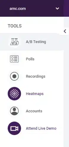
6. log in to FIgPii’s dashboard, and go over the heatmap section from the side menu.

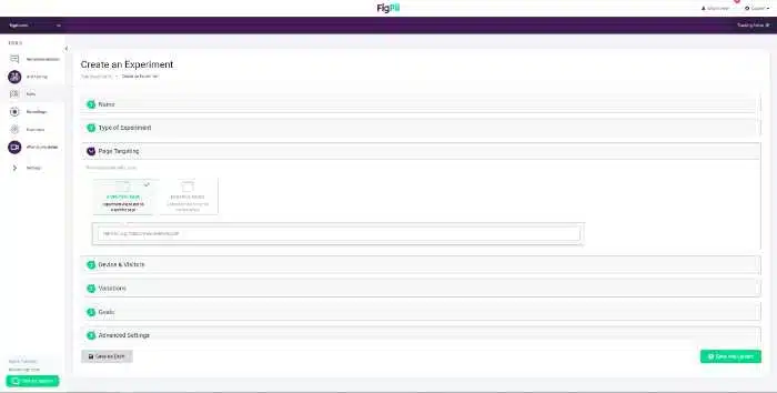
7. Press on Create an Experiment
8. Name your expermint
9. Choose the type of expermint
10. Choose which page you would like to run the test on, you can choose mobile or desktop.

10.1. You can choose mobile or desktop.
10.2. You’re also able to track new visitors or returning users.
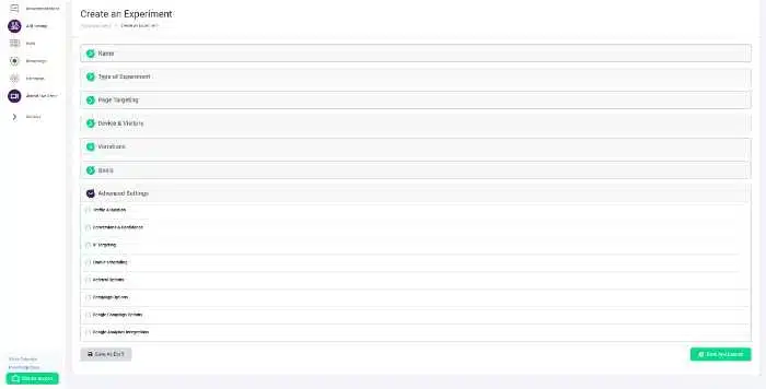
11. Add your variations.
12. Configure your goals.
13. Configure your settings with advanced options that help you create more accurate data.

You’re done! Now you’ll be able to A/B test like you never could before!

