Happy Friday, folks!
This week only lasted about three days. 😂
Maybe it’s because everyone on our team has been twice as busy. Tell you what, Black Friday preps are not for the faint-hearted.
I first realized this when I was working on my previous article – Invesp Black Friday Strategy: How They Uplifted Conversions by 10% In 3 Days Prior to it – which was published last week.
In it, I talk about:
- The playbook that was used by our friends from Invesp, to create a Black Friday strategy, for a well-established eCommerce brand three days before Black Friday.
- The standardized CRO approach they would have followed completely if they had enough time when optimizing an eCommerce site. This approach is called ‘The Ship’ process.
- The urgent approach they did follow for this client.
The whole strategy was extremely efficient, despite the lack of time.
Moving forward, here is how my week go:
A Newsletter Guide
In case you don’t know, I’m the face behind the FigPii newsletter which hits your inbox on Mondays, at 10 am Eastern time.
Wait a minute…
If you haven’t subscribed, I know you can do better. Just click here.
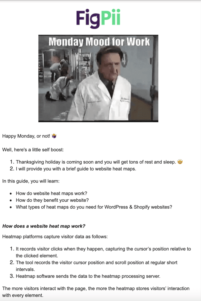
So, this week, I started a sequel in our newsletter. This one was part one of a guide about website heat maps.
In part one, I talked about:
- How do website heat maps work?
- How do they benefit your website?
- What types of heat maps do you need for WordPress & Shopify websites?
Part two will hit your inbox next week. Be sure not to miss it!
Here is a screenshot of newsletter part one, in order to be prepared for part two.

A Comparison Blog: Google Optimize VS. AB Tasty
It seems like this week was all about sequels.
I had another one on A/B testing tools. And it was all about comparing Google Optimize and AB Tasty.
In this blog, I highlighted the similarities and differences between these two tools.
So if you’re still starting out your journey in A/B testing, you might need to follow this sequel.
It is also recommended for medium-sized businesses and enterprises looking for a change and higher conversion rates.
Next week, there will be another comparison blog between another couple of tools.
Social Media Calendar for LinkedIn Posts
In order to grow my personal brand on LinkedIn, my boss, Khalid, gave me a task to create a social media calendar for my Linkedin.
The golden rules I got from Khalid sum up in:
- Set a target audience for yourself and start addressing them in your posts.
- Make sure to make your posts as informative as you can for who you are targeting.
- Talk from experience.
- Express your opinions.
Second Case Study Published
This week, I published the second case study that I worked on along with Ayat.
This case study focused on an A/B test on a cart page for an ecommerce website.
Our goal was to clean up the cart page significantly. The control was messy. It had many of the right elements, but it emphasized the wrong element, and it did not bring the proper action to visitors.
The goal from the cart page is to have people start the checkout process. Not only did the new design increase conversions, but it also gave visitors the information they needed to move quickly.
The hypothesis for the A/B test stated that:
- User research (one-on-one interviews) and usability testing on the cart page showed that users struggled to identify the primary conversion goal on the page.
- Analytics showed that the cart page had a higher than expected abandonment rate and a lower click-through rate to the checkout process.
- Session recordings showed that users are clicking back and forth on the different elements of the cart and not always starting the checkout process.
The variation improved conversions by 9.27% (macro-conversions).
To check the changes done in the variation, click here.
Wrapping Things Up
That is it for this week!
Hope you enjoyed this week’s blog. I sure did.
However, before I leave you to your weekends, tell me what interests you the most in this series? What do you feel needs enhancement? And, what do you want to read more about?
I will be waiting to hear from you.
Until next week.


