A/B tests are frequently used to prove or disprove hypotheses that emanate from research.
These can vary from tactical tests such as interface changes to strategic tests such as implementing a new checkout process on an eCommerce site or a completely new dashboard for a SaaS site.
Over the years, we have noticed that the QA process can determine the success or failure of your tests.
Visual and functional errors in the variants will distort your test results if you don’t do proper QA.
QA is an area we have invested in tremendously.
— Khalid Saleh
You want to make sure that you’re not deploying a test that is going to cause a breakdown in production. Each and every test we launch is QA’ed by multiple people on our side, and before we even launch any test, we always ask our clients to review those tests before we deploy them.”
It’s essential to have a standardized QA process in a high testing velocity program since you will be launching dozens and dozens of tests and making constant changes on your website.
Well-written documentation
For the QA team to be effective, they must be involved in the whole Conversion Rate Optimization process.
Ideally, they’re briefed together with the development team;
of course, well-written documentation and design are an acceptable substitute.
Those initial conversations are where the team gets to understand the point of view of the CRO specialist and the concerns of the development team.
1. What are your target pages?
Most of the time, a test is only meant for specific pages – like certain product pages or the cart page – and that’s the first thing the team needs to know.
We need to know where to test.
| Page Type | Targeting Type | Rule | Example |
| Product Page | Starts with | /product- | figpii.com/product-example |
| Blog Pages | Contains | /blog | figpii.com/blog |
| Pricing Page | Simple Match | /packages | figpii.com/packages |
2. Problem statement and your solution to the problem
Next, there needs to be a good explanation of what we are trying to solve. Are we trying to help users navigate the website more easily, find out information about the product above the fold, or something much more complicated?
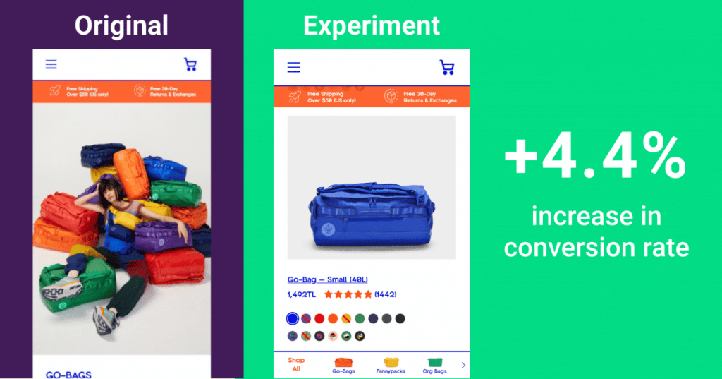
For example, here’s a real-life example of a test meant to smooth the navigation across different categories:
By providing a sticky menu showing all the subcategories, we can help visitors find the category they’d like to visit immediately without much scrolling.

3. List your variations
Listing your variations can help the QA team understand the differences between them.
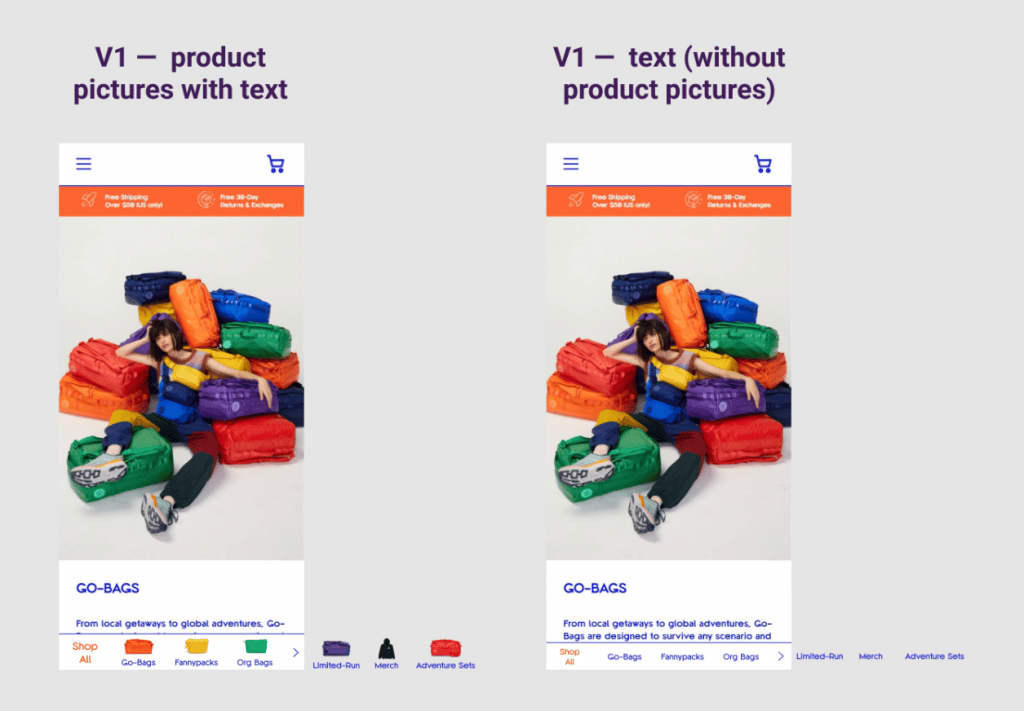
Including a short description and design examples – highlighting the differences between variations – is a must if you have over two variations.

V2: At the bottom of the page on the sticky clickable banner, the following text (without product pictures) will appear
4. Test conditions and exclusions
Is this a mobile or a desktop test?
Are you planning on only targeting users coming from a specific source? Or perhaps users from a certain coming from a particular country?
Documenting these questions with an adequate answer can help reduce back and forth between team members and managers.
An Adequate design
A good design for an AB test outlines all the differences between all your variations and the original.
Websites look different on different screens, make sure to keep that in mind.
Depending on your test that might mean providing the images in different resolutions, rearranging the elements to make them fit on smaller screens, etc.
After understanding the logic and look of the test, the QA team can get to work!
If the QA team consists of different members, split the work and make sure there’s an understanding of who’s doing what!
What to test?
1. Is it even loading?
This is the first thing you need to check. If the test was intended for a certain type of page, quickly check as many as you can just to make sure the test is loading on different kinds of that page type.
2. Does is look right?
For this step, we strongly suggest having a multi-monitor setup. Open the design on one and the website on another and compare them.
Check different screen sizes and browsers, for desktop tests we suggest the following screen sizes:
- 920 px
- 1024 px (Most common on iPads which might be detected as desktop by your testing engine)
- 1360 px (Common on older PCs)
- 1440 px (Common on MacBooks)
- 1920 px
- 2048 px
And for mobile tests check on the following screen sizes:
- 320 px
- 375 px
- 414 px
- 768 px
Pro tip: Head over to your Google Analytics and take a look at your audience technology.
There you can find the most common screen sizes among your visitors.
And in terms of which browsers to test on, The most popular current browsers are Microsoft Edge, Google Chrome, Mozilla Firefox, and Apple’s Safari.
3. The big F; Functionality
What happens when users interact with your test?
You are the user now! Put yourself in everyone’s shoes, test every element that exists on the page but especially the elements you’ve added/changed.
4. Are you breaking existing elements?
Your new elements might be just fine, but what about the rest of the page? Do they look like before and are they working as well?
For example, your new Fast Checkout shouldn’t be breaking the hamburger menu! I know it sounds strange but it happens.
Design details that went unnoticed!
Some developers don’t have a designer’s eye, which means many tiny details go unnoticed.
The QA team has to ensure that every detail was implemented as outlined by the test plan.
This includes checking the font sizes, all the different spacings and alignments, etc.
There are 2 chrome extensions that our team absolutely loves!
1. Page Ruler Redux (Free)
Using this extension you can measure the spacing between different elements to make sure they are the same as outlined on the design.
Tip: Check all the elements that were affected by your test. Scroll up and down the page, if the CSS rules were not set correctly your test might be affecting elements that are not related to your test.
2. Fonts Ninja (Free)
Use Fonts Ninja to check how your test is affecting the texts on the targeted pages. Again because of the way CSS works your test might be messing your paragraphs, headlines, and more!
Should every item identified in the QA process be fixed?
Sometimes the CRO specialist might make the call that this issue is not worth spending time on.
After all, we’re testing an idea to know if it will cause an increase in the conversion rate.
If the test is a winner, it should be hardcoded to the site, and if it’s a loser, it’ll just be paused and removed from the site.
Minor design issues can be ignored – if they don’t break the user experience.
Keep an eye on your visitors, launch session recordings for the duration of your test, and monitor how users are interacting with your variations.
The final check — Who QA’s the QA?
After the QA team is done with checking an experiment, then comes the last ghoul;
In our experience, the whole team should participate in the final check, including CRO specialists, Designers, Developers, and even the project manager.
Each member plays a vital role in the final check. Each of them brings their experience and specialty to the process.
Launch and validate any test in a QA or UAT environment that closely resembles your production site. Only after data is validated in a QA environment, then it is pushed to production servers.”
— Khalid Saleh
Conclusion: It’s never enough!
If a test is breaking your website, does it matter how fast it was developed?
No matter how much time you and your team spend QAing your experiments, problems are going to arise down the road. Let’s talk about a few solutions to reduce the number of unexpected issues after your experiment goes into productions.
1.Don’t run your experiments for too long
AB tests are meant to prove or disprove a hypothesis, not to make updates to your website.
This is especially the case if an external team is developing the AB test.
Most of the time, internal and external teams fail in communicating updates to the site’s structure, and any update to the site by the internal team will break your AB test!
Figure out how long you need to run your test to get conclusive results, communicate well with your team to hold back any upcoming updates to the site.“
— Hatice Kaya
2. Test, test, and keep on testing
It’s never enough. Educate your developers on how to do the initial QA, ask them to do a thorough and complete QA before they deliver.
Have more than one QA team member testing your experience.
Different people test differently, and that’s going to be a significant advantage for you!
There are many risks, and one I can think about is the implementation of the test. Rolling out an experiment without doing Quality Assurance. We once ran an experiment where we changed the priority order of a list of offers for our customers. When the experiment was rolled out, the swipe to go down the page wasn’t working. There was a bug. And because of that bug, we saw a pretty big negative impact.”
— Chad
Before pushing to live, make sure your CRO specialist and designer do a quick QA to make sure the experience of the test on the site is what they had initially planned.
3. Plan for issues on live
This is a must for all AB tests. When you discover that a bug within your variations slipped through all the testing (this will happen!), determine what impact the data pollution had on your test.
In most cases, we have to stop the test, fix the bug, and flush the test data..
It’s never a good idea to launch the test on Fridays.
Leave them for the beginning of the week, Most of the time, the issues are minor and can be fixed within an hour, but if you notice the problem on Sunday (or God forbids the client to report the issue to you), you won’t be able to fix it on the spot.
4. Be honest with your team; experimentation is not a game of blame
There’s nothing more important than having open and respectful communication between your team members. Please don’t blame your team members for the issues, things happen, and we’re all human.

