

Your website’s hero image is the first thing visitors see when they land on your page. It’s the visual centerpiece that sets the tone for their entire experience. Think of it as the digital equivalent of a storefront window—it needs to grab attention, convey your message, and entice users to explore further.
In today’s digital world, you have seconds to make a strong first impression. A well-optimized hero image can be the difference between a visitor bouncing off your site or staying engaged with your content.
Whether your hero image is dynamic and captivates with motion or static and speaks volumes through simplicity, it plays a significant role in shaping user perception and driving conversions.
In this article, we’ll walk you through everything you need to know about creating the perfect hero image. From choosing the right visuals to optimizing for different screen sizes, you’ll learn how to design hero images that look stunning and deliver results.
What is a Website Hero Image?
A website hero image is a large, visually striking element that spans the entire viewport of a webpage. It’s typically placed at the top of the page and serves as the focal point of your design.
The hero image is often accompanied by a headline, subheadline, and a call-to-action button, making it a powerful tool for communication and engagement.
The term “hero” comes from its role as the star of the page—it’s the first thing users notice, setting the stage for their journey through your site.
Whether you use a full-screen hero image to immerse users in your brand story or a banner hero image to highlight a specific promotion, the goal is to capture attention and guide users toward a desired action.
Why is a Website Hero Image Important?
Your hero image is more than just a pretty picture—it’s a strategic element of your web design that can make or break user engagement. Here’s why it matters:
-
First Impressions Matter
Studies show that users form an opinion about your website in less than a second. Your hero image is the first thing they see when they come in through your homepage, setting the tone for their entire experience. A great hero image can instantly communicate your brand’s values, build trust, and encourage users to explore further.
-
Drives Engagement
A well-designed hero image can reduce bounce rates and keep users on your site longer. Using engaging visuals and a clear call-to-action button, you can guide users toward key actions, whether clicking through to a product page or signing up for a newsletter.
-
Reinforces Brand Identity
Your hero image is an extension of your brand identity. It’s an opportunity to showcase your unique personality through bold colors, minimalist design, or animated hero images. Consistency in your visuals helps build recognition and trust.
-
Supports Your Message
A hero image isn’t just about aesthetics—it’s about communication. Whether promoting a sale, launching a new product, or sharing a story, your hero image should align with your message and resonate with your target audience.
-
Improves User Experience
A perfect hero image is optimized for all screen sizes, ensuring a seamless experience across devices. Thanks to high-resolution images that are compressed for performance, it’s also fast-loading.
In short, your hero image is an important component of your landing page and web design. When done right, it can elevate your site from ordinary to extraordinary.
Types of Website Hero Images
Every website’s hero image serves a purpose, but at its core, it can be categorized into these main types based on its function and impact. These categories define how the image communicates with visitors and what role it plays in guiding user engagement.
-
Product-Focused Website Hero Images
When the focus is entirely on the product, the hero image works as a visual sales pitch. This type is commonly used in ecommerce, automotive, and technology brands where showing the product in detail matters more than anything else.
-
Sensory-driven Website Hero Images
This category is all about creating an immersive experience. These hero images engage the senses through high-resolution photography, rich colors, or even video. They are commonly used in travel, food, luxury, and entertainment industries.
-
Utility-Focused Website Hero Images
Some hero images exist purely to guide users toward an action. These are often clean and minimalistic and paired with an intuitive navigation structure. The goal is clarity—making it easy for visitors to know what to do next.
-
Narrative-Driven Website Hero Images
These hero images tell a story at first glance. They are designed to evoke emotion, provide context, or introduce a brand’s mission in a way that instantly connects with visitors. The focus is not just on the visuals but on what they represent.
A nonprofit might use an image of volunteers in action, while a sustainability-focused brand could feature its production process. These images help visitors understand the brand’s values without reading additional text.
These hero image examples demonstrate how different approaches can be tailored to specific goals and audiences. Whether you choose a full-screen hero image, banner hero image, or dynamic hero image, aligning the visuals with your message and target audience is key.
Key Elements to create an effective Website Hero Image
Creating a perfect hero image requires more than just a beautiful picture. It’s about combining the right elements to create a cohesive and impactful design. Here are the key components to consider:
-
High-Quality and Authentic Visuals
A hero image must be crisp, well-composed, and high-resolution to create an immediate impact. A blurry or pixelated image instantly makes a website feel low-quality and untrustworthy.
However, quality doesn’t stop at resolution—authenticity matters just as much. Visitors can easily recognize overused stock images that feel impersonal or staged. The most effective hero images reflect the brand’s real-world identity, using custom photography or well-selected visuals that align with its purpose.
Zara’s hero image embraces editorial-style photography. It uses a monochrome aesthetic and bold posing to create a high-fashion, luxury feel that aligns with its brand identity.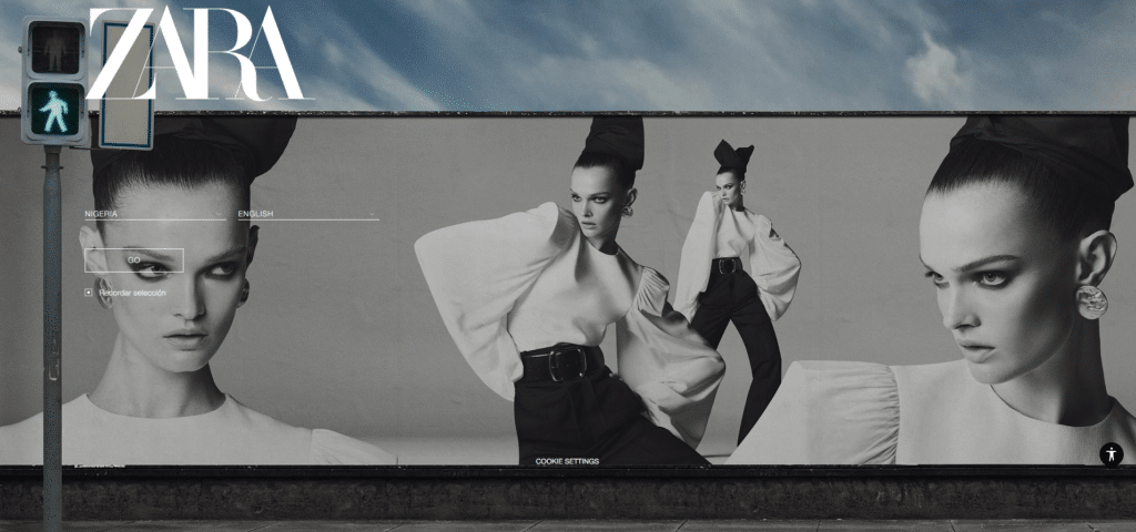
Quick Tips to Ensure High-Quality Visuals
- Use custom, brand-specific images instead of generic stock photos whenever possible.
- Optimize image resolution by ensuring it’s sharp and properly scaled for different devices.
- Stick to professional, well-lit photography that represents your brand’s aesthetic.
- Avoid overly edited, unrealistic visuals that feel disconnected from your audience.
-
Relevance to Brand and Audience
A great hero image doesn’t just look good—it immediately signals to visitors that they’re in the right place. This requires a deep understanding of your target audience’s expectations and needs and how they intersect with your brand’s message. An irrelevant image can confuse visitors or make them feel disconnected, reducing engagement.
Glossier’s hero image is a close-up of glowing, dewy skin, perfectly aligning with its focus on minimalist beauty and skincare.
The visual immediately speaks to its target audience, reinforcing the brand’s message of effortless, natural beauty while showcasing the product’s effect in a way that feels aspirational yet attainable.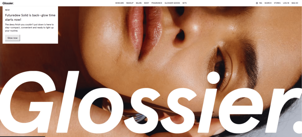
Quick Tips to Ensure Relevance
- Research your audience to understand their pain points and preferences.
- Choose an image that directly reflects the service, product, or value your brand offers.
- Test different visuals with real users to gauge immediate reactions.
- Keep cultural relevance in mind—an image that resonates in one region may not in another.
-
Emotional Connection and Simplicity
Emotionally driven images improve engagement and conversion rates by tapping into human decision-making. A well-optimized hero image evokes an immediate reaction, whether excitement, trust, or curiosity.
However, for this emotion to be resonate, the design must remain simple and focused. Cluttered hero sections dilute the message’s impact and create visual noise.
Nike’s hero image is a powerful black-and-white portrait of A’ja Wilson, conveying confidence and determination with a glance. The bold yet minimalistic text reinforces the emotional message, “Results speak louder than critics.” This aligns with Nike’s brand identity of perseverance and excellence.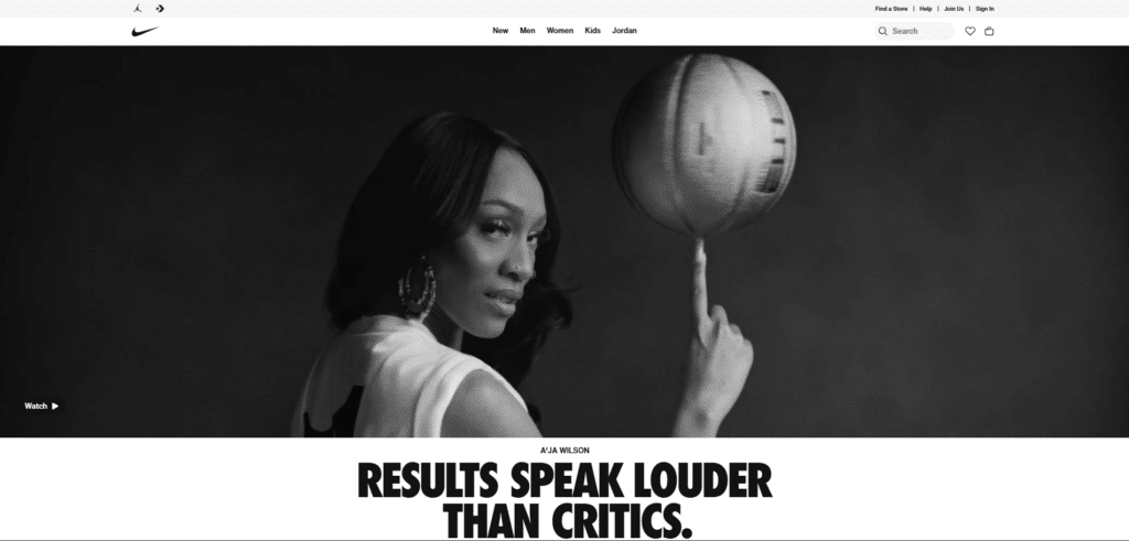
Quick Tips to Ensure Emotional Impact and Simplicity
- Choose images that tell a story rather than just displaying a product or service.
- Avoid clutter—one strong image with a clear message is better than multiple competing elements.
- Use negative space strategically to direct the visitor’s eye toward key content.
- Keep text minimal—let the image do the talking.
-
Strong Headline and Subheadline
Even the best hero image needs supporting text to provide clarity. A strong headline should immediately convey what your website offers, while the subheadline reinforces the message with more details or a value proposition. Users should understand the purpose of your site within seconds of landing on it.
Shopify’s bold yet simple headline, “Be the next big thing,” immediately communicates aspiration and possibility. At the same time, the subheadline reinforces the message with a clear value proposition and incentive, making it easy for visitors to grasp the benefit of using Shopify.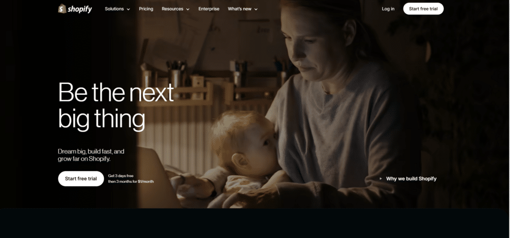
Quick Tips to Ensure Clear Messaging
- Keep the headline short and impactful—ideally under 10 words.
- Ensure the subheadline adds value rather than just repeating the main message.
- Use high contrast and accessible fonts for readability.
- Position text where it doesn’t obscure key elements of the hero image.
-
Clear and Actionable CTA
A hero image grabs attention but must also guide visitors to the next step. Without a clear and prominent CTA, users may admire the design but fail to take action.
Whether the goal is to encourage sign-ups, explore products, or initiate a download, a strong CTA should be immediately visible, action-driven, and seamlessly integrated into the hero section.
A well-designed CTA eliminates confusion, tells users exactly what to do next, and makes action effortless.
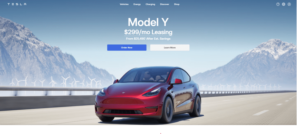 Tesla’s hero image keeps the CTA highly visible and action-driven. It features a bold “Order Now” button in contrasting blue and a secondary “Learn More” option. The placement ensures users can immediately take action, reinforcing a frictionless user journey.
Quick Tips to Ensure an Effective CTA
- Use high-contrast colors to make the CTA stand out.
- Action-driven wording like “Start Watching” or “Get Started” performs better than generic text.
- Ensure the button size is large enough for mobile users to tap easily.
- Avoid placing the CTA too far from the hero image, as it should be immediately visible.
-
Optimized for Mobile Devices
A hero image that looks flawless on a desktop can completely fail on mobile if it isn’t optimized. Issues like text getting cropped, CTA buttons shrinking too small to tap, or slow-loading images can frustrate users and cause them to abandon the site.
With mobile browsing making up over half of web traffic, it is necessary to ensure that hero images scale properly and remain fully functional on smaller screens. Mobile-friendly hero images retain readability, load quickly, and adjust dynamically based on screen size.
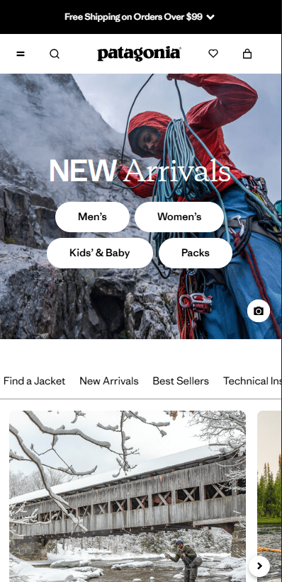
Patagonia’s mobile-friendly hero image stand is a great example of how a well-designed image adapts across different devices without losing impact.
Quick Tips to Ensure Mobile Optimization
- Use responsive design techniques to dynamically adjust hero images across devices.
- Reduce file size without sacrificing quality to improve mobile loading speeds.
- Ensure text and CTAs remain fully visible and tappable on smaller screens.
- Test hero images on multiple mobile devices to avoid awkward cropping issues.
-
Overlay Text and Contrast for Readability
Text overlays can improve a hero image, but if poorly executed, they can become unreadable, reducing the effectiveness of the entire section.
If users struggle to read text due to low contrast, poor font choices, or excessive background noise, they’ll likely skip over it—leading to missed messaging and lost engagement.
Overlay text must be balanced, showcasing the message without overpowering or blending into the background.
A good overlay provides enough contrast to remain legible while keeping the focus on the visual story being told.
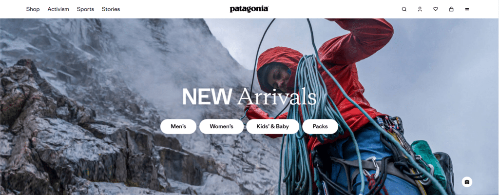
Patagonia’s hero image uses high-contrast white text over a darker background, ensuring readability without overpowering the image.
The subtle natural lighting keeps the climber and ropes visible while providing enough contrast for the “NEW Arrivals” text and CTA buttons to stand out clearly.
Quick Tips to Ensure Readability
- Use high-contrast text against the background image.
- Apply a subtle overlay to increase text visibility.
- Stick to simple, legible fonts that work across all screen sizes.
- Ensure the text color meets WCAG accessibility contrast ratios.
-
Speed and Performance Optimization
A beautiful hero image is worthless if it slows down your website. Speed is an important factor in engagement, and studies show that even a one-second delay in page load time can reduce conversions by up to 7%.
Large, unoptimized hero images increase load times, which can cause frustration, bounce-offs, and lower rankings in search engines. Websites that prioritize performance optimization ensure that their hero images improve rather than hinder the user experience.
Quick Tips to Ensure Fast Loading
- Compress images using lossless optimization tools like TinyPNG.
- Use modern formats like WebP, which provide high quality at a smaller file size.
- Implement lazy loading so the hero image only loads when needed.
- Keep image file sizes under 200KB for the best balance of speed and quality.
-
Accessibility Considerations
A hero image should be usable by everyone, including those with disabilities. Websites that neglect accessibility alienate a significant portion of their audience and fail to comply with Web Content Accessibility Guidelines.
An unclear or missing alt text description can render the hero image useless for visually impaired users who rely on screen readers. Low-contrast text or flashing animations can make navigation difficult or overwhelming for some users.
Quick Tips to Ensure Accessibility
- Add alt text that describes the hero image meaningfully.
- Use text overlays that maintain WCAG contrast guidelines.
- Avoid flashing animations that may trigger seizures in sensitive users.
- Ensure CTA buttons are keyboard-navigable and easy to activate.
A/B Testing Website Hero Images: How to Do It Right
If we check back on some of these websites in a few days, weeks, or months, chances are their hero images will look different. That’s not just a design refresh—it’s often the result of A/B testing.
Brands constantly optimize their hero sections to improve engagement, conversions, and relevance as seasons change, trends evolve, and new products launch. A/B testing hero images regularly ensures that the most effective version is always in place.
What to A/B Test in Website Hero Images
- Image Type – Test lifestyle images vs. product-focused visuals to see what resonates more.
- Headline and Copy – Experiment with different messaging styles, from bold statements to benefit-driven headlines.
- Call-to-Action Placement – Move the CTA button higher, lower, or closer to the image’s focal point.
- Color and Contrast – Adjust overlays, background hues, or text contrast to improve readability.
- Static vs. Dynamic Hero Image – To gauge engagement, compare a still image with a video or animated hero section.
How to A/B Test Hero Images Effectively
- Define Your Goal – Whether it’s increasing clicks, sign-ups, or purchases, establish clear success metrics.
- Test One Element at a Time – Isolating changes ensures accurate results.
- Use the Right Tools – Platforms like FigPii, Optimizely, or VWO make split-testing hero images seamless.
- Analyze and Iterate – Review heatmaps, click-through rates, and conversion data to refine future tests.
Final Thoughts
A well-optimized hero image does more than just make a website look good—it drives engagement, strengthens brand identity, and guides users toward action. From selecting high-quality visuals to crafting compelling copy and testing variations, every element shapes the visitor’s experience.
But optimization isn’t a one-and-done task. What works today may not work tomorrow as consumer behavior shifts, new trends emerge, and business goals evolve. That’s why continuous refinement is key.
Website Hero Image FAQs
What is a website hero image?
A website hero image is the large, prominent image at the top of a webpage, typically the first visual element users see. It sets the tone for the site, captures attention, and often includes supporting text and a call-to-action (CTA). Hero images are used to communicate a brand’s message, highlight a product or service, and improve engagement
How do I create a hero image for my website?
To create an effective hero image, start by defining its purpose—whether it’s storytelling, product showcasing, or guiding user action. Choose a high-quality and relevant visual that aligns with your brand. Add a strong headline and ensure any text is readable against the background. Optimize the image for desktop and mobile, keeping file size in check to maintain fast loading speeds.
What size is a hero image for a website?
For desktops, 1920 x 1080 pixels is the standard for full-width hero images, while 1600 x 900 pixels works well for smaller screens. For mobile, 1080 x 1920 pixels (portrait) and 1280 x 720 pixels (landscape) are common. To ensure responsiveness, use a flexible aspect ratio (16:9 or 4:3) and CSS media queries to adjust the image dynamically across different screen sizes.
Should every page have a hero image?
Not necessarily. While hero images are great for homepages, landing pages, and product showcases, they may not be needed on content-heavy pages like blog posts or technical documentation. In some cases, a clean, text-focused layout might be more effective. The decision to use a hero image should be based on whether it enhances user experience or unnecessarily slows down the page.

