Have you ever felt lost while browsing a website, unsure of how you got there or how to navigate back? It’s like walking into a massive shopping mall without any directory signs—every turn leads you somewhere new, but finding your way back to a previous store or section is frustrating.
That’s where breadcrumb navigation comes in. Just like well-placed signs in a mall, breadcrumbs help users understand their path, showing them where they are and how they got there. Without them, visitors might struggle to backtrack or explore related sections, leading to frustration and abandoned sessions.
In this article, we’ll explore different types of breadcrumbs, their role in improving navigation, and when they might not be the best fit. We’ll also look at real-world examples of how breadcrumbs create a more seamless browsing experience.
What is Breadcrumb Navigation?
Breadcrumb navigation is a secondary navigation system that shows users their current location within a website’s hierarchy. It typically appears as a horizontal trail of links at the top of a page, often just below the main navigation menu.
The term “breadcrumb” comes from the fairy tale Hansel and Gretel, where the characters leave a trail of breadcrumbs to find their way back home.
Similarly, breadcrumb navigation helps users retrace their steps or understand where they are on a website. Breadcrumb navigation is a small but powerful feature that enhances usability, improves SEO, and creates a smoother browsing experience.
Take breadcrumbs on EdX’s web pages, for instance.

The online learning platform offers thousands of courses from various institutions and subjects. Their breadcrumb navigation helps users navigate between different levels of courses, including programs, micro-credentials, professional certificates, etc.
Types of Breadcrumb Navigation
1. Location-based breadcrumb
Location-based breadcrumbs display a site’s hierarchical structure or path, showing users where they are within your website structure. This makes them ideal for sites with many subdomains or pages that aren’t linked.
For example, if you were building a site for an ecommerce store, then this would be an appropriate breadcrumb to use because it would enable visitors to see where they were within your store structure at all times, even if they weren’t currently viewing a product page or category page, etc.
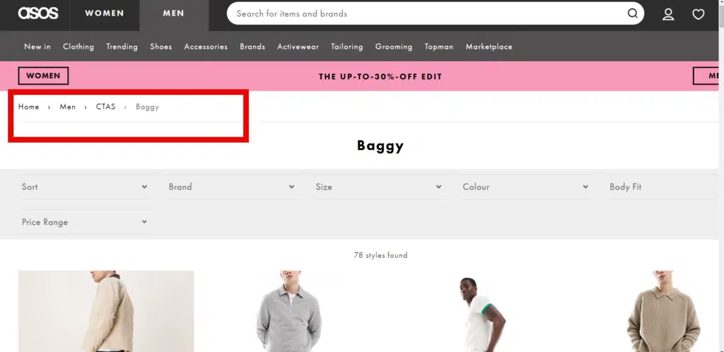
The location-based breadcrumb could be displayed as “Home > Men > CTAs> Baggy >”
Users can easily navigate back to a higher-level page within the hierarchy by clicking on any of these links.
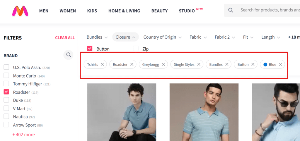
2. Attribute-based breadcrumb
3. Path-based breadcrumb
Path-based breadcrumbs track a user’s journey through a website rather than following a predefined category structure.
Unlike attribute-based or location-based breadcrumbs, which reflect hierarchical navigation, path-based breadcrumbs display the user’s steps to reach their current page.
For example, on Myntra, a user might start on the homepage, browse Men’s Clothing, then check out a Nike T-shirt, and finally visit the Sale section before landing on a specific product page. The breadcrumb trail would look something like this:
Home > Men’s Clothing > Nike T-Shirt > Sale > Product Page
If the user navigated differently, the breadcrumb would adjust accordingly:
This approach enhances usability by allowing users to retrace their steps exactly as they navigated, helping them quickly return to previous pages without relying on the browser’s back button.
Benefits of Implementing Breadcrumbs on Your Website
Here are some benefits of implementing Breadcrumbs:
1. Enhanced website navigation
Breadcrumbs enhance the navigation of your website by providing a visual map of where you are on your site.
They can help visitors find their way around and inform search engines about the structure of your website.
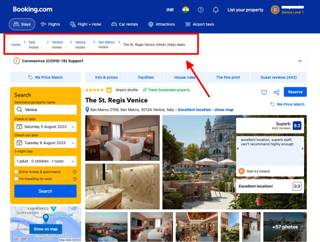
For instance, Booking.com uses location-based breadcrumbs, which show the user where they are in the site’s structure.
2. Facilitates backtracking and exploration
The breadcrumb trail helps provide users with an overview of their path through a website. If they get lost or need to return to a place they’ve been before, they can easily find their way back by following the breadcrumbs.
An essential part of breadcrumbs is that they indicate the current position in relation to the rest of the site’s content – which means you can use them for both backtracking and exploration purposes.
3. Improved user orientation
The primary purpose of breadcrumbs is to provide users with an overview of their current location on a website. This can be particularly important for large sites with multiple levels of navigation or content pages in different categories or sections.
In this scenario, breadcrumbs can help users quickly find their way back to the homepage or another page they know exists somewhere on your site. This reduces the cognitive load and the frustration of users who might feel lost or confused.
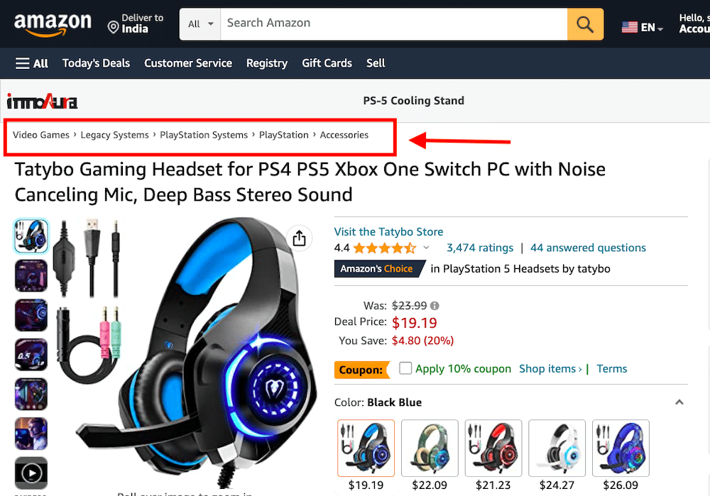
Take Amazon’s breadcrumbs, for example.
The e-commerce giant has a vast catalog of products grouped into categories and sub-categories, such as Books, Electronics, Fashion, etc.
This breadcrumb navigation helps users navigate between different levels of product categories and sub-categories.
For example, if the user is browsing for PlayStation systems, they can see the following breadcrumb navigation:
4. Provides context and hierarchy
Breadcrumb gives your site a hierarchical context (like siblings or parent/child relationships). It allows you to display the hierarchy of the current page in the URL instead of just showing the page name.
This helps users understand how they fit into the site at large, and it helps them navigate back up through that hierarchy if needed.
5. Breadcrumbs come with SEO benefits as well
Breadcrumbs help Google and other search engines understand your content structure better. This can help with Search Engine Optimization efforts by determining which pages to show in search results and showing links to those pages on their SERPs for specific queries.
Best Practices for Implementing Breadcrumb Navigation
Breadcrumb navigation is a great way to help users find their way around your website. But breadcrumbs can be tricky to implement well.
Here are some best practices for implementing breadcrumb navigation:
1. Clear and concise labels
The purpose of breadcrumb navigation is to help users understand their location in the site structure.
To do this, you need clear, concise labels for each level in the hierarchy – not just for the top-level pages but also for any other levels that may be nested within those top levels (such as subcategories).
So, resist the urge to include excessive levels of information in your breadcrumbs.
For example, if a page is only one step above another in the hierarchy, don’t include both pages in your breadcrumb – just include the higher level page (in this case, “Home”).
2. Make sure it’s always obvious where users in the hierarchy.
Breadcrumbs are helpful only if people can understand them at a glance. Color coding is one way to accomplish this goal.
For example, let’s say your site has multiple levels of navigation — such as “Home,” “Home > Products,” and “Products > Clothing.”
In that case, color code each level so users can tell which level they’re on by looking at the breadcrumb trail on their browser window’s left or right side.
Use clear language for each level so that users know exactly what each step is about when they see it on their screen (for example, instead of saying “Clothing,” say “Men’s Clothing”).
3. Consistent placement and styling
Place your breadcrumb at the top of the page in a consistent place that doesn’t distract from other content. It could be either above or below the logo or branding area but not directly to the left or right.
This way, you ensure it’s visible without distracting from other content on your page.
At the same time, the styling of your breadcrumbs should be consistent across all pages on your site. It’s best if they match the style of other elements on your site (like buttons) so they look like they belong together as part of an overall design system rather than being thrown in there randomly by different designers over time.
For instance, HubSpot’s Knowledge Base always has breadcrumbs near the top of the page, under the search bar.
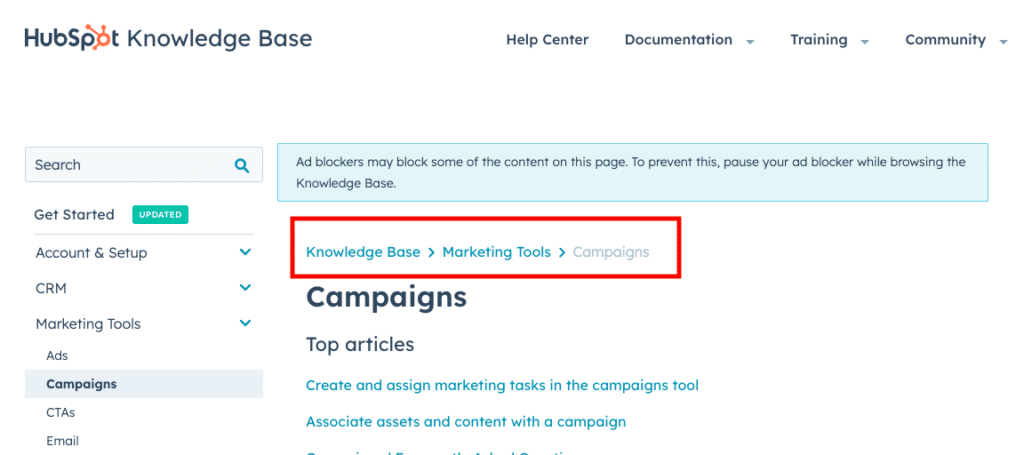
They also have a consistent style with the color and font style that aligns with the rest of their branding elements.
4. Responsive design considerations
When designing breadcrumb navigation for mobile devices, it’s essential to ensure a seamless user experience across different screen sizes.
On larger screens, breadcrumbs are displayed horizontally, allowing users to follow the navigation trail effortlessly. However, on smaller screens, such as mobile devices, horizontal breadcrumbs may take up too much space or become difficult to read.
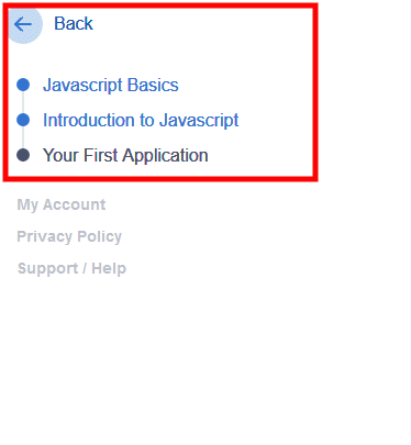
One practical approach is using vertical breadcrumb navigation, which stacks links vertically rather than horizontally. This layout conserves horizontal space and ensures breadcrumbs remain readable and accessible on narrow screens.
Another method is collapsing breadcrumbs into a dropdown menu, where users can tap to expand and view the full navigation trail when needed. This keeps the interface clean while maintaining easy access to navigation links.

5. Proper integration with other navigation elements
When it comes to breadcrumbs, there’s a lot of confusion. Is it supposed to be “Home > Products” or “Products > Home”? Should it be “Home > Products > Special Offers” or “Special Offers > Products”?
Well, that all depends on the context.
Breadcrumbs are not meant to be stand-alone items or your primary navigation menu. It’s better to use them as an additional way to navigate, not as the primary one by navigating breadcrumbs with your other navigation elements.
But how do you go about it?
For starters, integrate the breadcrumb navigation with the website’s search functionality. When users perform a search and land on a specific page, the breadcrumb navigation should accurately reflect the search context.
For example, if a user searches for “latest tech news” and clicks on a search result that leads to an article titled “Top Tech Trends of 2023,” the breadcrumb navigation could display “Home > Technology > News > Top Tech Trends of 2023.”
This integration will help your audience understand their search context and navigate within the broader website structure.
Challenges associated with implementing Breadcrumbs Navigation
Breadcrumbs are a great way to help users navigate your site, but they can be tricky to implement if there is not enough information available or the information isn’t organized correctly.
Here are some challenges you might face and the things to consider:
-
Complex Website Structures
Websites with deep hierarchies or multiple subcategories can make breadcrumb trails long and difficult to navigate. If a user moves between different sections of the site, the breadcrumb path may not clearly represent their journey, leading to confusion.
-
Duplicate Content and Titles
When multiple pages share similar or identical titles, breadcrumbs may not accurately distinguish between them. This can create misleading navigation paths, making it difficult for users to determine their exact location on the site.
-
Multilingual Websites
Managing breadcrumbs in multiple languages can lead to inconsistencies. If translations are not properly handled, users might see breadcrumb trails in a mix of languages or face navigation challenges when switching between different language versions of the site.
-
Mobile and Touch-Based Interfaces
Traditional horizontal breadcrumbs may not fit well on smaller screens. Touch interactions require breadcrumbs to be easily clickable, but small links or long trails can create usability issues on mobile devices.
-
Dynamic and Filtered Content
Breadcrumbs may struggle to reflect a user’s navigation path on sites with dynamic content, faceted search filters, or product recommendations. For example, in e-commerce, a user might arrive at a product through a filter rather than a fixed category structure, making breadcrumbs inaccurate or irrelevant.
-
SEO and URL Structure Conflicts
Poor breadcrumb implementation can lead to inconsistencies between navigation paths and actual URL structures. This can impact search engine crawling and indexing if not aligned correctly, leading to SEO inefficiencies.
-
User Misinterpretation
Some users may not be familiar with breadcrumbs or how they function, leading to underuse. If breadcrumb trails are unclear or don’t align with user expectations, they may go unnoticed or fail to provide the intended navigational benefit.
Final Thoughts
Breadcrumb navigation offers a range of benefits that significantly enhance the user experience and streamline website navigation. By providing improved user orientation, users can effortlessly understand their location within the website’s structure, making it easier to explore related content and backtrack when needed.
Breadcrumb navigation also promotes efficient navigation by offering clear pathways and allowing users to switch between different website sections easily.
With proper integration with other navigation channels and responsive design considerations, breadcrumb navigation becomes indispensable for ensuring a seamless and cohesive user experience across various devices.
So, whether for running e-commerce websites, news platforms, or any other content-rich site, website breadcrumbs navigation is a wise choice to enhance user satisfaction and engagement.
Breadcrumb Navigation FAQs
What is an example of breadcrumbs?
A common example of breadcrumbs can be found on e-commerce websites. For instance, if a user is browsing a laptop product page, the breadcrumb trail might look like this:
Home > Electronics > Laptops > Gaming Laptops > Product Name
This allows the user to quickly return to the broader Laptops category or Electronics section without restarting their search from the homepage.
Why are breadcrumbs important?
Breadcrumbs improve website usability by offering users a clear navigation path, reducing the number of clicks needed to return to previous sections. They also help organize content logically, making it easier for visitors to find what they want. Additionally, breadcrumbs enhance accessibility and mobile navigation by providing a structured way to explore a website.
What is a breadcrumb menu?
A breadcrumb menu is a secondary navigation system that displays a user’s location within a website’s hierarchy. It typically appears as a series of clickable links, separated by symbols like > or /, showing the path from the homepage to the current page. Breadcrumb menus improve usability by allowing users to backtrack easily without relying on the browser’s back button.
Why should you add breadcrumbs to a website?
Adding breadcrumbs to a website enhances user navigation, reduces frustration, and helps visitors quickly understand the site’s structure. They provide an intuitive way to move between pages, especially for content-rich or multi-layered websites, improving user experience and engagement.
Can breadcrumbs improve SEO?
Yes, breadcrumbs can improve SEO by making a website easier for search engines to crawl and enhancing internal linking. They also provide additional context to search engines about site hierarchy, which can lead to richer search results (breadcrumb trails appearing in search snippets). Improved navigation can also reduce bounce rates and increase user engagement, indirectly benefiting search rankings.


