In online shopping, the journey from browsing to purchasing hinges on a critical juncture: the checkout process. Checkout process optimization is necessary for turning casual browsers into satisfied customers.
The ecommerce checkout process is more than just a transactional formality; it’s a pivotal point where user experience and business goals converge. How you structure your checkout process can negatively or positively impact your conversion rates.
Imagine entering a supermarket, selecting items, and standing in line for a long time, not because there are many other customers in front of you, but because you have to fill in some details and answer some questions while waiting.
If you ever make it to the cashier, you’ll probably give them a piece of your mind or even abandon your shopping cart before it gets to your turn and never shop in the same store again.
The frustration and impatience that arise during this scenario mirror the sentiments of online shoppers faced with a cumbersome and convoluted checkout process. This is precisely where the importance of a simplified checkout process comes into play.
A frictionless checkout reduces the likelihood of abandoned carts and fosters a positive perception of the brand, paving the way for repeat business.
This article explores the different strategies to simplify your ecommerce site checkout process and increase conversions.
What is Checkout Process Optimization?
Checkout process optimization refers to the strategic optimization of the various stages and elements of the online purchase journey.
It involves the meticulous evaluation and refinement of each step—from adding items to the cart to the final confirmation—to minimize complexity, reduce friction, and enhance the overall user experience.
The ultimate goal of optimization of the checkout process is to create a seamless, intuitive, and efficient pathway for customers to complete their transactions easily.
Understanding the Checkout Process
Within the confines of the checkout process, customers navigate through a series of steps, each with a distinct role in ushering them toward conversion.
Beyond its transactional nature, the checkout process shapes the customer experience and significantly influences conversion rates.
Coming up with different strategies to simplify the checkout process starts with understanding the different stages of an online checkout process.
Steps Involved in an Online Checkout Process
The online checkout process mirrors the orderly progression of a physical transaction but with digital twists that can either enhance or hinder the experience.
Here’s what a typical checkout process looks like on an ecommerce website
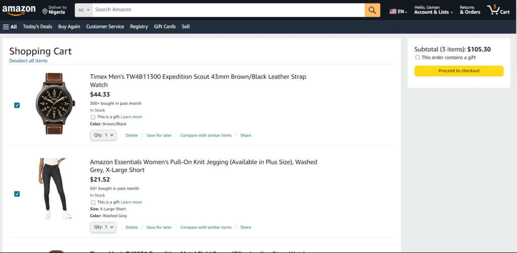
- View Cart
This initial step summarizes the selected items and their quantities. It provides users with a last-minute opportunity to review their choices before proceeding.
- Billing Information
Customers input their billing details, including name, address, and contact information. Accuracy is crucial to ensure a successful transaction and the delivery of purchased items.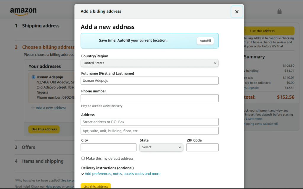
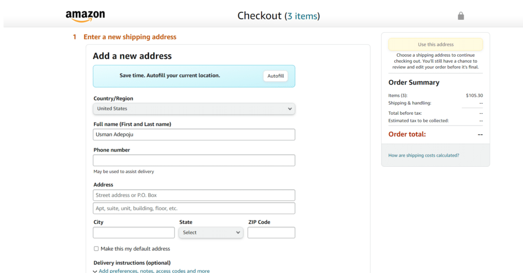
- Shipping Information
Users provide shipping details, ensuring that their orders reach the intended destination securely and on time. This step often includes options for various delivery methods.
- Order review
A summary of the entire purchase, including items, quantities, pricing, and shipping information, is presented for review. This final checkpoint allows users to make any necessary adjustments before moving forward.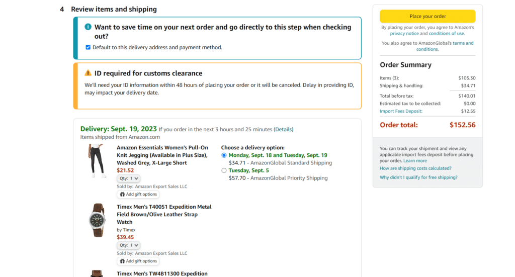
- Payment Authorization
Customers input their payment information, which is securely processed for the final transaction.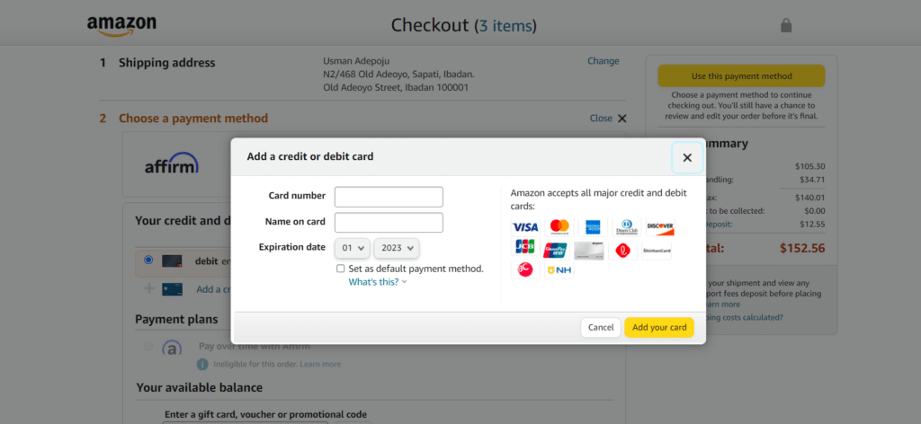
- Order confirmation
The culmination of the checkout process. This step confirms the successful transaction and provides users with order details, estimated delivery dates, and relevant contact information.
Common pain points associated with the checkout process
While the checkout process is designed to facilitate a seamless transaction, specific pain points can frustrate users and lead to abandoned carts.
These pain points include:
-
No progress indicators
Users appreciate knowing where they are in the checkout process. A lack of progress indicators can lead to confusion, making users unsure of how many steps remain.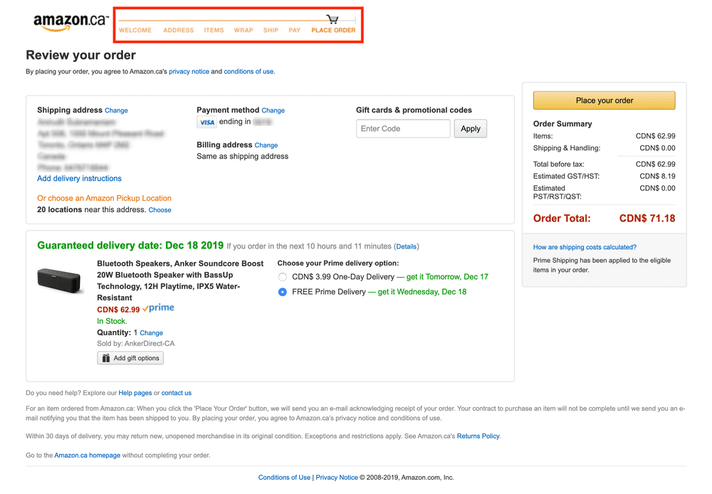
-
Forced account creation
Imagine you’re trying to purchase a sensitive item online, only to get to the checkout process and find out you must create an account. Yikes!
Mandating users to create an account before checking out can be a deterrent. Many users prefer to complete a purchase as a guest, saving time and reducing friction.
For example, If you try to checkout on Asos without signing in to your account, it takes you to this page.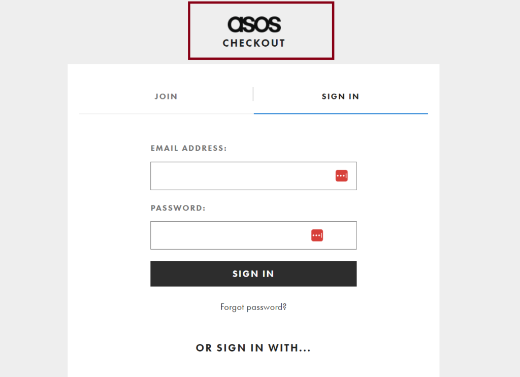
-
Limited payment options
A lack of payment options that cater to diverse customer preferences might force users to abandon their carts if their preferred payment option isn’t available.
-
Unnecessary form fields
Lengthy forms with redundant or non-essential fields can frustrate users. Streamlining the information-gathering process minimizes user effort and speeds up checkout.
How to simplify the checkout process
Creating a hassle-free and efficient checkout process is a delicate balance between user convenience and business objectives.
You can significantly enhance conversion rates and improve customer satisfaction by strategically optimizing various aspects of the process.
Here are key strategies to streamline the online checkout journey:
-
Reduce the number of steps to order confirmation.
Streamlining the process by minimizing unnecessary steps ensures customers can swiftly move from selecting products to confirming their orders.
Each additional step increases the number of pages before they reach the order confirmation page, ultimately increasing the likelihood of cart abandonment.
-
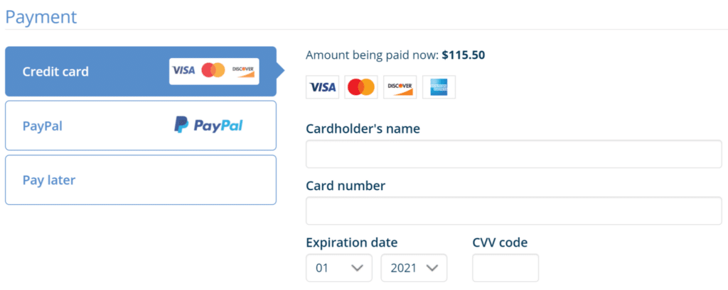
Offer multiple payment options.
This is a no-brainer. Once customers check the payment logos on the payment page and can’t find a suitable one, that’s the end of the customer journey. When you provide different payment choices like credit cards, digital wallets, cryptocurrencies, installment payments, and online payment platforms, you accommodate different payment behaviors, fostering a more inclusive and customer-friendly environment.
-
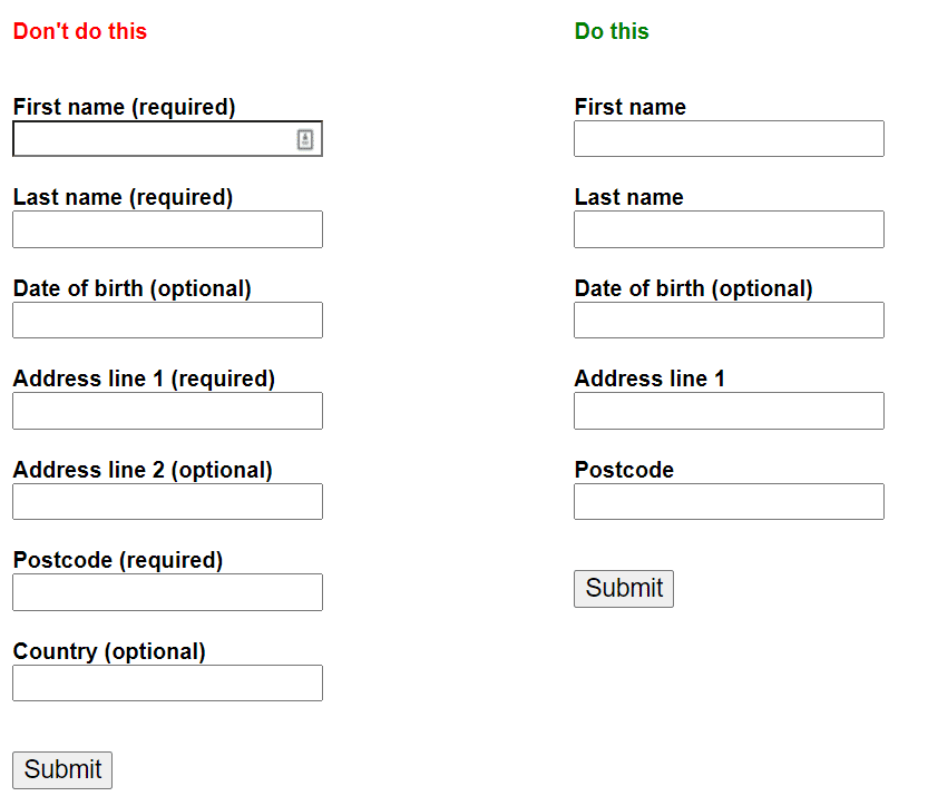
Remove unnecessary form fields.
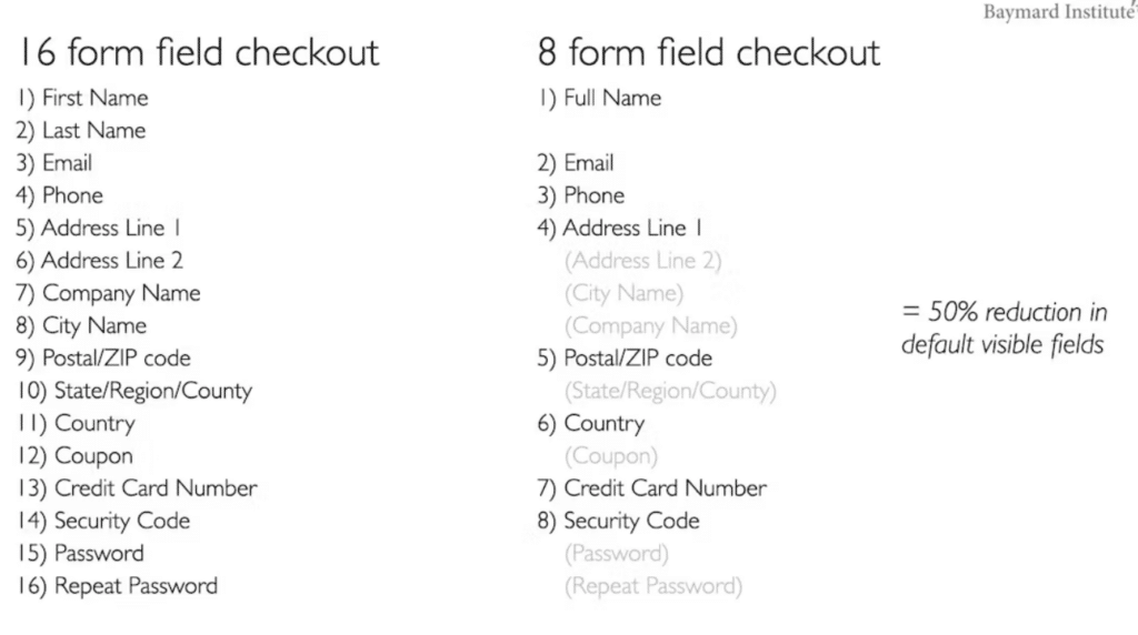
If I’m just trying to order a book, why should I have to fill in so many details like I’m trying to obtain a loan?
Reducing mandatory form fields reduces user effort and saves time during checkout. Request only essential information, aligning with the principle of providing relevant details without overwhelming customers.
Here’s an example from Bayman Insititute on reducing a 16-form field check to 8.
-
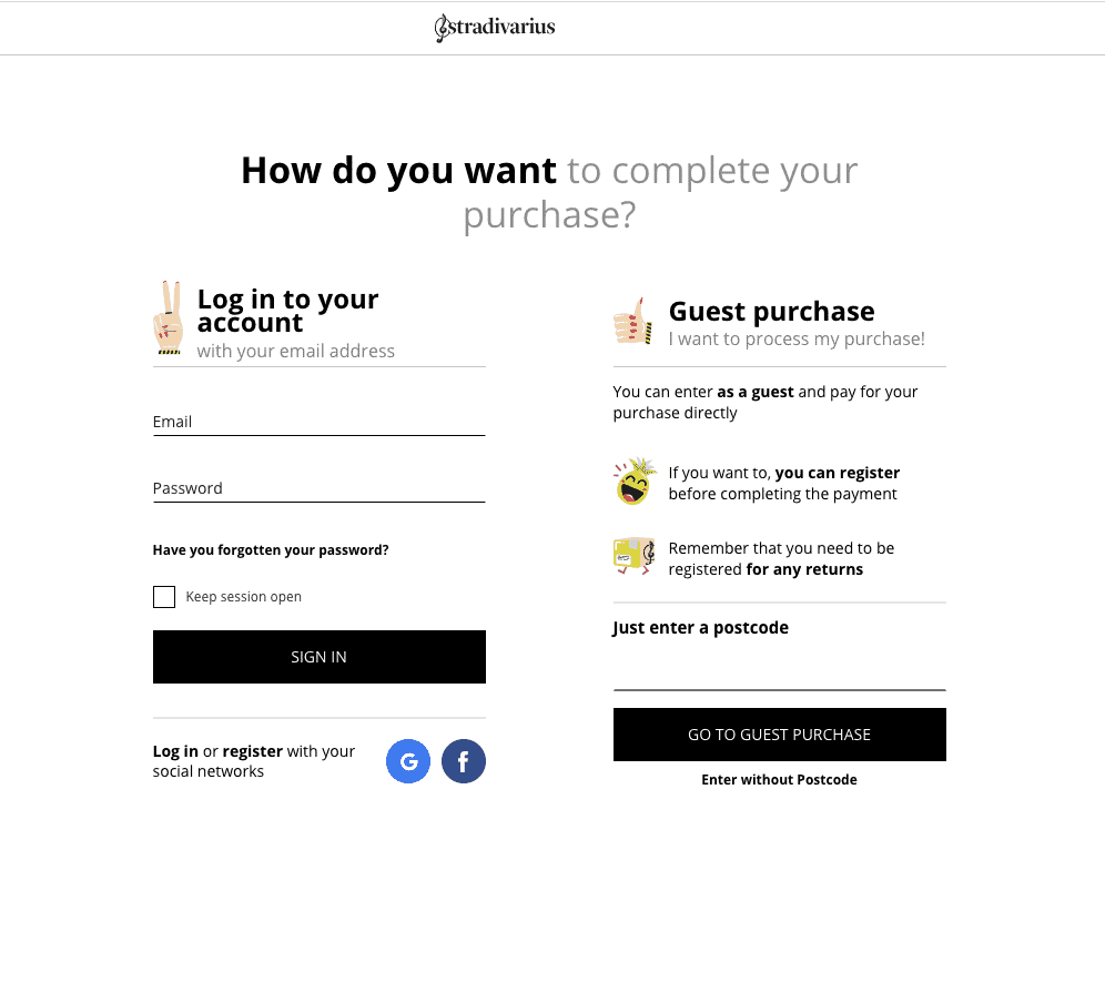
Provide Guest Checkout
Forcing account creation can be a deterrent to completing a purchase. Offering a guest checkout option lets users buy products without the friction of registration, resulting in a smoother transaction process.
-
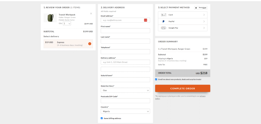
Single Page Checkout
Condensing the checkout process onto a single page reduces the perceived effort and simplifies the journey. Users can view and confirm their order details without the need to navigate between multiple screens.
-
Minimize Distractions
During the checkout process, maintain a clean and focused layout. Minimize extraneous information, promotions, or links that could divert customers’ attention from finalizing their purchases.
-
One-click payment options
For returning customers who have saved their payment details, offering a one-click payment option expedites the checkout process. This convenience can lead to faster conversions and an improved overall experience.
-
Auto-Currency Conversion and Location Detection
In a global marketplace, auto-currency conversion simplifies international transactions. Display prices in the user’s preferred currency and automatically convert the total to reduce confusion and friction.
In addition to currency conversion, the system can detect the customer’s approximate location. This information can be used to offer region-specific deals, shipping options, or localized content.


-
Account Creation after checkout
Instead of making account creation a prerequisite for purchase, offer users the option to create an account after they’ve completed their transaction. This approach strikes a balance between user convenience and data collection.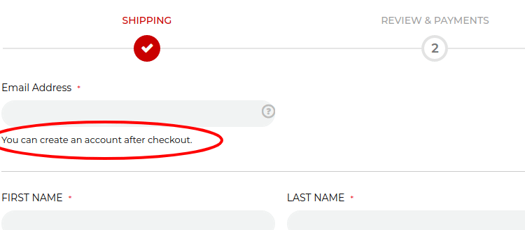
-
Autofill and Suggestions
Leverage autofill and intelligent suggestions to prepopulate fields like shipping and billing addresses. This feature saves time and reduces errors, further enhancing the user experience.
An excellent example of a suggestion is “Ship To My Billing Address.” When customers opt to ship to their billing address, it eliminates the need to enter a separate shipping address.
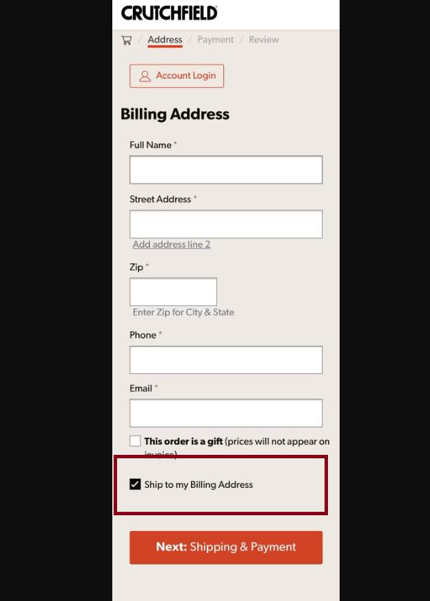
This streamlined process saves time and effort, particularly for customers who prefer receiving their purchases at their billing address.
Benefits of a simplified checkout process
-
Increased conversion rates
A straightforward and uncomplicated checkout process reduces barriers and encourages users to follow through with their purchase intent. The result? Higher conversion rates that translate into tangible revenue growth.
-
Reduced cart abandonment
A convoluted checkout process is a prime contributor to abandoned shopping carts. When you simplify the customer journey, businesses can significantly reduce cart abandonment that occurs out of frustration or confusion.
-
Positive impact on customer satisfaction and experience
A seamless checkout experience leaves a lasting impression on customers. It contributes to overall positive brand perception, fostering a sense of trust and reliability that can lead to repeat business and brand advocacy.
-
Reduced Customer Support Requests
A straightforward and intuitive checkout process minimizes the need for users to seek assistance. Fewer support requests related to the checkout process mean reduced operational costs and increased efficiency.
-
Faster checkout
In the fast-paced digital world, speed matters. Simplified checkout processes expedite transactions, catering to users who seek efficiency and immediacy in their online interactions.
-
Reduced Cognitive Load
A complex checkout process can overwhelm users with unnecessary information and decisions. Simplification reduces cognitive load, allowing users to focus on the essentials and complete their purchases with clarity and ease.
Conclusion
At its core, checkout process simplification embodies the principle of user-centric design. It recognizes that a confusing checkout experience can discourage potential buyers, leading to abandoned carts and missed revenue opportunities.
So, as an ecommerce site owner, remember – a simplified checkout process is a backstage pass to a smoother, smarter online shopping world.

