As marketers, we always try to figure out what our customers want
In the process, we use tools like Google Analytics and Heat maps to help us.
But we overcomplicate things for ourselves the more we use more tools.
In this blog, I want you and I to focus on one thing, one thing only.
Heatmaps.
By this point, we all know what are heatmaps and how to use them.
But what are the different types of heat maps?
In this blog, I want to shine the light on 3 Examples Of Heat Maps.
To discover besides the knows ones, how can different types of heat maps help you.
How can you use them to gain more insights into your users and customers?
So, without further ado, let’s begin.
What are heat maps?
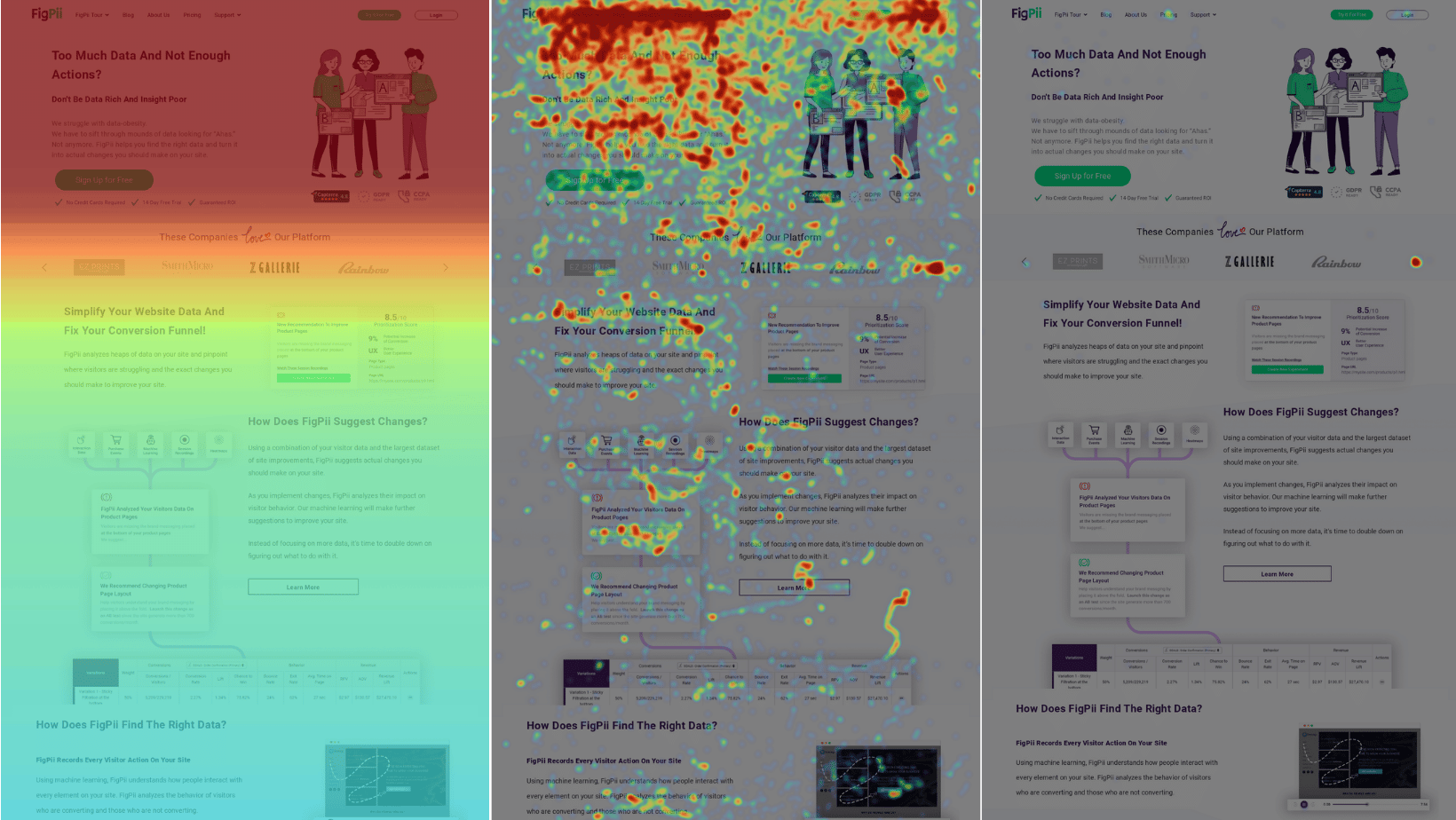
Heat maps are tools designed to give you an insight into where users interact with your website or app.
The most common types of heat maps are mouse tracking, click maps and scroll maps.
Heat maps like mouse tracking and click maps track where your users are clicking on your site.
Mouse tracking heat maps record the movement of the cursor (or clicks) across your screen.
Then it converts that data into a visual format which you can use to discover patterns behind user interactions with your website.
Click maps do exactly like mouse tracking but instead, show conversions or clicks on elements within your site.
For example, if you open an email, the number of times the link was clicked will be shown in click map as red dots.
Heat maps like scroll maps track where users scroll and read on your website.
Scroll maps reveal how far down your users are reading on your site.
Now let’s dive deeper into each type of these heatmaps and see how can you use them.
Scroll Maps

A scroll map is a visualization technique that visualizes the amount of scrolling on a webpage.
A scroll map, in a nutshell, depicts how far down your material users scroll.
The color-coding on scroll heatmaps is reversed from bottom to top: red represents high scrolling, while blue signifies low scrolling.
Scroll maps, as the name implies, illustrate where readers concentrate their attention when reading online material or obtaining information from blog posts by displaying scroll intensity on each pixel of a scroll map.
A scroll heatmap allows you to see what your readers appreciate and dislike about your material, which subjects are popular among them, and where additional information should be placed in future posts for enhanced conversion rates.
A scroll map is similar to a digital marketing report. It shows us how users use our website or blog article so that we may make appropriate adjustments.
What is a click map?

A click map is a heatmap of clicks on an element of the page.
It shows where users are clicking most frequently, providing insight into how your visitors are interacting with your page.
You can use it to learn more about user behavior and discover UI issues that might not be otherwise obvious.
A click map is great for analyzing your app’s user interface, but it can also show you where users are seeing issues with your page.
For example, if you notice a spot where users aren’t clicking on your menu, it’s a good indication that there might be a problem with the way menu items are being displayed.
How is this different from an analytics tool?
Most analytics tools tell you what happened on a page or site after the fact — they’ll show you aggregate information on popular pages, the number of visits, time spent on site, etc.
But don’t let you watch real people interact with your site as they do it.
A click map lets you see exactly what users are doing as they interact with your page.
You can watch them make mistakes or struggle with some part of your design, giving you an opportunity for easy usability wins.
What is a mouse move map?

A mouse move map is a data-gathering tool that creates a visual representation of the physical movements that have been performed by a user on their computer.
Mouse move maps are often used as part of usability studies to gain feedback from participants on how easy a website is to navigate and/or use.
They can also be used in marketing research to understand which areas of a web page or app were visited most frequently, for what duration, and by whom.
Mouse move maps track all movements made by the participant’s cursor solely.
In other words, if you clicked on an element during your visit but didn’t scroll down after it, it wouldn’t show up in the heatmap.
With a mouse move map, you’ll see this and every other movement the cursor made during the session.
When you should use a heatmap?
Heatmaps are useful during the initial definition of hypotheses and can help you to understand what your users do (or don’t) do on your site.
For example, it is possible to identify if a percentage of visitors typically drop off from or abandon a specific page.
You can also track if most people click on certain elements such as links or buttons, allowing you to easily validate calls-to-action and their placements and sizes (and even colors).
Although heatmaps help answer questions like: “Where should we place our call-to-action?”, they cannot tell you why.
That’s where user testing comes in.
Heatmaps give you an idea of how users interact with your design but do not provide reasons for this behavior and why this occurs.
Further, heatmaps can give actionable insights when you have a ‘problem’ area on your site and need to know why users are not performing an action or if their attention is being drawn in the wrong area.
This gives you a way to validate design decisions and see if proposed UX changes actually do produce positive results for both users and your business goals.
You can then monitor these areas further with A/B testing to help quantify any impact that the changes have made.
Getting started with heat maps
1. Log in to FigPii.
2. The FigPii code will appear at the bottom section of the dashboard3. Click on “copy code”4. Paste the FigPii Tracking Code into the <head> section of your website.
3. Click on “copy code”
4. Paste the FigPii Tracking Code into the <head> section of your website.
FigPii integrates with major CMS and e-commerce websites, check our full list of integrations right here.
5. Check your FigPii dashboard to verify the installation. When the tracking code is installed on your site, the tracking indicator will show you that the code is active.
Once you have added the FigPii Tracking Code to your site, you will need to wait for about an hour to check if it is installed correctly. This usually happens the moment your site is loaded with the FigPii tracking code installed in. But there can be a delay for up to an hour before it shows as “Active”.
6. log in to FIgPii’s dashboard, and go over the heatmap section from the side menu.
7. Press on create a heat map
8. Name your heat map
9. Choose the number of recordings that you want
10. Choose which platform you would like to record, you can choose mobile or desktop.
You’re also able to track new visitors or returning users.
11. Choose which page or pages you would like to track with your heatmap.
12. Configure your map with advanced options that help you create more accurate data
You’re done! Now you’ll be able to track your users like you never could before!
How do multi-page heat maps work?
All you have to do when creating your heat map is to add all of the pages that you need to track in step 4 when creating the heat map.
A multi-page heat map captures the data from multiple pages on your site and displays it over a single page representing all of these pages.
Let’s say that you run an e-commerce website and want to see how users interact with the different product pages.
Unfortunately, you do not have enough users coming to the different product pages, so it would be great to create a heat map that shows how users interact with ALL of your product pages.
That is what a multi-page heat map does. It combines the visit clicks from all the product pages and displays it as a single page.
Since the data is from all the product pages, which page will the data be shown?
Different heat map tools handle this situation differently.
In FigPii, we provide two options:
- At first, FigPii shows the heat map data on the first page a user comes to from the group of pages. So, if you create a heat map for 1,000 product pages, we will show the data on the first product page that a user landed on after you created the heat map.
- FigPii allows you to change the page on which the data is displayed. If for some reason, you do not like the page on which the data is displayed on, then you have the option to select a different page.


