A heat map can tell you how people use your site and what pages they spend their time on.
You’ll see that some parts of the page get clicked much more often than others while other areas don’t get any clicks at all–and this tells you what needs improvement!
You might think that most visitors would go for the menu bar or search box because those are necessary features for navigating around a website–but if these sections aren’t getting many clicks.
- What do heat maps show?
- What information can a website heat map provide?
- What do web designers use a heat map for?
- How can heat maps be valuable to web designers?
- What do developers use a heat map for?
- What do marketers use a heat map for?
- What do visitors look at when they come to a website?
- What does a website’s heatmap tell you about their site visitors’ experience?
What do heat maps show?

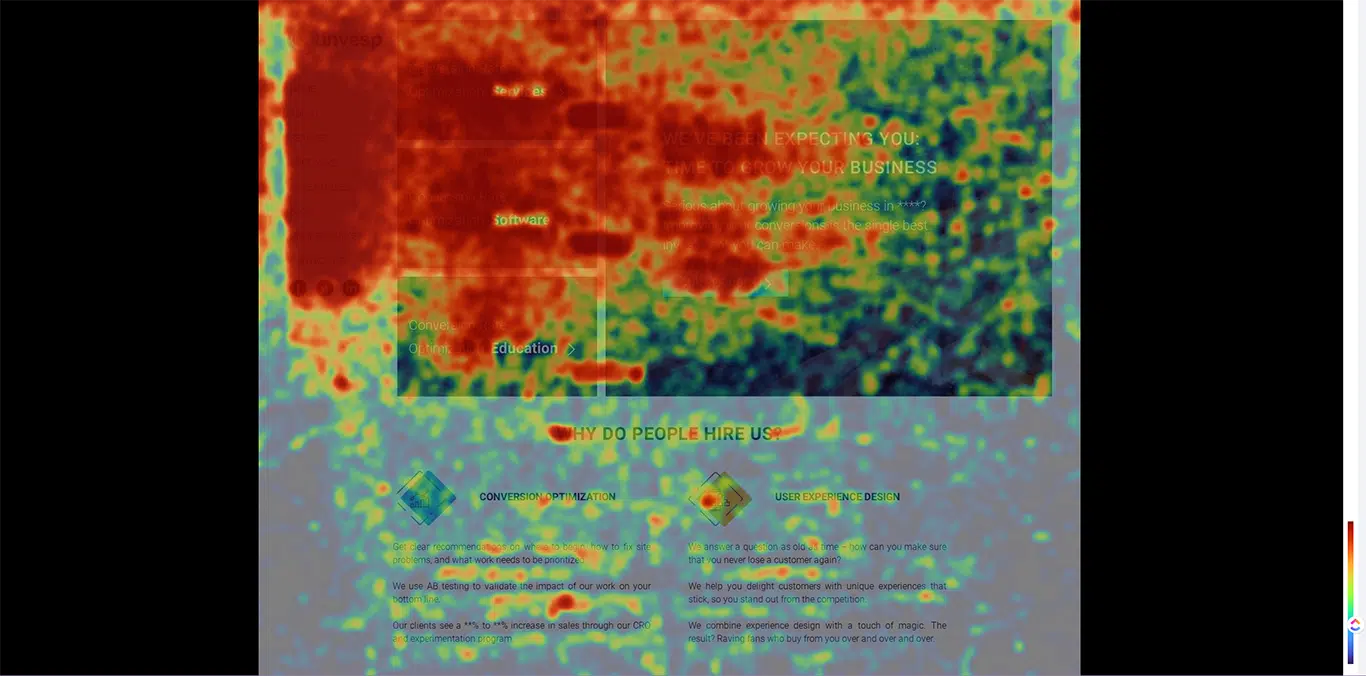
Heat maps are interactive, colored graphs that display what areas of the page users are clicking on.
This is useful to web designers and marketers because it can show what pages visitors spend their time on and what they don’t click on at all.
Using this information, website owners can determine what content needs improvement or what features should be added.
A heat map will tell you what pages need more attention by showing where people click the most (or least)–giving insight to what visitors want or what distracts them.
For example, if your site’s menu bar isn’t getting many clicks even though it’s necessary for navigating around the website, you might want to make it bigger or change its color to stand out more.
Here is what a heat map looks like to the website visitor, with the colors being determined by what percentage of people are clicking on that section.
This particular one shows what areas people are clicking on the least:
A heat map can tell you what pages your visitors spend their time on and what they don’t click at all, which can help you make better decisions about content, layout, design, and features.
Colorful graphs will show what visitors are clicking on–or not!
It’s best to use these interactive tools alongside other data analytics because they only provide half of the information necessary for making good decisions. Heat maps should be used in addition to information from Google Analytics or surveys that ask users what they think of your website.
By looking at what people are doing on your site and what they want, you can determine what needs improvement and what should stay the same.
You might want to change what visitors are clicking on the least by making those areas bigger or changing their color so it stands out more.
A heat map is a useful tool for website owners because it can tell what pages need improvement and what content needs to be altered.
Heat maps give web designers and marketers insight into what they should do differently or what to keep the same on a website based on what visitors click on.
These colorful graphs show what people are clicking on–and what they’re not!
To summarize, a heat map is an interactive graph that shows how users interact with different parts of your site. It’s used primarily by web designers and online marketers in order to improve user experience and increase conversion rates through targeted content, layout, design, and features.
By using what heat maps show in combination with other types of data analytics, you’ll be able to improve your website much more easily!
What information can a website heat map provide?

Heat maps provide crucial data that helps you know how people think about your website!
What page categories are people clicking on the most?
It can tell what pages need improvement and what content needs to be altered based on what visitors click on.
Where are people clicking the least?
It shows what people aren’t interacting with at all, giving insight into what should be added or changed to improve the user experience.
Just like any other data analytics tool, it’s best used in combination with other information!
Heat maps only provide half of the necessary information for making good decisions–you’ll want to look at Google Analytics data or survey results that ask users what they think of your website too.
Heat maps show what visitors are doing–but surveys show what they’re thinking!
These colorful graphs give you insight into what people are thinking and what you can do to improve your website as a result.
By using what heat maps show in combination with what visitors are saying, you’ll have all the information necessary to make good decisions about what should stay the same and what needs improvement on your website.
What do web designers use a heat map for?

Heat maps are used to get an idea of what is the most popular, or what is least popular on your website. They track what pages people visit and how they interact with them.
The popularity ranking might end up showing you what parts of your site visitors like or dislike, which can help you adjust content or design accordingly.
Heatmaps also give you an idea of what demographic uses your site – does all traffic come from males in the United States?
Information about what pages are not being visited can be helpful when it comes to deducing whether or not a page is providing any value to users.
The absence of information might have meant that there was no interest in viewing it at all!
How can heat maps be valuable to web designers?

Heatmaps can give valuable information that would otherwise be difficult to attain.
By tracking what people do on a page, you can get an idea of what they enjoy or what their interests are.
You may learn what demographic uses your site and what might need to change if the user base is not what you expected!
Without using a heat map you could miss valuable information about what needs improvement in order to provide a better experience for users.
This provides important data for web designers who look forward to improving user experience and increasing conversion rates, which in turn boosts business revenue!
What do developers use a heat map for?
As a developer, what you’re most interested in is what users interact with the least.
That way, time is not wasted optimizing what visitors already find unappealing or dull!
Use what heat maps show to find what users want you to change and what pages they view the most.
This information can help you avoid spending time on potential redesigns or new features that would not actually improve the user’s experience.
What do marketers use a heat map for?

Heat maps show is what people love seeing, hate seeing, and what falls flat with no response at all!
By using what heat maps show in combination with other data analytics tools such as survey results and Google Analytics tracking, marketers can determine how to tailor content and design accordingly.
It’s what heatmaps show that marketers are most interested in since they already know what people think!
They want to focus on what is working and what isn’t, so redesigns or new features aren’t wasted efforts.
Heat maps show is what people love seeing, hate seeing, and what falls flat with no response at all!
By using what heat maps show in combination with other data analytics tools such as survey results and Google Analytics tracking, marketers can determine how to tailor content and design accordingly.
What do visitors look at when they come to a website?
Visitors typically only spend time looking at what they find interesting or appealing.
As you can see, this information is incredibly valuable if it’s used correctly by web designers and marketers to make important decisions about what content should stay the same or change.
Better yet, use what heat maps show in combination with the other data analytics tools out there for better results all around!
What does a website’s heatmap tell you about their site visitors’ experience?
It tells you what content the users find interesting and what they don’t.
This can help web designers improve user experience by making what pages more appealing to them!
Better still, what heat maps show helps marketers learn what demographic is using their site and what they might want to change or add to increase conversion rates.
This data drastically improves business revenue in the long run!
What do a website’s heatmaps tell you about your site visitors’ experience?
A website’s heatmap tells you what content the users find interesting and what they don’t.
This can help web designers improve user experience by making what pages more appealing to them! Better still, what heatmaps show helps marketers learn what demographic is using their site and what they might want to change or add to increase conversion rates.
This data drastically improves business revenue in the long run!
By using what heat maps show you can make important decisions about what content should stay the same or what needs to be changed with the goal of improving user experience, which in turn boosts business revenue.
What changes do developers use a heat map for? What changes do marketers use a heat map for?
Heatmaps are what web designers need to know what’s popular and what isn’t. Web designers also look at what users interact with least, so time isn’t wasted on redesigning pages that may already be unappealing!
Marketers work together with Google Analytics tracking and survey results to determine how to tailor content and design based on what heatmaps show.
Both use what heatmaps show to avoid wasting time, resources, and money on what users don’t want or what doesn’t work.
By doing this more revenue will definitely be generated!
Websites are always looking for ways to understand their visitor’s experience and improve their site accordingly.
One way they can do that is by using a heat map, which tracks the most popular, or least popular pages on a website and provides insight into how people interact with them.
This information is used by web designers and marketers to make informed decisions about content, layout, and design all with the goal of improving user experience and conversion rates!

