According to Google Analytics data, over 50% of global website traffic now originates from mobile devices, yet many businesses experience mobile conversion rates that are almost half those of desktops.
This gap highlights a critical need for specialized strategies tailored to mobile optimization. Mobile A/B testing emerges as an essential tool in this context, allowing developers and marketers to experiment with and refine various elements of their mobile websites and apps.
When businesses, developers, and marketers methodically test different versions of a page or app feature, they can identify what most effectively drives user engagement and increases conversions.
What is Mobile App A/B Testing?
Mobile app A/B testing is a method for comparing different versions of a mobile app or its features to determine which one performs better in achieving specific goals.
You split your audience to expose each group to different variants of your mobile application.
The performance of each variant is then measured and analyzed based on user interactions and outcomes like click rates, conversion rates, and user retention metrics.
By testing these changes and analyzing the results, you can make data-driven decisions that enhance the user experience and increase your app’s effectiveness.
This approach helps optimize the app design and ensures that every change contributes to your app’s overall goals.
How Does Mobile App A/B Testing Work?
Unlike A/B testing on websites, mobile app A/B testing has unique challenges. Updates require app store approvals (unless feature flags are used), users may have different device capabilities, and app interactions are more gesture-based than traditional clicks. Despite these challenges, mobile A/B testing is a game-changer for continuous improvement.
Here’s how the process works, step by step:
-
Step 1: Define a Clear Objective
Every test should have a specific goal. Instead of testing random changes, focus on measurable outcomes. Are you reducing onboarding drop-offs? Testing a new checkout flow? Comparing subscription models? A clear objective ensures the test provides valuable insights. Without a clear objective, you’re making changes without knowing if they improve the user experience.
-
Step 2: Identify the Right Audience for the Test
Not every user should see the test at the same time. Mobile A/B testing tools allow you to segment your audience based on different factors—new vs. returning users, iOS vs. Android users, users in different countries, or even based on previous in-app behavior. For example, if you’re testing a new onboarding flow, running the test only for new users makes sense rather than showing it to those who have already completed onboarding.
-
Step 3: Implement the Variants Using Feature Flags
Unlike websites, where A/B tests can be deployed instantly, mobile apps require app store approvals for updates. This can slow down the testing process—unless you use feature flags.
Feature flags allow developers to enable or disable specific features remotely without pushing a full app update. You can test new UI elements, different pricing plans, or alternative navigation layouts without waiting weeks for app store approval.
Feature flags make mobile A/B testing more agile, allowing businesses to iterate quickly without disrupting the user experience.
-
Step 4: Deploy the Test and Track User Behavior
Once the test goes live, you need to track user interactions to see how each variation performs. Unlike websites, where engagement is often measured in clicks, mobile apps rely on deeper behavioral tracking.
- Instead of just asking, Did users click the button?, mobile A/B testing looks at:
- How far users scroll before they drop off
- Whether they swipe on an interactive element or ignore it
- If they spend more time on a feature in Variant A vs. Variant B
- Whether changing a CTA position increases conversions without affecting retention
It’s not just about what users do—it’s about why they do it. If a test shows that moving the CTA button increases taps but also leads to faster app exits, then it might not be a real improvement. Mobile A/B testing needs to balance short-term gains with long-term user satisfaction.
-
Step 5: Analyze Results and Deploy the Winning Version
A test isn’t complete until you analyze the data and act on it. Once the experiment has run long enough to gather statistically significant results, it’s time to determine whether the new variation actually improves the user experience.
A successful test should answer:
- Did the change improve conversions, engagement, or retention?
- Did it perform consistently across different user segments (iOS vs. Android, new vs. returning users)?
- Were there any unexpected downsides, like slower load times or increased churn?
If the test shows a clear winner, the better-performing version gets rolled out to all users. If the results are inconclusive, you may need to refine the test, tweak the variables, or run additional experiments.
Benefits of Mobile App A/B testing
-
Minimizing the Risk of Poor App Updates
Rolling out a bad update can frustrate users, leading to negative reviews and uninstalls. A/B testing allows you to test changes with a smaller group of users first, helping you identify issues before a full release. This reduces the chances of introducing features or UI changes that users dislike.
-
Finding the Best UI/UX for Mobile Users
What works on a desktop site might not work in a mobile app. A/B testing helps refine mobile-specific elements like navigation menus, button placements, and gestures, ensuring they are intuitive for touchscreen interactions and small screens. This is particularly useful for optimizing one-handed use, mobile load times, and swipe gestures.
-
Optimizing In-App Engagement Strategies
A/B testing empowers you to make informed decisions based on data rather than intuition. This scientific approach eliminates much of the guesswork and bias in app development.
Each change is tested and analyzed for effectiveness, ensuring that every update contributes positively to the app’s performance and user satisfaction.
-
Improving Monetization Without Hurting Retention
Many mobile apps rely on in-app purchases, ads, or subscriptions for revenue. A/B testing allows you to experiment with pricing models, ad placements, or premium features without risking mass user drop-off. For example, you can test whether offering a free trial before a subscription leads to better long-term retention compared to a direct paywall.
What to A/B Test in Mobile Apps
In a mobile-first age, optimizing the user experience for smaller screens is not just an option; it’s a necessity. Users’ interaction with your mobile app can influence their perceptions and actions.
A/B testing serves as a precision tool in this context, allowing you to sculpt and refine every element of your app
-
Navigation
Navigating a mobile app can be challenging, especially on small screens. A/B testing different navigation structures can help identify the most intuitive layout for users.
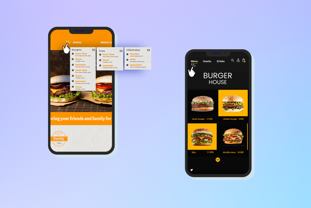
For instance, test a hamburger menu (where navigation is hidden behind an icon) against a visible tab-based menu. Some users prefer minimalism, while others may find an always-visible menu easier to access.
Test Idea:
- Control: A mobile screen with a visible, detailed navigation menu.
- Variant: A mobile screen with a hamburger menu that expands when clicked.
By testing streamlined, minimalistic designs versus more complex ones, you can discover what helps users navigate your app more intuitively, thereby improving user satisfaction and retention rates.
-
Button Size and Placement
The size and placement of buttons are critical on mobile devices. A/B testing helps you find the optimal button design that’s easy to tap—a concept known as thumb-friendly design.
Here’s an example of an original design with standard-sized buttons placed at the top of the screen and a variation with larger buttons placed in the thumb-accessible area at the bottom.
Adjusting the size and position of buttons can increase the likelihood of user actions, leading to higher conversion rates.
-
Checkout Process
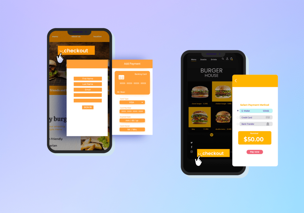
The checkout process in your app can make or break a sale. Testing one-page versus multi-page checkouts, reducing the number of form fields, and incorporating auto-fill technologies can improve customers’ checkout experience.
This simplification helps reduce friction and can significantly increase the likelihood of completing a sale.
-
Use of Accordions for Content Display
For content-heavy mobile pages, using accordions and tabs can help effectively manage information presentation.
A/B testing different content layouts can show you how best to balance detail with user engagement, ensuring users aren’t overwhelmed but still have access to all the information they need.
-
Modal Pop-Ups Versus In-Line Offers
Mobile app optimization requires a delicate balance between capturing user attention and preserving a seamless user experience. Modal pop-ups, while attention-grabbing, can sometimes disrupt user interaction.
A/B testing modal pop-ups against more integrated, in-line offers allows you to analyze their impact on user engagement and conversion rates.
Experimenting with different approaches helps you determine the most effective way to present offers without causing user annoyance or friction.
This strategy aims to optimize user engagement and conversion pathways on mobile screens, ensuring a smoother and more compelling user experience.
-
Interactive Elements
Interactive elements like swipeable galleries or dynamic CTAs can make your app more engaging. A/B testing these features lets you understand how much interactivity enhances the user experience.

This insight can guide you in implementing features that actively engage users and encourage more interactions.
Mistakes To Avoid During Mobile App A/B Testing
-
Overlooking Touch Interactions
Mobile apps rely heavily on touch-based interactions like swipes, taps, and pinches. Neglecting these nuances can frustrate your target audience, leading to a poor user experience and decreased satisfaction.
-
Device Variation Neglect
Mobile devices come in all shapes and sizes, with varying screen resolutions and performance capabilities. Failing to test across a broad spectrum of devices, including less common models, may result in inconsistent user behavior. App developers should prioritize testing on both popular and niche devices to ensure a seamless experience.
-
OS Compatibility Oversights
Operating systems, particularly between iOS and Android apps, handle features differently. Ignoring these differences in your A/B testing strategy can lead to uneven performance and lost opportunities to engage your audience.
-
Ignoring Load Times
Mobile users often rely on mobile data, which can vary in speed and reliability. Introducing features that increase load times can alienate users, especially if they’re accessing your app in areas with slow connectivity. Be sure to test how changes affect load times across different scenarios.
-
Resource-Intensive Features
Features that require significant processing power or memory can slow down or crash an app, especially on older or low-performance devices. App developers must test new features for performance impacts to ensure they’re practical for widespread use.
-
Ignoring Contextual Use
Your target audience likely uses your mobile app in diverse environments—on the go, at home, or during short breaks. Testing under various real-world scenarios ensures your app remains intuitive and reliable in all use cases.
-
Failing to Test Offline Scenarios
Not all mobile apps are designed for constant connectivity, yet many users will access them in low or no-connectivity conditions. A/B testing should include offline scenarios to identify potential functionality gaps and enhance usability.
-
-
Neglecting App Store Compliance
-
App store guidelines for platforms like Google Play and the Apple App Store are stringent. Failing to consider these regulations during A/B testing can delay app updates or lead to rejection. Always verify that your tests align with app store policies while adhering to broader privacy and security standards.
Mobile A/B testing tools
-
Apptimize
Apptimize is designed to help product teams rapidly improve mobile app experiences through A/B testing, feature release management, and analytics. Its features include Advanced A/B testing, instant updates without app store approvals, funnel analysis, and robust segmentation capabilities.
-
Leanplum
Leanplum is a multi-channel engagement platform that allows for mobile campaign management, which includes A/B testing, push notifications, and personalization.
-
Adobe Target
Adobe Target is part of the Adobe Experience Cloud. It provides an intuitive user interface for creating, testing, and deploying personalized digital experiences. With Adobe Target, you can conduct multivariate testing, AI-powered personalization, and audience segmentation. You can also integrate it with Adobe Analytics and Adobe Experience Manager.
-
Firebase A/B Testing
Powered by Google, Firebase A/B Testing is integrated within the broader Firebase suite of mobile development tools. It focuses on improving app quality and retaining users.
-
VWO
VWO (Visual Website Optimizer) is a comprehensive A/B testing and conversion optimization platform that offers tools for visual editing, user feedback, analytics, and more.
-
Optimizely
Optimizely is one of the leading platforms for experimentation and A/B testing across websites, mobile apps, and connected devices. Its features include multivariate testing, feature flagging, personalization, and extensive integration with other tools.
Over To You
There you have it! The power of mobile A/B testing lies in its ability to transform your app development process from guesswork to a strategic, data-driven approach.
Every adjustment helps you refine your app into something users genuinely enjoy. It’s about paying attention to what works, fixing what doesn’t, and improving the overall experience.
When users feel comfortable and engaged with your app, they’re more likely to keep using it, recommend it to others, and spend more time or money on it.
Over time, these efforts can make a real difference, helping your app perform better and attract more users. The key is to stay consistent and keep improving.
Mobile App A/B Testing FAQs
What is A/B Testing in Mobile Apps?
A/B testing in mobile apps is a process of comparing two or more versions of an app feature or design to see which performs better with users. It’s a way to experiment with changes—like button colors, layouts, or onboarding flows—and use data to decide which option improves metrics like engagement, retention, or conversions.
What is A/B Testing for iOS Apps?
A/B testing for iOS apps works similarly to other platforms but involves considerations specific to Apple’s ecosystem. Developers use tools like Xcode or third-party platforms to create test variations and distribute them to user groups. Results help you understand what resonates with your iOS audience, keeping in mind Apple's App Store guidelines and user expectations.
How do you split-test Mobile Apps?
Split-testing mobile apps involves creating two or more variations of a feature or design, assigning them to different user groups, and comparing the results. Start by selecting a clear goal, like increasing sign-ups or improving screen navigation. Use tools like Firebase A/B Testing or Optimizely to manage the experiment and track results. Analyze the data to identify which version performs better, then roll out the winning variation.
What should I test in Mobile Apps?
You can test almost any aspect of a mobile app that affects user experience or performance. This includes app layouts, navigation menus, call-to-action buttons, onboarding processes, and app store listing elements like screenshots and descriptions. Focus on areas where user behavior suggests room for improvement, like drop-off points in the conversion funnel or features with low engagement.

