Let’s say you walk into a big department store, and everything is neatly categorized. There are distinct sections for clothing, electronics, home appliances, and more. Each section has clear signage guiding you to find what you need. Life is good, right?
Just as a well-organized department store makes life good and shopping hassle-free, the carefully designed and structured category pages on an e-commerce website contribute significantly to its success by enhancing user experience and simplifying the product discovery process.
Category pages are “supposed” to be designed to enhance user experience and drive conversions. “Supposed” because you come across some ecommerce category pages, and finding products become ten times harder.
In this article, we dive into different ways through which e-commerce owners can create high-converting category pages.
What Is A Category Page
If you’re here, you most likely know what an ecommerce category page is; however, if you don’t, here goes:
A category page is a specific type of webpage commonly found on websites with organized content, particularly e-commerce platforms.
Its primary purpose is to group related items or content that share a common category, making it easier for users to browse and find specific products or information.
In an e-commerce context, category pages are used to organize products into different groups based on their characteristics, such as type, brand, price range, or any other relevant attribute.
This is an example of a main category page on Amazon, “Computers,” with other subcategories under it.
Why bother with category pages at all?
Category pages are important if you want to avoid situations where customers get to your ecommerce store and they’re like:
If this happens, it’s safe to say you’ll be losing customers, and there will also likely be a hike in your site’s cart abandonment rate.
However, when you invest time and effort in optimizing category pages, you create a user-friendly and appealing online store that improves user experience and enhance customer retention.
Let’s delve into how these category pages contribute to better navigation, enhance the overall user experience, impact SEO, and effectively allow businesses to showcase their featured products and promotions.
-
Organizing Website Content and Improved Navigation
Without well-organized category pages, your website can feel like an overwhelming maze of information, leaving visitors perplexed and likely to bounce away.
High-converting pages act as signposts, making it easy for customers to find what they want.
Whether it’s “Trendy Summer Dresses” or “Latest Tech Gadgets,” these cues guide visitors directly to their desired destination, saving them time and effort.
-
Enhancing the User Experience of the E-commerce Site
A delightful user experience is vital to keeping your customer retention rate soaring high.
Optimized category pages contribute significantly to this experience. These pages’ visually appealing layout, engaging product images, and persuasive descriptions captivate your visitors from the get-go.
You’re simplifying their search by presenting a curated selection of products or content under each category.
-
Impact on SEO through Well-Structured Category Pages
Search engines are like keen detectives constantly scanning for valuable information. They appreciate a well-organized ecommerce store and will also reward you for it.
When your category pages are optimized with relevant keywords, clear titles, and meta tags, search engines can easily decipher the structure of your website.
-
Showcasing Featured Products and Promotions
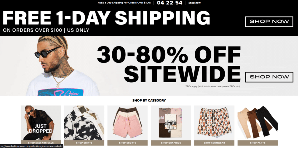
When customers are greeted with eye-catching banners and enticing visuals of your featured products, promotions, or limited-time offers, they can explore more and potentially add these special items to their cart, boosting your sales and maximizing conversions.
Tips to Create High-Converting Category Pages That Sell
If you’re eager to elevate your e-commerce category pages to their fullest potential, prepare to embark on an exciting journey of implementing the following best practices.
By embracing these strategies, you’ll pave the way for category pages that stand out and captivate your customers like never before.
-
Hierarchy
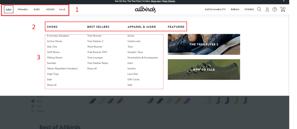
When it comes to category pages – a clear hierarchy is the key to an appealing and logical arrangement.
At the core of a high-converting category page lies a well-defined hierarchy. Organizing your products or content in a structured manner creates a sense of order that resonates with your visitors.
Start by placing the broader categories at the top, representing the main sections of your website. As users delve deeper, they encounter subcategories, refining their search further.
This cascading effect ensures visitors can effortlessly navigate through the virtual aisles, finding precisely what they seek at each level.
A logical hierarchy appeals to the visual senses and reflects customers’ thinking. When your category page arrangement mirrors their thought process, it’s like you’re reading their minds and guiding them to the products they need.
-
Category Information Positioning
How you present the information on your category pages can significantly impact customers’ buying journey.
First and foremost, ensure that the essential category details are prominently displayed. Customers want to know the crucial information at a glance.
Positioning these key elements above the fold, where they’re visible without scrolling, grabs immediate attention and piques curiosity. That’s why it’s also important not to overwhelm them with too many words.
Think of it as the equivalent of a striking window display that entices passersby to step into your store.
-
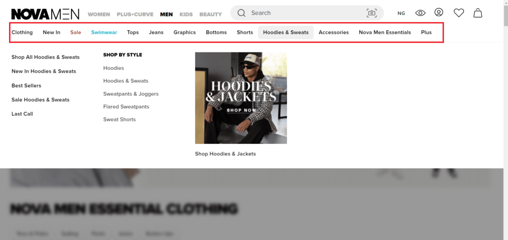
Product Category Names
In e-commerce, product category names play a pivotal role as navigational aids for shoppers, directing them to relevant sections of your online store.
The importance of these names lies in their ability to provide a clear and precise representation of the content within each category.
Avoiding ambiguity is crucial. Opt for straightforward and descriptive category names that leave no room for confusion.
For example, “Women’s Footwear” clearly indicates what customers can expect within that category.
Descriptive category names not only enhance user experience but also serve SEO purposes. They align with user intent, making it easier for search engines to understand the content and context of your website.
-
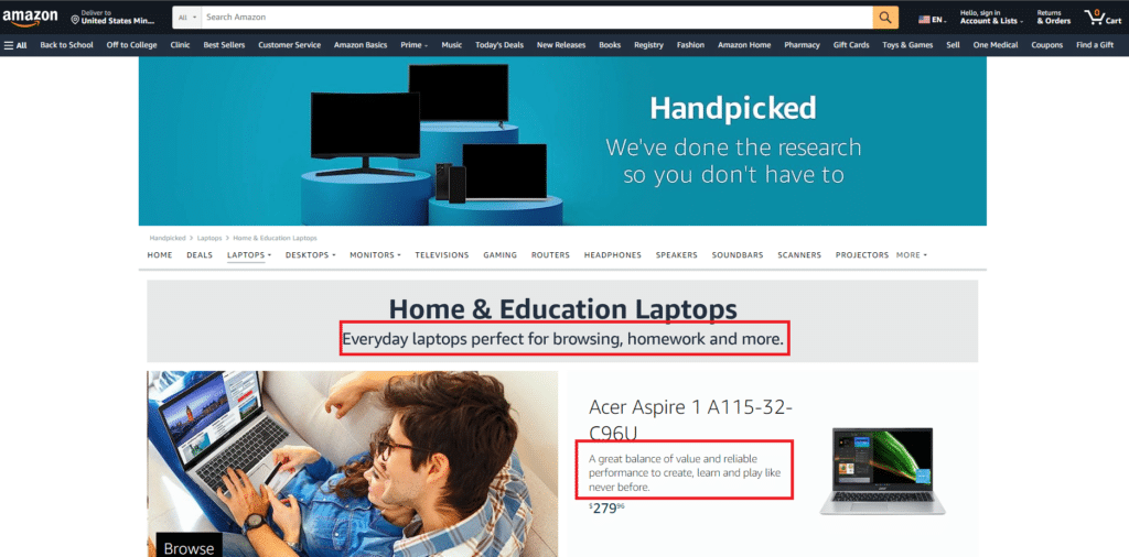
Don’t Forget SEO-optimized Content
Optimizing your category pages with SEO-optimized content is an absolute must for ecommerce store owners.
Doing so can enhance visibility in search results, targeting customer intent with strategic keywords and phrases.
This alignment improves the user experience and facilitates effective internal linking throughout your website, making it easier for users to explore related products or content.
SEO optimization lets you capture long-tail keywords, attracting highly interested and motivated customers while driving qualified traffic to your store.
-
Internal Linking of Similar Categories
When optimizing your online store for higher conversions, internal linking of similar category pages is vital in enhancing the overall shopping experience.
Strategically linking related categories and similar pages creates a seamless and intuitive journey for your customers, increasing their chances of converting.
When visitors explore a particular category, providing relevant internal links to similar or complementary categories entices them to discover more products that align with their interests.
For example, if a customer is browsing “Women’s Dresses,” linking to “Women’s Accessories” or “Women’s Shoes” invites them to explore additional items that complement their chosen category.
This cross-category exposure can lead to additional purchases, boosting the average order value and overall sales. Moreover, internal linking helps users easily navigate your online store, reducing the risk of feeling lost or overwhelmed.
When you guide them from one category to another, you keep their attention focused on exploring related products, making their shopping experience more engaging and enjoyable.
-
Add Additional Information that will be useful to customers.
To create high-converting category pages, don’t overlook the value of providing additional information that caters to your customers’ needs.
Going beyond the basic product listings, you can transform your category pages into valuable resources that enhance the overall user experience.
First, consider including detailed product descriptions that go beyond the basics. Offer insights into the products’ features, benefits, and potential uses.
-
Optimize Filters
Optimizing filters is a game-changer for enhancing navigation and providing a seamless shopping experience.
These basic features act as trusty guides, allowing users to find what they want with minimal effort and time.
When you incorporate well-designed filters, you empower your customers to refine their search results according to their preferences.
For instance, in the “Electronics” category, filters for brand, price range, and customer ratings enable users to narrow down their options swiftly.
Optimized filters eliminate the need for customers to scroll endlessly through a sea of products, reducing the likelihood of them getting overwhelmed or leaving your site in frustration.
-
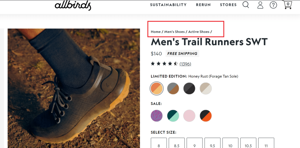
Use Visible Breadcrumb Navigation
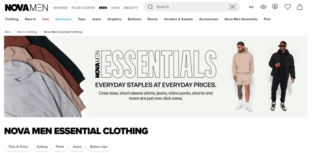
Using visible breadcrumb navigation is a strategic move that aids site navigation and enhances user experience.
The primary purpose of visible breadcrumbs is to enhance the user experience by providing clarity and context. When users land on a specific category page, they may not be aware of the broader website structure.
Breadcrumbs fill this gap by showing the path they took to reach the current page, offering a reassuring sense of orientation.
Imagine a customer exploring your “Home & Decor” category, stumbling upon a fascinating collection of wall art. With visible breadcrumbs, they can instantly see they are within the “Wall Art” subcategory, which is one click away from the main “Home & Decor” category.
With just a glance, they know precisely where they are in the broader hierarchy of your website.
-
Optimize Page Speed
Optimizing your overall site speed can be a game-changer, significantly impacting the performance of your category pages.
A speedy website improves the loading time of your category pages and plays a crucial role in reducing bounce rates and cart abandonment.
When your site loads quickly, customers can swiftly access their desired category pages without the frustration of waiting.
Studies show that a one-second delay in page load time can result in a 7% reduction in conversions. As the seconds tick by, the bounce rate also increases, and potential customers might abandon your site in favor of a faster competitor.
-
Optimize Your Site’s MetaData
When you optimize your site’s metadata, particularly the meta descriptions for your category pages can be a game-changer, driving valuable traffic and boosting conversions.
These concise snippets of information play a significant role in enticing potential customers and encouraging them to explore what your category pages have to offer.
Meta descriptions are virtual previews for your category pages in search engine results. When users search for relevant products, a well-crafted meta description can be the deciding factor in whether they click on your page or a competitor’s.
A carefully optimized meta description provides a clear and concise summary of what users can expect within the category page.
-
UI and UX are both important.
The union of user interface (UI) and user experience (UX) takes center stage in creating a high-converting category page.
UI, the visual aspect of design, focuses on crafting a visually engaging interface that entices users to explore further. UX involves understanding users’ needs, behaviors, and motivations to design an intuitive and efficient browsing experience.
When UI and UX work together seamlessly, the category page becomes a combination of design and functionality.
The visually appealing UI entices users to explore the products, while the user-centric UX ensures they can navigate effortlessly and find what they seek.
-
Incorporate Customer Reviews and Social Proof
When maximizing the impact of your category pages, using customer reviews and social proof proves to be a winning strategy.
These authentic testimonials and social signals act as powerful influencers, encouraging other customers to follow suit and make confident purchase decisions.
Authentic feedback from real users adds credibility and trustworthiness to your products.
When potential customers read positive reviews from satisfied buyers, they feel more assured about the quality and performance of the items within that category.
To maximize the impact of customer reviews, showcase a diverse range of opinions and experiences.
-
Continuously A/B Test
A/B testing is a powerful tool that can unveil the best ways to organize and structure your category pages.
A/B testing your category pages allows you to experiment with different layouts, designs, and content arrangements, enabling data-driven decisions that lead to optimal user experiences and higher conversion rates.
Start by testing small and focused changes, such as the placement of a call-to-action button, the size of product images, or the wording of product descriptions.
Analyze the A/B Test results to understand which variation performs better, guiding you toward the most effective design elements.
Explore different page layouts, navigation options, and filtering systems to discover which combination resonates best with your audience.
Perhaps users prefer a grid view over a list view or favor a sidebar for filtering options. A/B testing helps you identify the most intuitive and user-friendly arrangement.
A/B testing is an iterative process, and as you gather insights from one test, you can apply those learnings to new experiments, continually refining your category page designs.
Final Thoughts
In conclusion, optimizing category pages is the key to unlocking e-commerce success. We’ve explored the significance of organized content, visually appealing UI and UX, optimized filters, customer reviews, and visible breadcrumbs.
From SEO-optimized content to A/B testing, every step plays a vital role in driving conversions.
By implementing these practices, you’ll not only captivate customers but also turn leads into paying customers.

