Have you ever browsed an online store, added items to your cart, and then left without completing the purchase?
If so, you’re not alone.
Shopping cart abandonment is a major problem for ecommerce businesses, with research showing that nearly 70% of all online shopping carts get abandoned before the completion of the checkout process.
For Shopify websites, this can be particularly damaging, as Shopify cart abandonment can lead to lost sales, reduced revenue, and lower customer satisfaction.
But fear not; there are proven strategies you can implement to reduce shopping cart abandonment rates and increase conversions.
In this article, we’ll explore effective tactics to optimize your Shopify ecommerce store and keep online shoppers engaged throughout the entire checkout process.
1. Simplify the checkout process
One of the most important things you can do to reduce Shopify cart abandonment rate is to simplify your checkout process.
If it’s too long or complicated, customers will lose interest and abandon their carts before completing their purchase.
The goal of any good ecommerce site is to make the customer happy and get them through the checkout process as quickly as possible.
The best way to do this is by using one-click checkout.
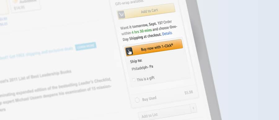
This means that when a customer adds an item to their cart from your store, they can easily check out by clicking on a single button that says “Checkout” or “Purchase” instead of having to enter all of their information each time they want to make a purchase.
A good example of this is Amazon’s one-click checkout process, where customers can add items to their cart and check out with just one click!
(Source)
Here are some more tips to help you simplify your checkout process:
- Use one page for all of your fields: If your store has a lot of fields in its checkout process, consider consolidating these into one page.
- The payment information should be easy to find: If there are multiple ways for customers to pay (credit card, PayPal, or another third-party service), make sure they’re easy to access during checkout, so they don’t have to hunt around for this information.
- Allow paying with Apple Pay or Google Pay: This allows them to pay without whipping out their credit cards or other personal information stored on their phones.
- Show shipping options at checkout: The more information you offer, the easier it is for customers to make a decision.
- Reduce the steps required to complete the purchase: Remove any unnecessary steps from your checkout process. Make sure that each page only contains one action (such as clicking a button or entering their address). This will keep users focused on what they need to do next.
- Use auto-fill fields: Use auto-fill fields for common information, such as name, address, and phone number. This saves customers time and makes the process more efficient.
And most importantly, don’t make customers add unnecessary information during checkout. If they don’t need to enter their phone number or email address, don’t ask them for it!
Pro Tip: If you want to collect additional information from customers later on, offer them an email newsletter opt-in box instead of asking for it during checkout.
2. Provide a guest checkout option
Guest checkout eliminates the need for customers to create an account before they buy. This is particularly useful when you’re selling products that are inexpensive and don’t require much customization, such as clothing or accessories.
If you’re selling high-priced items that require customization, consider offering both options at checkout – a guest checkout and an account creation option.
Here are a few ways you implement guest checkout on your Shopify ecommerce stores:
- Enable the “Enable customer accounts” option in the Checkout settings of your Shopify admin panel.
- Add a “Checkout as Guest” button on your cart page or checkout page.
- Allow customers to create an account after their purchase is complete. You can include an option to create an account on the order confirmation page or in the order confirmation email.
- Make sure to clearly communicate the benefits of creating an account, such as access to order history, tracking information, and faster checkout for future purchases. This can encourage customers to create an account even if they initially checked out as a guest.
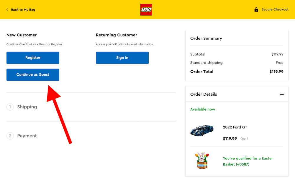
LEGO’s checkout page is an excellent example:
LEGO’s checkout page is effective because it offers guest checkout, reducing barriers to entry and increasing conversions while also providing the option to register or sign in for returning customers, facilitating repeat purchases and building customer loyalty.
Guest Checkout vs. Logged-In Checkout
Unlike logged-in checkouts, guest checkouts are not connected to any account. When users opt for the guest checkout option, they don’t have access to any of their order history or other information related to their accounts. They also don’t get access to support from your company if something goes wrong with their purchase.
3. Reduce distractions
The last thing you want is for your customers to get distracted during checkout.
The fewer distractions that stand between a customer and their order, the better.
Ensure you have only the necessary information on this page, including shipping details, billing info, and your return policy.
It’s equally important to remove unnecessary links from the cart page. If there’s something else you want people to do after they’ve added an item to their cart, include it on the product page or another relevant page. If not, don’t include it at all!
However, how will you know what elements or parts on your checkout page are distracting the shoppers?
That’s where conversion optimization tools like FigPii come into the picture.
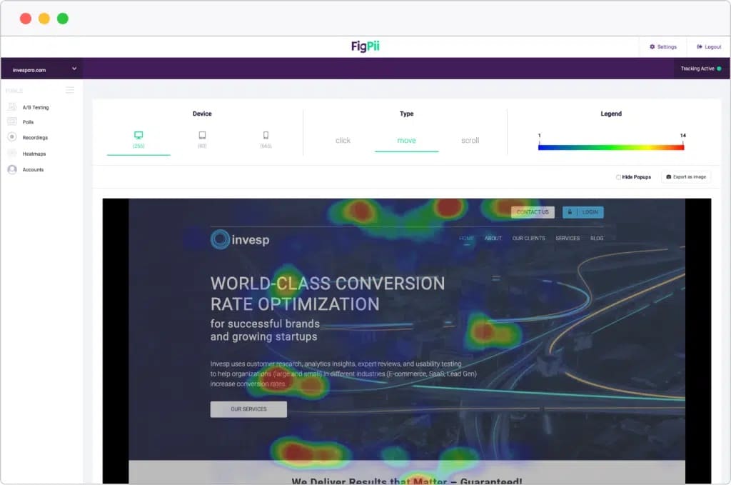
FigPii has features like scroll maps, click maps, and session recordings to help identify areas of the checkout page that may be distracting or confusing for users.
This is a heat map for a homepage. You can see the most clicked elements in red. These are the elements that are relevant to the user’s goal and should be prominent on your page.
Once you know the precise point of distraction, you’ll be able to decide which elements to remove or modify.
For instance, FigPii can help you detect if some visitors are clicking on a banner or a link that takes them away from your main goal. You can remove or modify this distraction to keep them focused on your offer.
4. Use a progress bar to indicate the checkout process
A progress bar is an excellent way to indicate how much longer a customer has left in the checkout process, which can help them feel confident about completing their purchase.
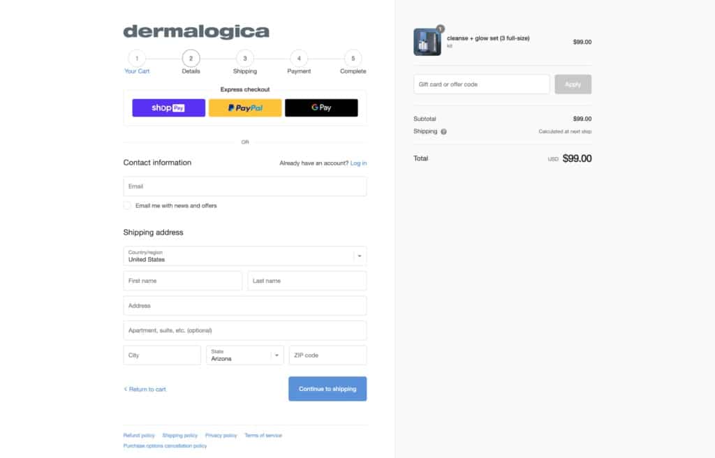
Dermalogica’s use of a progress bar during checkout is a smart move. By visually representing the checkout process, customers can see exactly how much progress they’ve made and how much further they have to go.
(Source)
This makes the process feel more manageable, reduces frustration, and ultimately leads to more completed purchases and happier customers.
Aside from the checkout process, you can use a progress bar at any point during a customer’s journey through your site. You could use it when they first land on your homepage or on category pages. It can also be used on product pages and cart pages, especially if you have multiple products in each listing.
5. Offer free shipping
Free shipping is a powerful tool for increasing sales. In fact, it’s one of the most effective ways to reduce cart abandonment rates.
According to a study, 49% of people abandon their shopping carts because extra costs – including shipping costs and taxes – at checkout were too high.
We’ve all done that ourselves.
Free shipping is effective because it allows customers to shop without worrying about the mounting shipping costs.
Offering free shipping can also help you build customer loyalty and encourage repeat purchases. Customers who are happy with their shopping experience are more likely to return to your store and make future purchases, helping you save on marketing costs to acquire new customers.
If possible, consider offering expedited shipping options (for example, two-day or next-day delivery). This will help convince customers who want their purchases quickly while also reducing their chances of abandoning their carts because they have to wait too long for delivery.
But offering free shipping can be expensive. So how do you offer free shipping without breaking the bank?
Here’s how:
Minimum order value for free shipping
To keep up with the shipping costs, you can introduce a minimum order value for free shipping.
By offering free shipping for orders that meet a certain minimum value, you’re encouraging customers to spend more to take advantage of the offer. This can help you offset the cost of shipping by increasing the average order value.
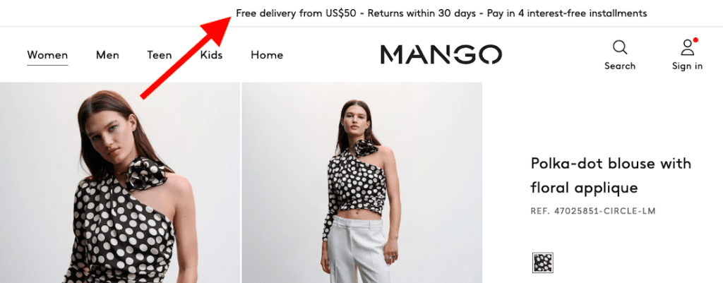
For example, Mango – a famous clothing brand – offers free shipping for orders of $50 or more to reduce cart abandonment and increase customer satisfaction.
By setting a minimum order value, they encourage customers to add more items to their cart to take advantage of the offer, which can increase their average order value and, ultimately, their revenue.
Offering free returns also helps alleviate customer concerns about buying items online and can help build trust and loyalty with the brand.
Other conditional shipping options
What if you want to go beyond the “minimum order value” option?
In that case, you can set up conditional shipping options in Shopify, where you can offer free shipping if the order meets certain conditions.
Here are a few other conditional shipping options you can consider for your Shopify website:
- Free Shipping for Specific Products: You can offer free shipping for specific products that you want to promote or clear out of your inventory. This can help you increase sales for those products and reduce your inventory holding costs.
- Free Shipping for Repeat Customers: You can offer free shipping to customers who have made multiple purchases on your website. This can help you build customer loyalty and encourage repeat purchases.
- Free Shipping for Members: If you have a membership program on your website, you can offer free shipping as a benefit of membership. This can encourage customers to sign up for your program and increase their overall spending.
- Free Shipping for Local Customers: If you have a physical store or warehouse, you can offer free shipping for customers who live within a certain distance of your location. This can help you attract local customers and reduce shipping costs.
- Tiered Shipping Rates: You can offer tiered shipping rates based on order value or weight. For example, you can offer free shipping for orders over a certain value, a flat rate for orders between a certain range of values, and a higher rate for orders below the minimum value.
6. Display trust badges and security seals
Trust badges are visual cues that demonstrate to visitors that a third party has vetted you.
They also provide information about your business in an easily digestible format. Security seals show users that your site is secure and private, which can help them trust you more.
Using a variety of badges can help build trust with customers by showcasing your website’s security and reliability. To diversify your trust badges, consider using badges for SSL encryption, payment security, customer reviews, and certifications from reputable organizations.
Here are some of the prominent trust badges and security seals that you can use on your Shopify website:
- McAfee Secure Site Seal
- Verisign Secured Seal
- Norton Secured Seal
- TRUSTe Privacy Certified Seal
- Google Trusted Store Seal
- PayPal Privacy Policy Link
You have to place them in prominent positions, such as the header, footer, and checkout page, to reassure customers at key moments.
Here are some more tips to help you make the most out of your trust badges:
- Choose High-Quality Badges: Use high-quality badges that are easy to read and recognizable to customers. Poor quality or unfamiliar badges can create confusion or even distrust.
- Avoid Clutter: Too many badges can create clutter and confusion, leading customers to question their authenticity. Choose badges that are relevant to your business and remove any that are not necessary.
- Highlight Unique Selling Propositions (USPs): Use badges to highlight your USPs, such as fast delivery or eco-friendly products. This can differentiate your business from competitors and encourage customers to make a purchase.
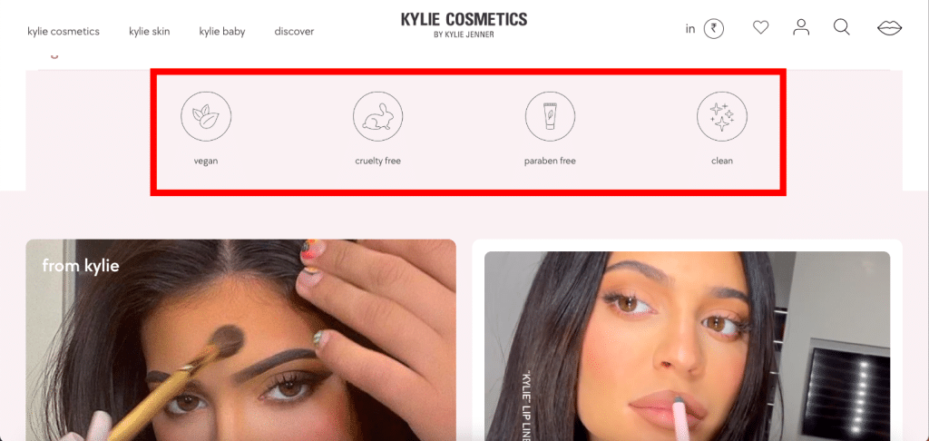
For instance, Kylie Cosmetics’ website displays trust badges such as Cruelty-Free, Vegan-Friendly, and Paraben-Free. These badges show that the website offers products that are ethical, natural, and safe for customers.
7. Use retargeting techniques
Retargeting is a form of online advertising where you follow people around the web after they visit your site without making a purchase — usually by showing them an ad on another website that reminds them about the goods they were looking at before.
It’s part of what makes ecommerce so effective: You don’t have to spend money right away; you just need to get people in the door.
And if you’re not convinced, here are some retargeting statistics:
- Retargeting can reduce cart abandonment by 6.5%, and increase online sales by almost 20%.
- As many as three out of four shoppers notice retargeted ads.
- Of those three out of four consumers, over 26% will click on the retargeted ad and return to your site.
You can start by placing dynamic retargeting ads to remind customers of the items they left behind.
Dynamic retargeting ads show users the exact products they abandoned in their cart, making it easier for them to complete the purchase. These ads use data from your Shopify store to automatically create ads featuring the products left in the cart.
For example, if a user adds a pair of shoes to their cart but abandons the cart, dynamic retargeting ads will show them an ad featuring the same pair of shoes.
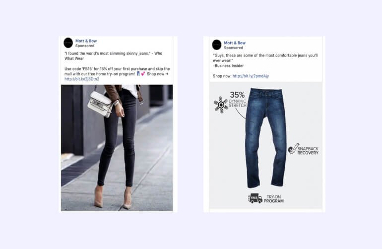
Here’s an example from Mott & Bow, a famous denim brand. They use dynamic retargeting ads to show customers the products they viewed or added to their cart on their website.
(Source)
To entice potential customers, their ads also include social proof and a free home try-on offer to overcome customers’ hesitation.
Aside from that, don’t just rely on one platform. Instead, retarget users across multiple channels to increase the effectiveness of your campaigns. For example, you could place retargeting ads via social media platforms, abandoned cart email campaigns, and websites to reach users on different platforms and increase the likelihood of them completing their purchase.
You can also offer a discount code or a free shipping coupon code to revive abandoned shopping carts.
Here are some more tips to help you retarget your customers effectively:
- Use retargeting to offer support: Sometimes, users abandon their cart because they have questions or concerns about the products. Using retargeting ads to offer support can help address these concerns and encourage them to complete their purchase. For example, you could offer a live chat support option in your retargeting ads or include a phone number for users to call if they have questions.
- Use retargeting to upsell or cross-sell: You can also use retargeting to upsell or cross-sell to users who have already made a purchase. For example, if a user has purchased a camera on your Shopify website, you could use retargeting ads to show them ads for camera lenses or other camera accessories.
- Retarget users with personalized messages: Personalized messages can encourage users to return to their cart and complete the purchase. For example, you could use retargeting ads to remind users of the items in their cart and offer a discount or free shipping to incentivize them to complete the purchase.
8. Provide clear and detailed product information
Another reason for cart abandonment on Shopify websites is the lack of product information.
Providing clear and detailed product information can help customers make informed purchase decisions and reduce the likelihood of them abandoning their cart due to uncertainty.
For example, your product pages should include high-quality photos from multiple angles, detailed descriptions of features and benefits, and customer reviews to help customers make informed decisions.
Boost Your Shopify Sales with These Cart Abandonment Tips!
In conclusion, reducing the average cart abandonment rate is essential for the success of any Shopify website.
By implementing a streamlined checkout process, offering multiple payment options, and providing exceptional customer service, you can create a more positive shopping experience for your customers and increase the likelihood of completed purchases.
Remember, every lost sale due to abandoned carts represents a missed opportunity for your online business.

