If you are into sports, you must have seen something similar to the image below.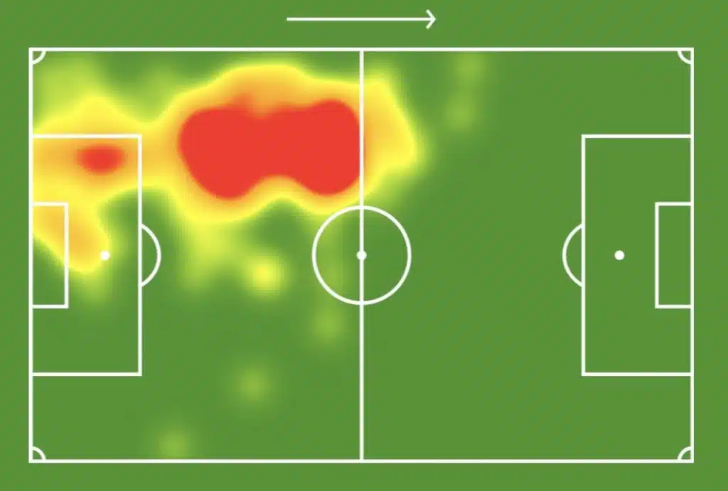
They are called heatmaps, analytical tools that show the activities of individual players during the game.
With heatmaps, coaches, fans, and players can easily see the parts of the field where they spent the most or least time playing. Sports analysts also use heatmaps to gauge players’ performances.
Heatmaps use a color scale (blue to red) to depict intense activity or inactivity in selected areas. The image above is the heatmap of a player; the section colored red shows that the player was mainly active during the game. The section that is colored yellow indicates activity but not as much as the red-colored section.
In marketing, the same analogy applies when using heatmaps as an analytical tool on websites. Heat maps help marketers, designers, and product teams understand user activity on their sites and provide an overview of the sections and elements of their websites getting the most attention.
Let’s formally define what a Heat map is.
What is a Heatmap?
Heatmaps are visual representations of user activity on your website.
They help provide visual data that reveal where users are clicking, how far they scroll, the content they engage with, and how well they engage with the content.
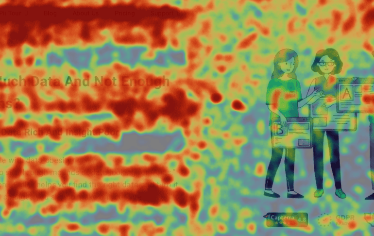
Heat maps use a color scale (from red to blue) to show which sections or elements of your website users interact with the least or the most.
Heatmaps date back to the 1800s when they were used in Paris as a shading map that visually represented social demographic changes. Although, they weren’t called Heatmaps until the 1990s. A software engineer, Cormac Kinney, used the term “heat map” to describe a tool he created to display financial market information graphically.
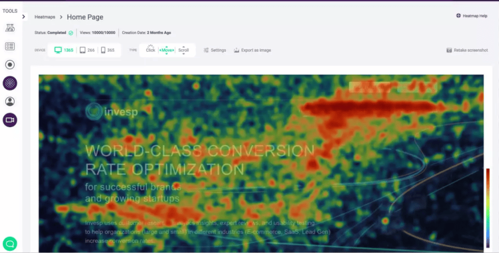
Red indicates an area you should monitor to understand why visitors are highly concentrated in that area.
Orange means less concentration, but clearly, it is enough to consider.
Yellow signifies minimal activity or data and is essential to note if it’s an area of priority.
Green, less movement on this area of the page
Types of Heatmaps and What They Show You
There are different types of heatmaps, and each has its purpose. Still, when combined, these different heatmaps give a detailed insight into your users’ behavior. The common heatmaps are click-tracking, mouse-tracking, scroll maps, and eye-tracking heatmaps.
-
Click Tracking Heatmaps
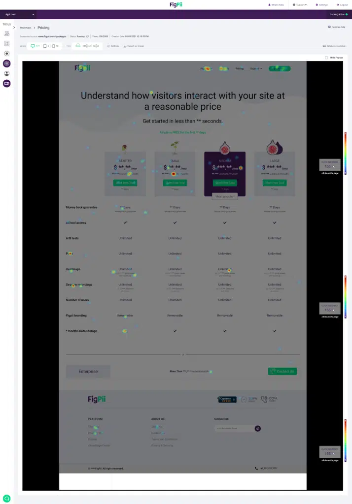
As the name suggests, Click-Tracking heatmaps visually represent where visitors are clicking on your site. On mobile devices, they show elements of your site that users tap on.
As a business owner, you may have specific sections on your website where user clicks or taps are important. Click-tracking heat maps can provide visuals that help you decide whether or not to make changes to influence users to engage with these specific sections.
-
Eye Tracking Heatmaps
Eye-tracking heatmaps use sensor software to record the user’s eye behavior, including blinking, pupil dilation, and fixation length, on a site’s element. They also reveal what your visitors are paying attention to by visualizing their mouse movements.
The only problem with eye-tracking technology is that it is expensive to acquire and requires users to wear special glasses. Also, unlike other heatmaps, eye-tracking heatmaps require physical usability sessions with users.
Alternatively, you can integrate less expensive eye-tracking software into your website to monitor users’ eye activity. However, they do not accurately represent the visitors’ eye activities since they rely on mouse movement.
-
Scroll Heat Maps
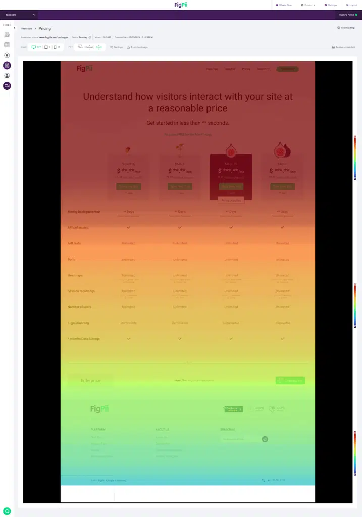
A scroll map is a website heat map that visualizes data on how visitors scroll when they are on your website. Scroll maps also reveal how far down your visitors scroll and the sections of the site they scroll through the most or least.
Scroll maps also help you determine how long a page should be to help you optimize conversions on your page since they show how far users scroll on it.
-
Mouse Tracking Heatmaps.
This heat map visually depicts visitors’ mouse movement while clicking, hovering, or scrolling on your website. Mouse-tracking heatmaps are sometimes used in place of eye-tracking heatmaps, based on the ideology that the position of a user’s mouse on a site is equivalent to where their eyes are focused.
Like most heat maps, mouse-tracking heatmaps make it easy to get an overview of website visitors’ activities without having to go into details of statistical analysis.
How Does A Website Heat Map Work?
The process involves capturing, processing, and presenting user behavior in a way that’s easy to interpret and use for optimization. Here’s a breakdown of how it works:
-
Visitor Interactions
When visitors arrive at your website, they perform various actions, such as scrolling, clicking, and hovering over different elements. These interactions are needed for understanding user behavior. Heatmaps record:
- Clicks: Identifying where users click the most (e.g., buttons, links, images) helps you assess which elements attract attention or may need adjustment.
- Scrolls: Understanding how far users scroll down a page reveals which sections are most engaging and where users lose interest.
- Mouse Movements: Tracking where users hover or move their cursor helps gauge interest in specific areas, even if they don’t click.
-
Real-Time Data Capture and Logging
As visitors interact with your website, the heatmap tool logs these actions in real-time. This process involves continuously recording user activities like clicks, scroll depth, and mouse movements.
The data is regularly sent to a centralized server, ensuring every interaction is captured without overloading your website’s performance.
-
Data Processing
Once the interactions are recorded, they are sent to a centralized server where the data is processed. Here’s what happens:
- The system compiles user sessions across various devices and browsers, ensuring the data reflects a wide range of user experiences.
- The data is then aggregated into heatmaps, providing an overall view of how users interact with each page of your website. For example, multiple sessions will show collective user behavior, making trends like popular areas or ignored sections more visible.
-
Visual Representation
After processing, the collected data is visualized in the form of a heatmap. This heatmap uses color to represent different levels of engagement:
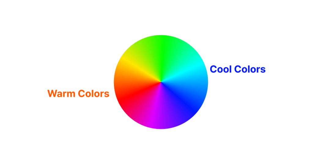
- Warm colors (red, orange, yellow) indicate areas with high activity, such as frequently clicked buttons or links. Warm colors highlight where users are most engaged.
- Cool colors (blue, green) show areas with lower activity, indicating parts of the page that may be overlooked or less engaging for users.
- No color: Sections without color represent areas without user interaction, signaling content or features that might need reworking.
-
Insight and Action
The heatmap provides actionable insights by showing you where visitors spend the most time and where they disengage. These visual cues allow you to optimize your site layout, content placement, or call-to-action buttons to improve user experience and boost conversions.
A website heat map typically looks like the image below, with the warmer colors showing a lot of user activity and the cooler ones signifying little interaction.
Using Heatmap Analysis to Uncover Visitor Frustrations on Websites
When visitors feel stuck, confused, or frustrated on your website, it can lead to high bounce rates or abandoned shopping carts. Heatmap analysis offers a visual way to identify these pain points and make data-driven improvements.
I think heatmaps help you understand the areas of your website where visitors are struggling. They are not necessarily a usability testing tool, but they give you signals that people are struggling in a particular area.
— Khalid Saleh, CEO, FigPii
Let’s walk through how to use heatmap analysis effectively to uncover visitor frustrations:
-
Identifying Unresponsive or Confusing Elements
Heatmap analysis can reveal where users are clicking the most (or not at all). For example, if users are repeatedly clicking on non-clickable elements like images or text, it signals confusion.
This often happens when visitors think an image or heading should lead to another page, but nothing happens. By identifying these hotspots, you can turn frustrating dead ends into actionable features.
-
Spotting Scroll Issues
Scroll heatmap analysis shows how far down the page visitors go. If users are dropping off before reaching key information or CTAs, it’s a red flag.
You might find that your most important content is buried too far down the page or that users aren’t engaged enough to keep scrolling. Shortening the page, moving key content higher, or adding compelling hooks can help reduce this frustration.
-
Understanding Form Abandonment
Forms are critical for conversions, but they can also be a source of frustration. Using heatmap analysis to track clicks and interactions around form fields can reveal where visitors get stuck.
If many users hover over or start to fill out a form but don’t submit it, it could indicate that the form is too long, confusing, or asks for too much information upfront.
-
Pinpointing Slow-Loading Areas
Heatmap analysis can also help identify areas that slow down page performance. If you notice users clicking repeatedly or scrolling quickly over a section without interacting, they might be experiencing slow load times or broken elements. Pairing heatmap analysis with site speed analytics can help pinpoint and resolve these issues.
-
Tracking User Frustration on Mobile
Due to screen size, touch controls, and load times, mobile visitors often face different frustrations than desktop users.
Heatmap analysis can reveal mobile-specific problems, like users trying to zoom in on text, misclicking tiny buttons, or struggling with unresponsive menus.
Addressing these issues with mobile-optimized designs can improve the overall user experience.
What are the benefits of heatmaps?
-
Understand how users navigate your site.
Visual representations from heatmaps can reveal everything you need to understand about how users navigate your site. Heatmaps will also show different navigational patterns used by site visitors, enabling you to detect patterns with friction. This will help you when redesigning navigations that will match users’ expectations.
-
It reveals underlying UX problems.
Heatmaps are a valuable tool for identifying UX problems on web pages. By visually representing user interactions, they can highlight areas where users are confused or frustrated.
For instance, if a heatmap shows excessive clicks on a non-clickable element, it signals a UX issue. This insight allows for targeted improvements on your web pages, enhancing user experience and potentially increasing conversions.
-
It gives a comprehensive insight when used with other analytical tools.
Session recordings allow you to record activities like mouse clicks, scrolls, and form interactions, which you can replay to understand what a visitor did on your site. Combining this with heatmaps gives you a more comprehensive view of interaction since you can see what elements visitors interact with on the site.
-
It helps you understand what’s working and what isn’t.
If you added a new element to your site to encourage users to interact with it, heatmaps could show whether or not users are interacting with it.
-
Uncover hidden trends in website usage and user behavior.
Website designs usually follow a user story/journey, which simulates how the user navigates from one point to another while on the site. However, we’ve seen cases where some users navigate the website in an entirely different way. Visualizations from heatmaps allow you to uncover trends in user behavior that would have gone unnoticed.
-
Direct Overview of Website Performance
A quick look at a page from your site’s heat map can reveal its performance in serving its intended purpose. Mouse-tracking, click, and scroll heatmaps will show the sections of your site where users interact, and eye-tracking heat maps will reveal where most visitors’ visual attention is directed.
-
Make better business decisions.
All the above benefits of heatmaps eventually translate into helping you make better business decisions backed by data. This begins with understanding the insights from the heatmaps and knowing how and what to change on your site that will ultimately help you increase conversions.
Conclusion
Heatmaps are website analytics tools that can reveal much information about user activities, even on complex web pages. They present hours and tons of user activities on your website in a format that’s easy to understand.
Heatmaps reveal areas of the site that users struggle to use, which, if improved, can drive your conversion rates and engagements.
Heatmap Analysis FAQs
What is the difference between scroll, click, and move heatmaps?
Scroll heatmaps show how far users scroll down a page, highlighting which sections get the most or least visibility. Click heatmaps track where users click, helping identify popular elements and potential issues with navigation. Move heatmaps visualize where users move their mouse, often indicating areas of interest or hesitation. Each type gives a different perspective on user engagement and behavior.
How Accurate Are Heatmaps in Analyzing User Behavior?
Heatmaps accurately track clicks, scrolls, and mouse movements, providing a clear visual of user interactions. However, accuracy depends on sample size and user diversity. While heatmaps show what users do, they don’t explain why—combining them with user feedback offers deeper insights.
How Often Should I Analyze My Heatmap Data?
You should analyze heatmap data after significant site updates or marketing campaigns to see how changes impact user behavior. For more static websites, monthly or quarterly reviews work well. Regular analysis during peak traffic periods or after major campaigns helps identify trends and optimize continuously.
Are Heatmaps GDPR Compliant?
Heatmaps can be GDPR-compliant if implemented correctly. They must anonymize user data and avoid collecting personally identifiable information. Ensure users are informed about heatmap use through your privacy policy and obtain consent where required. Choosing heatmap tools that prioritize data privacy and offer GDPR-compliant features is important.
How Accurate Are Heatmaps in Analyzing User Behavior?
Heatmaps are highly accurate in visually representing user behavior on a website. They track user interactions like clicks, scrolls, and mouse movements, offering a real-time snapshot of how users engage with different elements on a page.
However, the accuracy can be influenced by the sample size and the diversity of the user base. Larger and more varied user samples generally yield more reliable insights.
It’s important to note that while heatmaps show ‘what’ users are doing, they don’t explain ‘why’ – for this, combining heatmaps with other qualitative tools like user feedback can provide a more complete picture.

