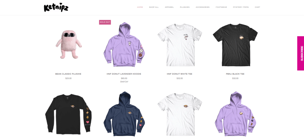
Are you ready to take your Shopify store to the next level? Look no further than A/B testing! A/B testing has many benefits, but it primarily allows you to test different variations of your website and email campaigns and see which drives the most sales, increases engagement, and boosts conversion. But you knew this already, right?
With so many different elements to consider, the next question is, where do you even begin? Don’t worry; I’ll try my best to help you with that; try to keep up.
In this article, I’ve compiled a list of 15 effective A/B testing strategies for Shopify stores that will help increase sales and conversion rates.
These strategies will help you make informed decisions about your store, from testing different product descriptions to experimenting with different website layouts. So put on your analytics hat, and let’s start boosting those sales!
Before we get into it, let’s discuss some of the important factors to consider during A/B tests on your Shopify Store.
-
A/B Testing Goals
Before conducting an A/B test, it’s important to identify your specific testing goals. This means clearly defining what you want to achieve with your test. For example, you may want to increase conversion rates, reduce bounce rates, and improve user engagement with a particular website element. Having clear and well-defined goals allows you to measure the success of your test accurately and align your testing efforts with your overall business objectives.
-
A/B Testing Tools
A/B testing requires specialized tools to create and implement variations of your Shopify store and measure their performance. There are various A/B testing tools available, both free and paid, that offer different features and capabilities. Choosing the right A/B testing tool that fits your needs and provides reliable and accurate results is important.
-
Focus on one variable at a time.
To accurately measure the impact of changes, it’s crucial to test only one variable at a time. This means making one change to your store, such as a headline, button color, or product image, and keeping all other elements unchanged. By isolating the effect of a single variable, you can attribute any changes in performance to that specific change and avoid confusion or inaccurate conclusions that may arise from testing multiple variables simultaneously.
-
Statistical Significance
Statistical significance is an important concept in A/B testing that refers to the level of confidence you can have in your test results. It ensures that the differences observed between variations are not due to random chance but are statistically meaningful. It’s important to ensure that your test results are statistically significant to make reliable and informed decisions based on the outcomes.
-
Test Duration and Traffic
The duration of your A/B test and the amount of traffic allocated to your variations can significantly impact the reliability of your results. Running tests for too short a duration or with too little traffic may not yield statistically significant results and can lead to inaccurate conclusions. Conversely, running tests for too long or with too much traffic may result in unnecessary delays in making decisions or implementing changes. It’s important to strike a balance and determine an appropriate duration and traffic allocation for your A/B tests based on the specific context and goal(s) of your testing.
-
Seasonal Trends
Seasonal trends, such as holidays or other special events, can significantly impact the results of your A/B tests. For example, during holiday seasons, the traffic and user behavior on your website or app may be different than during regular periods, which can influence the outcomes of your test. It’s important to be aware of any seasonal trends that may affect your test results and take them into consideration when interpreting your findings. This can help you avoid making incorrect conclusions or implementing changes that may not be effective in the long term.
Shopify A/B Testing Strategies To Increase Sales
Without further ado, let’s get into the different A/B testing strategies that can make a difference on your Shopify store and help you increase your chances of getting more visitors to buy from you.
In addition to these strategies, you should conduct quantitative and qualitative research better to understand the user experience on your Shopify homepage. Also, collect feedback from users through surveys or user testing, and use this feedback to refine your tests.
Here are 15 different Shopify A/B testing that can put you ahead of your competitors and help you drive sales.
Headlines and Product Titles
Have you ever been shopping in a supermarket looking for a particular item, but somehow, another product catches your attention, a product you didn’t plan on buying?
That’s an effect that Headlines or Product Titles can have on your store.
With so many options, so little time, and users’ attention span on the decline, you have about 2 to 3 seconds to get your site visitor’s attention with your headline.
A/B testing your Shopify store headlines is an effective way to increase sales and optimize your website. By testing different headlines, you can determine which resonates more with your customers and leads to a higher conversion rate.
Headlines are typically the first thing visitors see when they land on your website, so having a compelling headline can make a big difference in getting users’ attention and driving sales.
Product titles are often the first thing customers see when browsing your product pages, so it’s essential to make sure they are clear, compelling, and accurately describe the product.
Here are some Headline formats that you can A/B Test on your website
Direct Headlines: These types of headlines go straight to the point and state the purpose of your product or website.
Pain Point Headlines: Pain point headlines use keywords and terms related to users’ frustration and challenges. These headlines usually reinforce how the product or brand will solve the users’ problems.
Question Headlines: As the name suggests, they come in the form of questions that are answered when the user clicks on the headline. They usually begin with words like “When”, “How To” “Why”, etc.
Emotional Headlines: These headlines evoke emotions that prompt users to take specific actions, such as clicking the headline or product.
Location-Specific Headlines: These types of headlines are used by businesses that offer services to a specific geographical location. They are also used to target an audience or prospective customers in a specific location.
Product images and videos
Depending on what you sell on your Shopify store, you could also A/B test product images and videos.
Using images to showcase your product in action can be an effective way to increase conversion rate. It’s essential to use different images that highlight various product features, such as different angles and details, to give customers a comprehensive view of what they can expect.
You can also test different video formats, such as product demos, unboxing, or even customer reviews, to see which resonates more with your customers.
Pricing and discounts
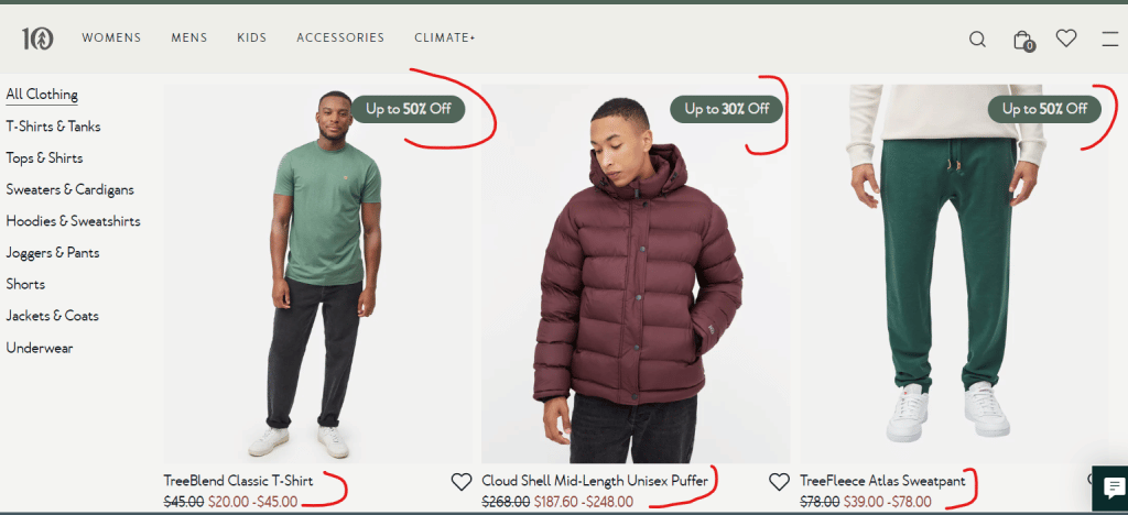
Split testing pricing and discounts on your Shopify store can help you increase sales, attract more customers and boost conversion rates.
When you test different pricing strategies, it’s easier to understand your audiences’ spending capabilities and limitations and set prices within their budgets without your products losing value.
For example, you can A/B test different price points, such as offering a higher price for a premium version of the product or a lower price for a limited-time promotion. Additionally, you can test discounts, such as a percentage off or a buy-one-get-one-free offer, to see which is more effective in driving sales.
You can also test the placement of the discounts, such as displaying them on the product or cart pages. It’s important to note that pricing is a sensitive topic and can significantly impact your sales, so testing different variations and monitoring the test results closely is essential.
Calls to action (CTAs)
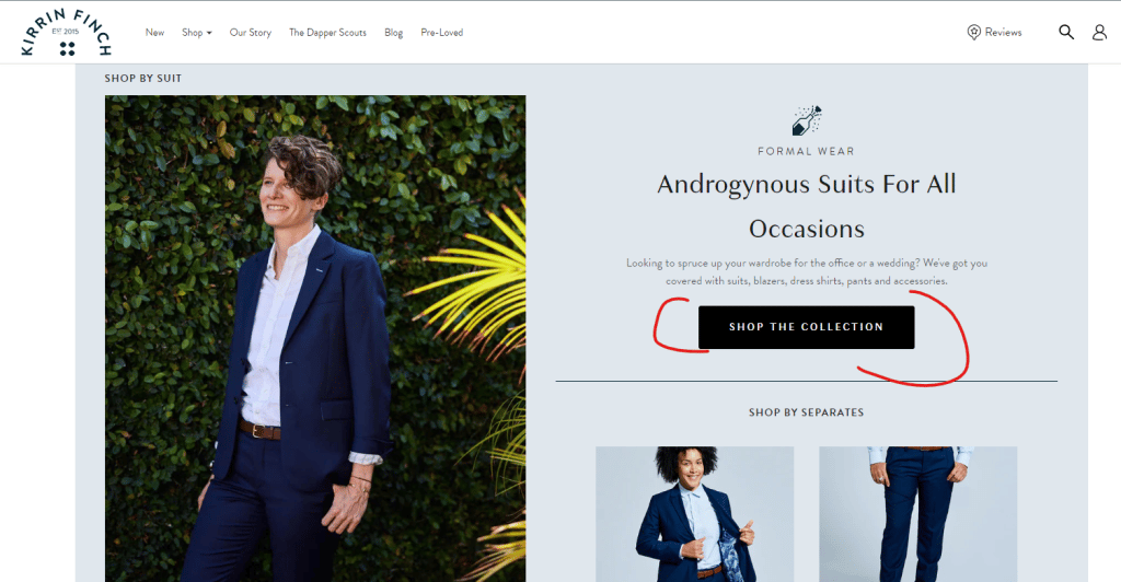
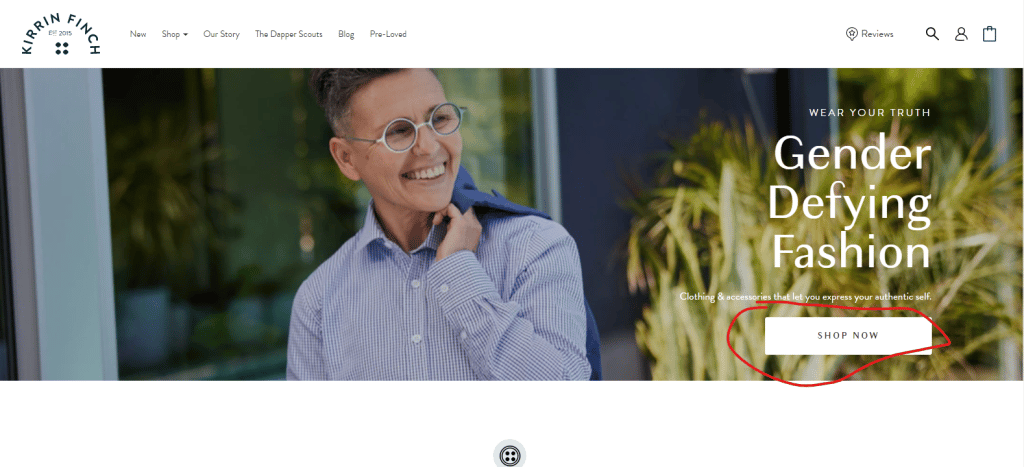
The images above are from the same web page, and the CTAs are used in different landing page sections. “SHOP NOW” and “SHOP THE COLLECTION.”. This shows that you can have more than one CTA with different copies. But how do you know which CTAs to use?
Through A/B Testing
When it comes to A/B testing elements like CTAs, it’s pretty easy to make assumptions because you’ve seen CTAs similar businesses are using, and you think you should adopt the same. In some instances, it may not have the desired effect on your store. This is why it’s important to test
A/B testing call-to-action (CTA) on your online store involves creating multiple versions of your CTA and testing which performs better with your target audience and would ultimately lead them to click on that button.
For example, you can test different CTA text, such as “Buy Now” versus “Add to Cart” or “Learn More” versus “Sign Up Now” to see which one increases your conversion rate. Additionally, you can test different colors, sizes, and placement, such as placing the CTA button above or below the fold, to see which leads to more clicks.
Product descriptions and reviews
Split testing product descriptions and reviews on your Shopify store can help you improve product performance and customer satisfaction.
Testing different descriptions and reviews makes it easier to understand your customer’s preferences and tailor the language, tone, and level of detail to match their needs.
For example, you can test different levels of technicality in your product descriptions or other types of reviews, such as video reviews or customer testimonials. Additionally, you can try different review placements, such as displaying them on the product pages or during the checkout process.
It’s also important to consider the language and tone you use and the level of detail included in your product descriptions and reviews, as it can significantly impact customer engagement and purchase decisions.
Navigation and menu structure
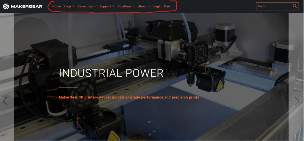
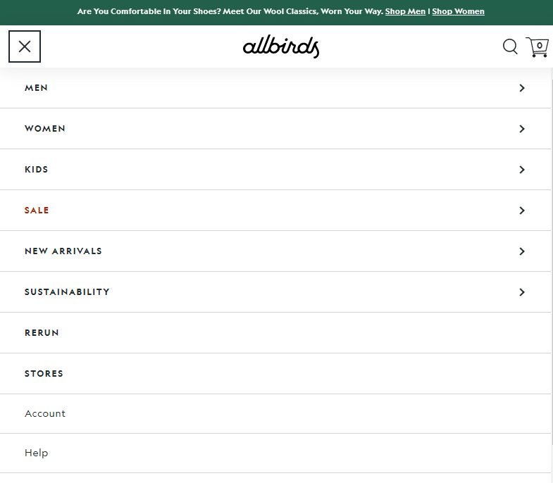
How your navigation and menu are structured on your Shopify store can determine whether or not users have a good experience while navigating your website.
You can test different menu layouts, such as a drop-down menu or a side menu, to see which one is more user-friendly and easy to navigate. You can also test different menu categories and subcategories and the placement of the menu on the page. Subcategories are important if your website has a lot of products.
Navigation and menu structure plays a crucial role in the user experience on your website. A clear, intuitive, and easy-to-use navigation can help visitors quickly find what they’re looking for, leading to increased engagement and conversion rate.
Homepage layout and design
Your homepage or your landing page is often the first point of contact for visitors coming to your website. It plays a crucial role in making a positive first impression and encouraging engagement.
Testing different design elements, such as color scheme, typography, and imagery, you can gain insights into what appeals most to your target audience and create a visually appealing and engaging landing page or homepage.
You can test different placements of crucial information, such as featured products, calls to action, and promotions, to see what works best for you; after all, if you’re running a test, you should explore the most viable options.
A well-designed and well-organized homepage can help visitors navigate your website more quickly and ultimately increase conversion rates.
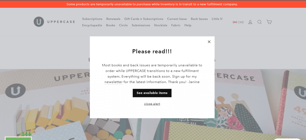
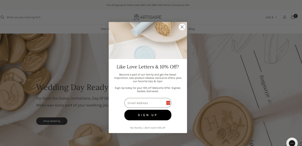
Pop-ups and other forms of on-site messaging
A/B testing pop-ups and on-site messaging on your website can help you optimize their performance, build rapport with customers, and pass across important information, as seen in the image above.
For example, you can test different timings for displaying the pop-ups, such as immediately upon arrival or after a certain amount of time on the site. There are also different types of pop-ups, such as newsletter signup or promotional offers, that you can test. The messaging, such as the language, tone, and level of urgency used in the pop-up or on-site messaging, is also essential.
Knowing that pop-ups and on-site messaging can greatly impact user experience will help you understand how to effectively use these tools without negatively impacting the customer experience.
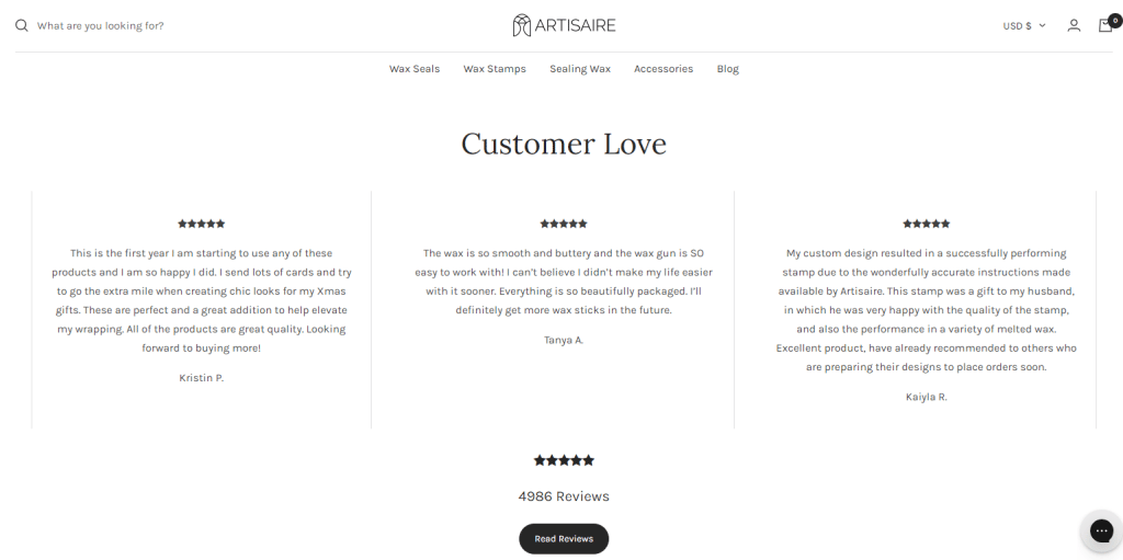
Social proof, such as customer testimonials
Social proof can influence customer behavior and increase conversion rate. Social proof can be in any of the following forms.
- Reviews
- Testimonials
- Case Studies
- Social Media
- Celebrity Endorsement
Test different combinations and placements of social proof, such as displaying them on the product page or in the checkout process. You can also try different testimonials, such as written reviews or video testimonials.
It’s important to remember that social proof can greatly impact customers’ buying decisions and can help increase trust and credibility in your brand, ultimately resulting in increased conversions.
It’s also important to consider the authenticity of these proof. When using testimonials, you can test the impact of displaying the customer’s name, picture, or location. However, ensure customers consent to this. I don’t think anyone would appreciate having their name and picture up on a site without prior notice.
Trust badges and security seals.
Trust badges and security seals are powerful tools that can help build customer trust and confidence in your brand. These visual cues, such as a padlock icon or a security certification badge, communicate to customers that their personal and financial information is secure when shopping on your website.
You can test different trust badges and security seals, such as a money-back guarantee or a secure checkout seal.
Trust badges and security seals are important for customer trust and confidence in your brand and for protecting their personal and financial information.
When your customers trust that you can protect their information, they are encouraged to keep buying from you, and this positively contributes to your conversion rates.
Loading speed and website performance
When a website loads too slowly, I check my internet speed first. If I see that it’s at the right speed, I conclude that something is wrong with the website, and I bounce. That’s minus one potential customer and a plus one to the website’s bounce rate.
Website performance and loading speed are crucial factors that can significantly impact the user experience and conversions. A slow-loading website can lead to higher bounce rates, lower engagement, and fewer conversions.
Test different optimization techniques, such as image compression, minifying code, or using a content delivery network (CDN) to speed up loading times. Additionally, you can test different website design elements, such as heavy animations or videos, to understand how they impact loading speed and website performance.
You can also test different hosting options, such as cloud hosting or dedicated hosting, to see how it affects the website performance and loading speed.
It’s important to remember that website performance and loading speed play a crucial role in the user experience, and optimizing them to provide a seamless and enjoyable experience to your customers or risk losing customers.
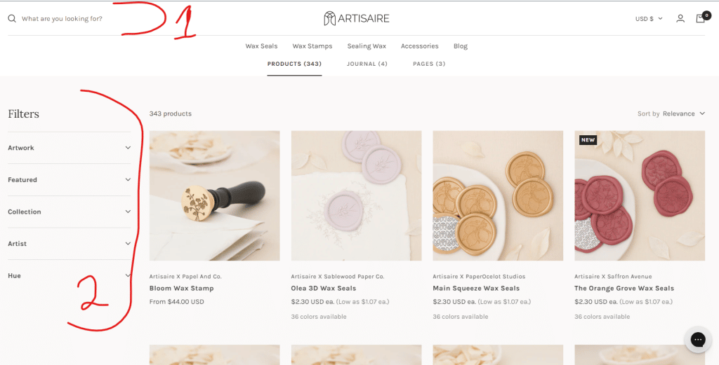
Search functionality and filtering options
If you are a regular Amazon shopper or online store that sells clothing items, you must have observed that these sites seem to have similar website layout patterns, where products are arranged according to their categories, making it easy for users to search and locate.
A well-structured search functionality and filtering options can help you improve the user experience on your website.
For example, you can test different search bar placements at the top of the page or in the sidebar. You can also try different search algorithms, such as keyword-based or semantic search, to understand which one is more accurate and efficient.
In addition to this, you can test different filtering options, such as by price, brand, or category, to understand which ones are most useful to your target audience.
A well-designed and easy-to-use search functionality and filtering options can help visitors quickly find what they want, leading to increased engagement and conversions.
Checkout process and payment options
The image above shows two payment options for customers shopping in the Flourist store.
Customers are usually cautious and wary when it comes to payments on websites. If there are signs that their information or payment might be compromised, this will likely result in cart abandonment. Therefore, you want to go with the most efficient checkout process while providing multiple payment options.
This can be achieved through A/B testing.
You can test different steps in the checkout process, such as the order of the form fields or the inclusion of a progress bar. You can also try other payment options, such as offering multiple payment gateways or allowing guests to checkout.
A well-designed and user-friendly checkout process and offering various payment options can help increase customers’ confidence in the store and make the purchasing process more seamless.
Email capture forms and newsletter signups
Email capture forms and newsletter signups can help you improve your email marketing efforts and drive conversions.
For example, you can test different placements of the email capture forms and newsletter signups, such as on the homepage, product pages, or during the checkout process. Also, you can test different types of forms, such as lightbox or slide-in forms, to understand which one is more effective in capturing email addresses.
Email capture forms and newsletter signups are a great way to build relationships with your customers, keeping them informed about new products, promotions, and events.
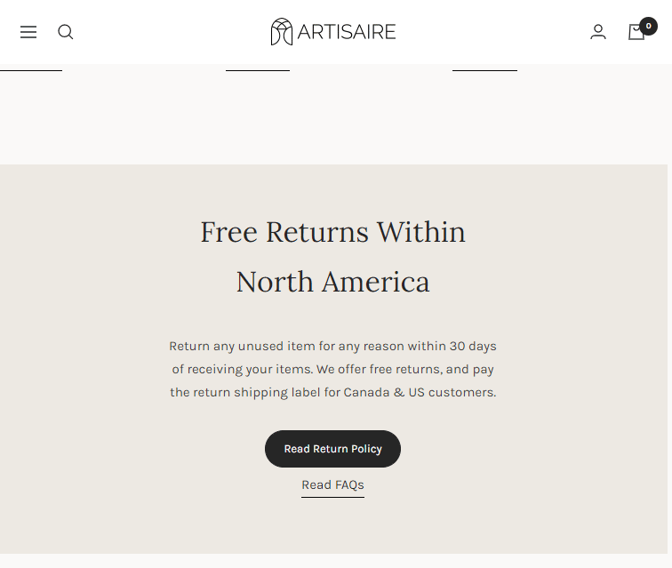
Return and refund policies.
I don’t know about you, but returns and refund policies always delight me. Knowing that I can return a product and get my money back encourages me to purchase without worrying about not getting value for my money.
You can test different return timeframes, such as a 30-day or a 60-day return policy. Additionally, you can try different types of refunds, such as store credit or a money-back guarantee.
Return and refund policies are crucial to customer satisfaction and can significantly impact customer retention. A transparent, fair, and user-friendly return and refund policy can help increase customers’ confidence in your brand and increase conversions.
Why You Should A/B Test Your Shopify Store
A/B testing is important for optimizing the performance of your Shopify store. By running controlled experiments where you test different versions of your website, you can identify what changes are most effective in improving key metrics like conversion rates, average order value, and customer engagement.
-
Improved Conversion Rates
A/B testing can help you identify what design, layout, and messaging changes lead to higher conversion rates, allowing you to improve the overall effectiveness of your website.
-
Increased Revenue
Optimizing your Shopify Store for conversions can increase your revenue per visitor, resulting in increased sales and profits.
-
Better User Experience
A/B testing can help you identify and fix user experience issues that may be driving visitors away from your store, leading to better engagement and customer loyalty.
-
Data-Driven Decision-Making
By relying on data rather than assumptions, you can make more informed decisions about improving your website and driving business results.
-
Stay Ahead of Competitors
Finally, A/B testing can help you identify new opportunities that can help you stay ahead of your competitors.
Tracking the Effectiveness Of Strategies
A/B testing is a great way to optimize your Shopify homepage to increase conversions and drive revenue. You can discover the best combination for your store by implementing the strategies discussed in this article.
However, A/B testing is only effective if you track and measure your results. Without tracking, you won’t know which version of your homepage is performing better, and you won’t be able to make data-driven decisions about how to improve your site.
To track the effectiveness of the A/B testing strategies on your Shopify homepage, start by setting up a tracking system that measures key metrics such as bounce rate, conversion rate, and click-through rate.
There are several A/B testing tools to use when implementing the different strategies. These tools help you determine if the differences in performance between your homepage variations are statistically significant. If they are not, you can adjust your design accordingly.
Over To You
A/B testing on your Shopify homepage aims to optimize your conversion rates and improve your overall conversion optimization strategy. You can make data-driven decisions that positively impact your website by conducting research, running A/B tests, and analyzing your test results.
Don’t be afraid to iterate and test different homepage variations until you find the design and messaging that resonates most with your target audience while driving sales simultaneously.


