The e-commerce landscape is becoming increasingly competitive, and finding ways to stand out from the crowd is more critical than ever.
A/B testing is a powerful tool that can help you do just that by enabling you to identify which website elements are most effective at driving conversions. Optimizing your website through A/B testing can improve the user experience, increase customer engagement, and ultimately boost your revenue.
In this article, we’ll explore 15 e-commerce A/B testing ideas to help you improve your website’s performance and stay ahead of the competition.
Whether you’re just starting with A/B testing or looking for new ideas to try, you’ll find plenty of inspiration here to help you take your e-commerce site to the next level.
What Is E-Commerce A/B Testing?
A/B testing is a randomized control experiment that compares two versions of a variable to determine which one performs better in a controlled environment.
In marketing, we simply replace “variable” with a website, web page, email campaigns, or page elements such as CTA, buttons, copies, etc.
Ecommerce A/B testing is all about experimentation and seeing what works best for your online store.
So let’s say you’re an ecommerce store owner and you want to boost your sales. You could create two versions of a product page – one that’s the same as your current page (the “control” group) and one that has a few changes (the “variation” group).
By directing equal amounts of traffic to each page, you can see which one is more effective in terms of getting people to actually buy your product.
A/B Testing goes beyond running tests and just declaring a winning variation. It also involves setting up the a/b test, choosing the right A/B Testing tools, analyzing your a/b testing results, and identifying opportunities for improvement.
Does Shopify Allow AB testing?
Yes, Shopify allows A/B Testing. Over 42.5 million ecommerce websites are built with Shopify. You don’t want to imagine how difficult it would be if those stores could not run A/B tests.
Shopify also has split testing software, available only to Shopify Plus users. However, its functionalities are not as robust as those of dedicated A/B testing tools.
Also, if you don’t have a Shopify Plus account, you can integrate third-party A/B testing tools like FigPii, VWO, and Kameleon to run your tests.
-
A/B Testing Ideas On Category Pages
Category pages are essential for e-commerce websites as they provide a structured and organized way for customers to browse and purchase products.
But why should you run A/B tests on category pages?
A/B test on your category pages is important because it lets you know the elements you can improve to drive more users from the category page to the product detail pages.
Let’s look at some ideas you can A/B test on your category page.
-
A/B Testing Different Layout Styles
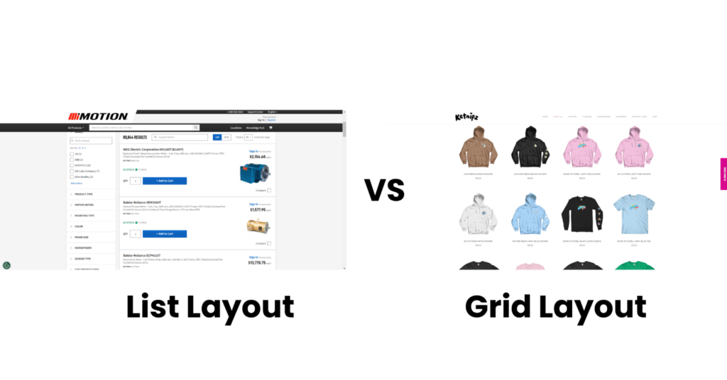
Regarding category pages, you have different design layouts and A/B tests to see which is best at enhancing user experience and improving your conversion rate.
You could A/B test the list style view against the grid style view.
List View Vs. Grid view layout
-
Using Filters
Have you ever been on one of those shopping sites where you search for a product and realize you want it in a different color or size, but you have to manually check through the products to find the right size or color? Stressful, right?
You don’t want your users to go through the same thing.
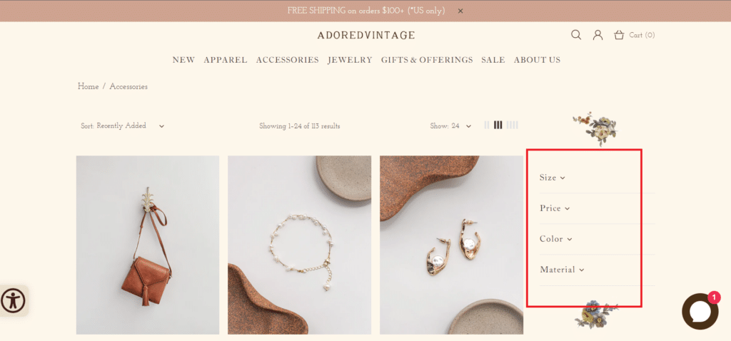
However, it’s easy to assume that users want this, but A/B testing can eliminate the assumption. So, run an A/B test to see if adding a filter feature will make any difference.
The filter feature on the AdoredVintage website allows customers to sort products based on size, color, material, etc. Thereby making it easy for customers to find desired products.
-
Product Display Order
How do you want the products in the different categories to be displayed to maximize sales and make users’ life easier?
This one’s tricky because it’s often more effective to use a combination of ordering than sticking to just one.
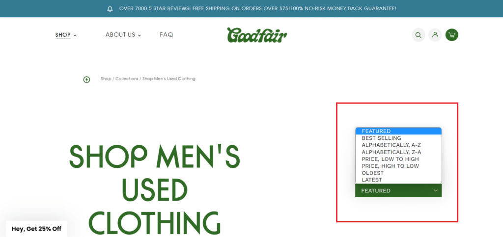
However, that’s why you’re running these A/B tests anyway. So, you can A/B test all these sorting orders to see which works best for you.
- Sort by name.
- Sort by popularity (sales)
- Sort by average rating
- Sort by most recent
- Sort by price (increasing or decreasing)
On the Goodfair website, you can rearrange products and get them to display in a specific order, as seen in the image above.
-
A/B Testing Ideas On Product Pages
Your product page is one of the most essential pages of your website and in the customer buying journey. It contains all the necessary information to help customers decide whether or not to add items to their cart.
One important reason to A/B test product detail pages is that it can help you identify the elements most effectively driving conversions.
With A/B testing, you can determine which elements, such as product images, prices, descriptions, or reviews, are most persuasive to your target audience.
This can help you optimize your page and increase the number of users who add these products to their shopping carts.
Let’s look at some ideas you can A/B test on product pages on an ecommerce store.
-
Product Pricing
Prices are sensitive to customers, so when running A/B tests for your product prices, you want to ensure you’re not undercharging or overcharging.
There are different types of pricing strategies you can use when testing different price points. When your A/B test is complete, and you are analyzing the results, you must be able to tell from your data which pricing strategies yielded the desired results.
Some common pricing strategies to experiment with include comparative pricing, competitive pricing, price anchoring, item bundling, charm pricing, etc.
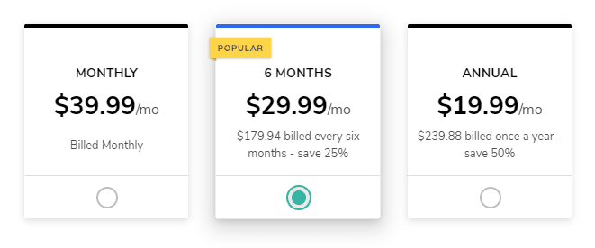
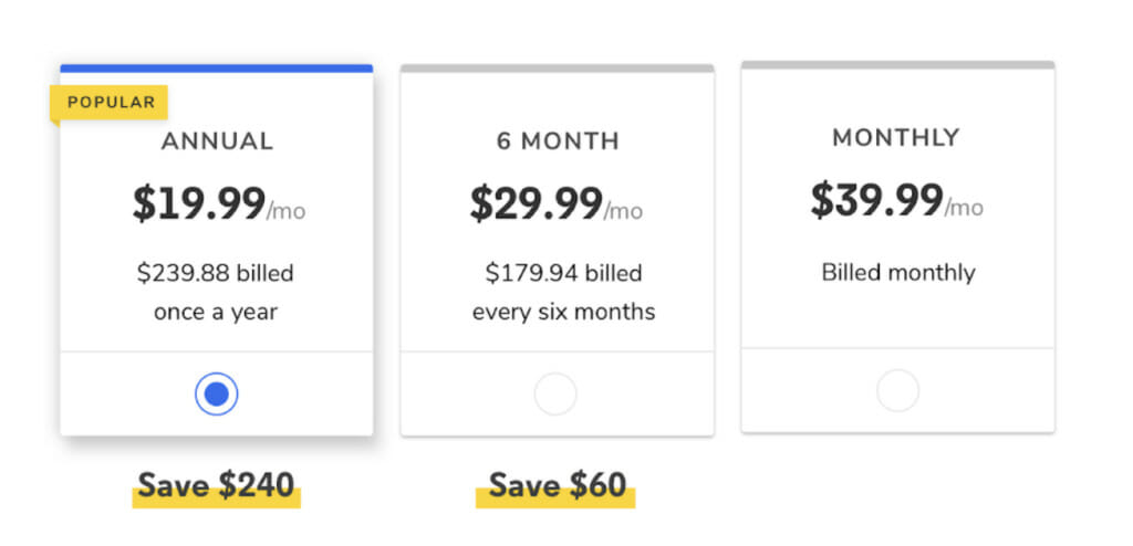
A good example of a Price A/B Testing experiment that yielded a significant page conversion was the Codeacademy Pricing Page. They A/B tested two variations of their pricing plans by introducing the Rule Of 100, which suggests that amounts greater than $100 are perceived to be of greater value than percentages.
For example, customers are more likely to go with “save $500 on your next order” than “save 20% on your next order”
Control version (Image Source)
Variant (Image Source)
The variant with “Save $240” and “Save $60” resulted in a 28% increase in the subscription to the annual plans and a noticeable increase in pricing page conversion.
-
Product Images vs. Videos
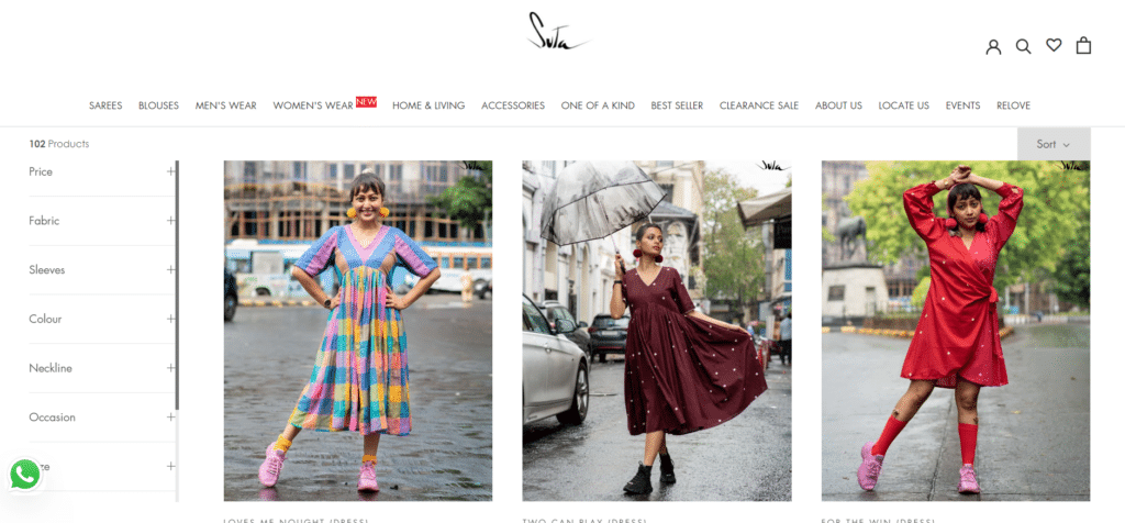
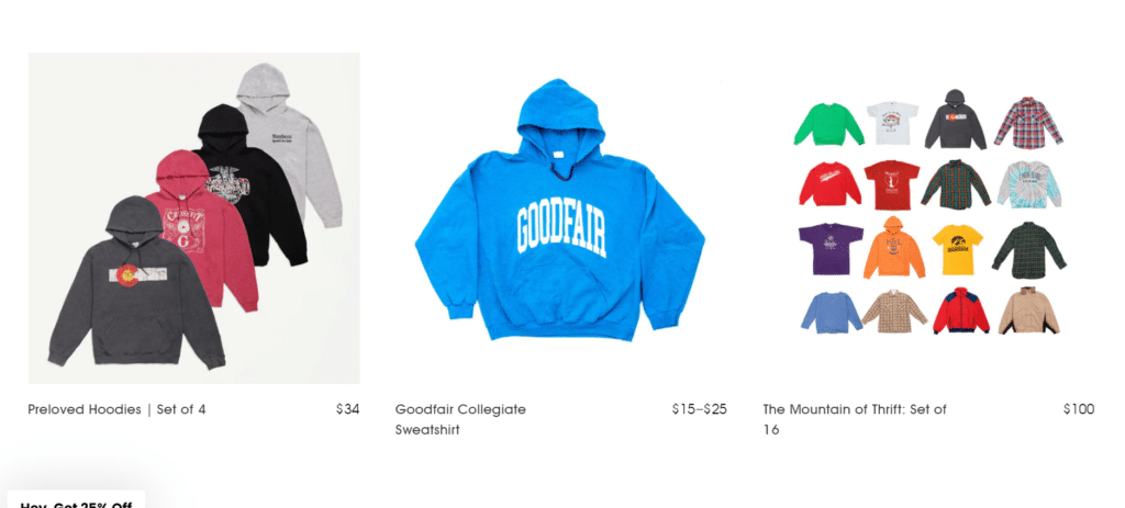
There is room for experimentation in showcasing your product images, ranging from displaying a lifestyle context on a product category page to featuring an isolated product image against a plain white background.
Product image on Suta featuring a real-life model
Product images on Goodfair featuring images against plain backgrounds
Also, you can A/B test videos against images to see which performs better at encouraging customers to purchase.
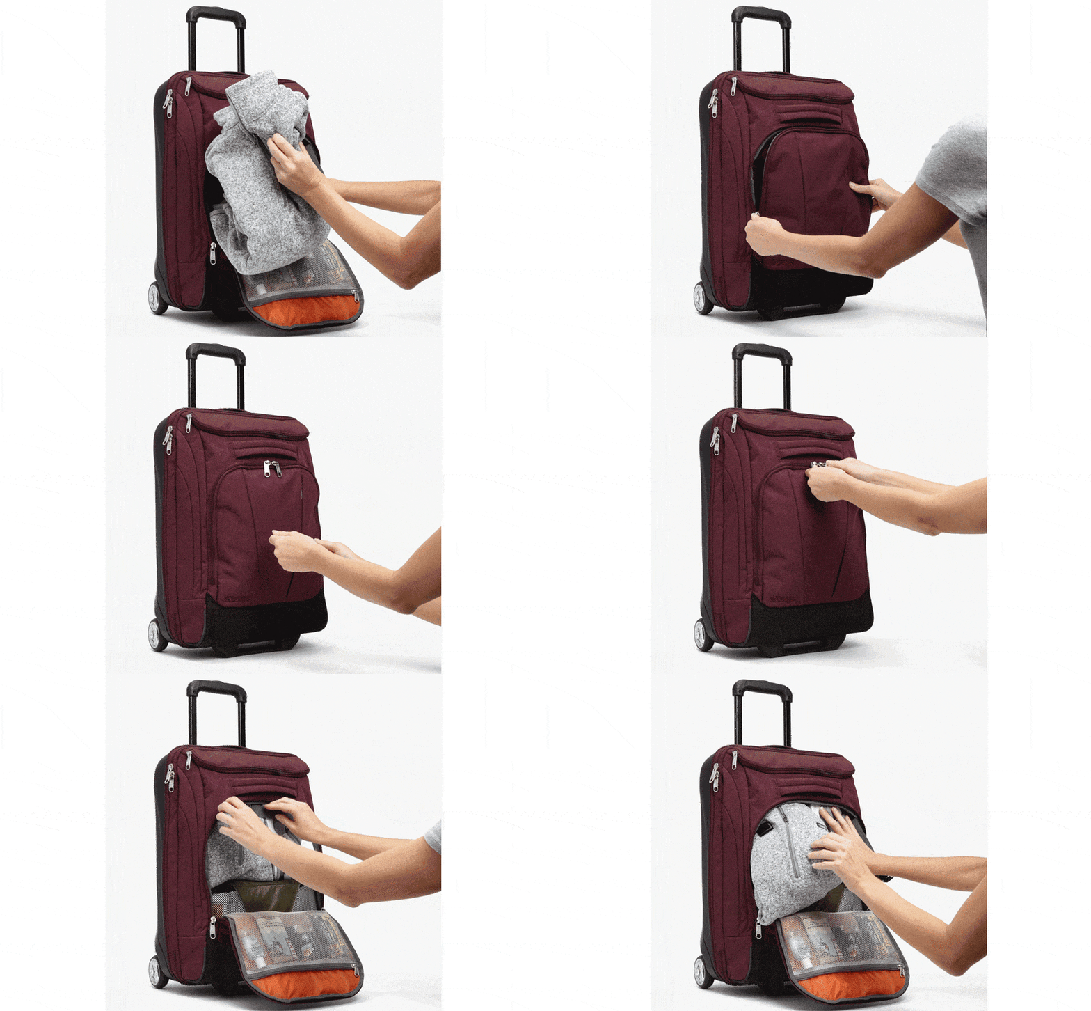
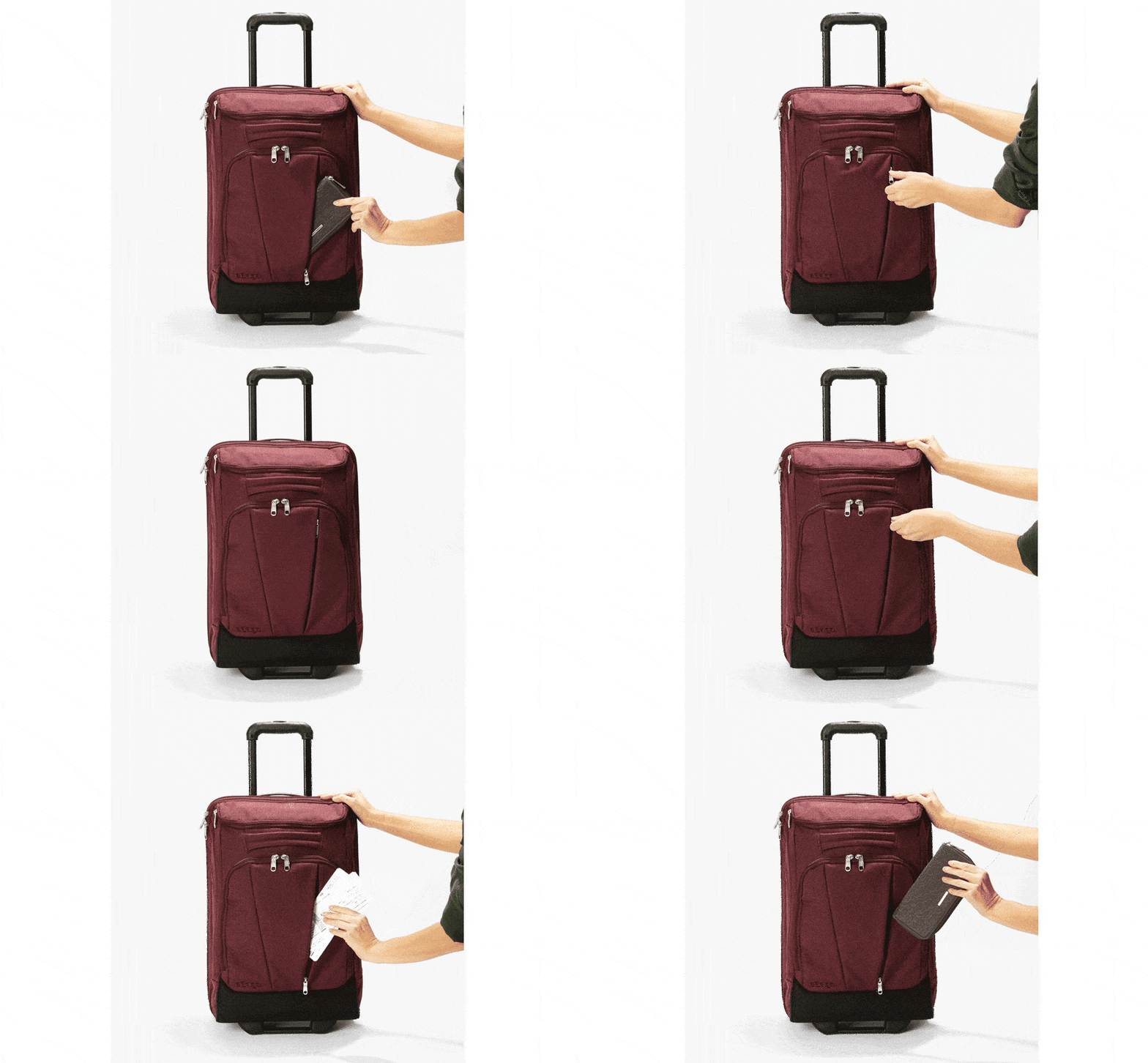
Videos can effectively communicate the context of use and how to use a product, thereby improving user experience.
Image Source (Ebags)
According to Invesp, Ecommerce product pages with videos convert up to 80% better than those without videos, and 74% of users who watched an explainer video about a product subsequently bought it.
If your product video sizes are large, you can host them on third-party platforms like Vimeo or Youtube and embed them on your product page to avoid slowing your site down.
-
Product Reviews
Customer feedback on products can inspire potential customers to trust your product and brand. People tend to be at ease when they see positive reviews about products they want to purchase.
A product with only good reviews can make potential buyers wary because it seems too perfect. A mixture of good and average reviews creates a more balanced and trustworthy impression, helping buyers make a more informed decision.
When buyers see various reviews, they can weigh the pros and cons of the product, leading to greater satisfaction with their purchase.
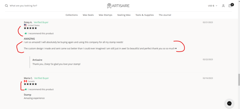
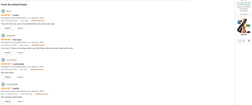
You can A/B Test written reviews against the star ratings review where customers rate your product on a scale of 5 stars.
You can also combine the two methods to see if it’s better that way. After all, you’re running the A/B Test to see what works and what doesn’t, so don’t limit yourself.
Product Reviews on Artisaire featuring written reviews and star ratings
Product Reviews on Amazon featuring written reviews and star ratings
Another type of review you can A/B test is video reviews. They provide a more authentic and personal perspective on the reviewed product or service.
Video Reviews by customers
-
A/B Testing Ideas On Cart Pages
You’re probably wondering what you can A/B test on cart pages since customers have already added products to their online shopping carts.
Wait till you see the statistics on cart abandonment rate on ecommerce sites. Every cart tends to be abandoned until payment is made, so you must continue to A/B test to reveal the best ways to reduce and prevent cart abandonment.
Here are some A/B testing ideas to experiment with on cart pages.
-
Upselling and Cross selling
Depending on the product type, upselling or cross-selling can help you sell more products to your customers.
If you’ve been using either method, it might be time to A/B test them against each other to see which drives more conversion.
Instead of always offering complementary products, you can offer higher-priced products that provide more value to customers.
Even when you assume one strategy is better, running an A/B test can prove you wrong.
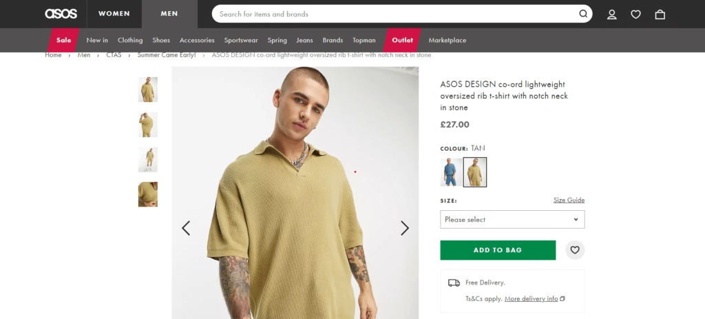
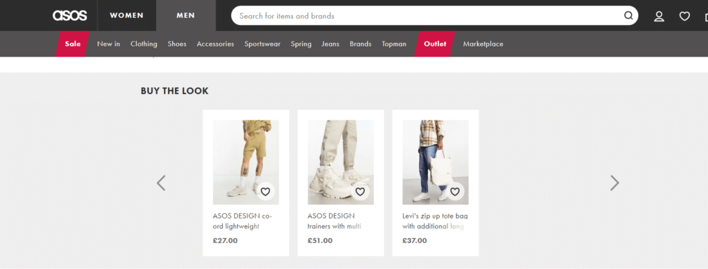
The two images above are from the Asos website. The first image shows the item purchased initially, while the second is an attempt to cross-sell complementary products.
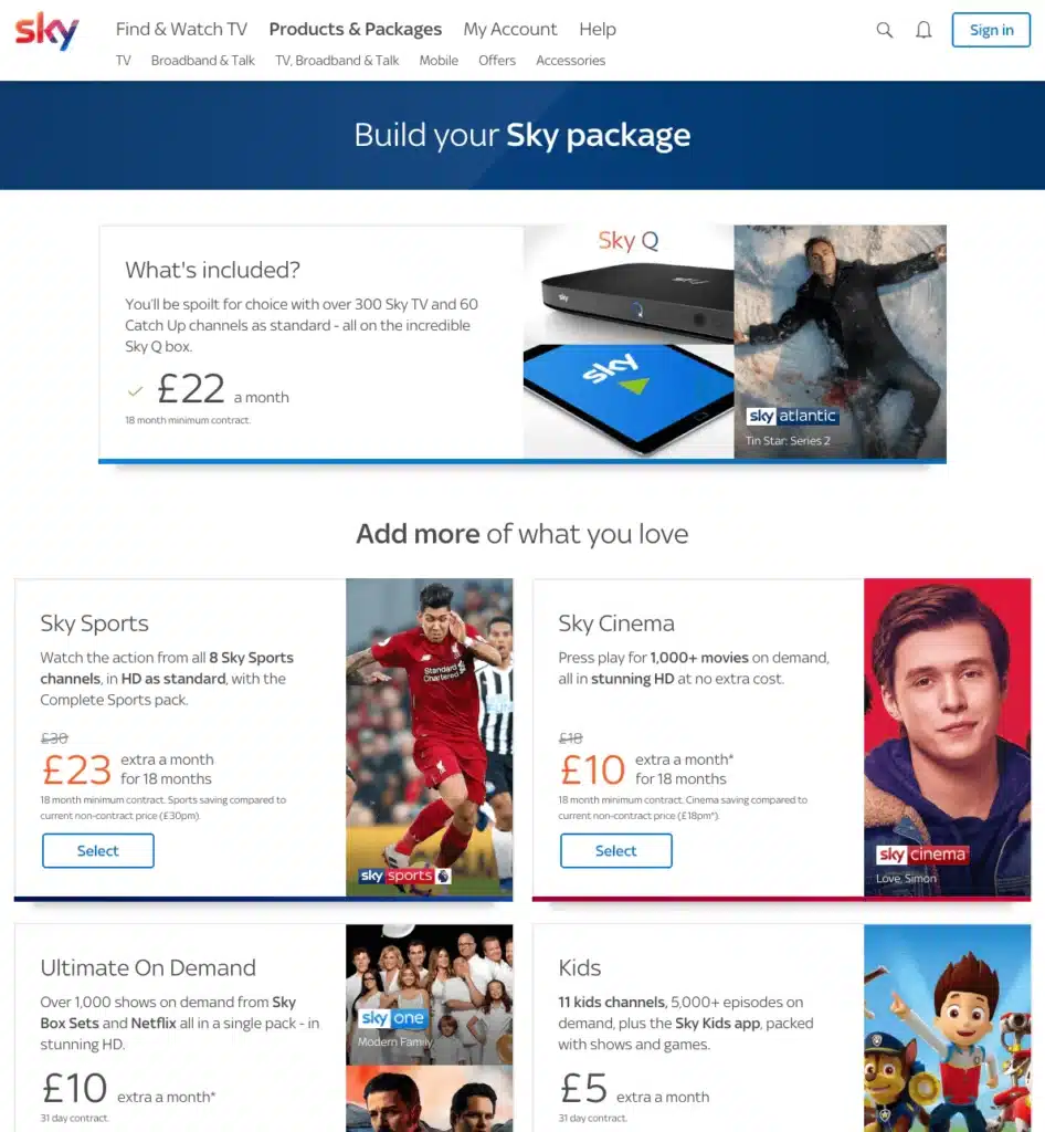
Sky also uses the Upselling approach in their TV Deals, where users see add-ons that can be included in their initial purchase.
-
Trust Badges
No matter how excited customers are about purchasing a product online, they still want to be able to trust your website before inputting their card details.
So, how do you build this trust on your cart pages? By using trust badges.
If you still can’t see how trust badges and seals can help improve your sales, you should run an A/B test with one version of your cart page having trust badges while the other does not.
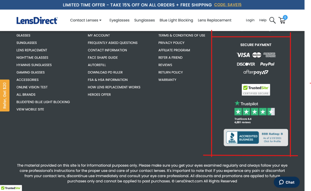
Payment and Security Trust Badges (LensDirect)
-
Progress Indicator
So, A/B testing progress indicators on an eCommerce website aims to make the checkout process smoother and more user-friendly.
You know how sometimes you’re trying to buy something online, and it can be confusing or frustrating to figure out what steps you need to take to complete your purchase. A clear and easy-to-understand progress indicator can really help with that.
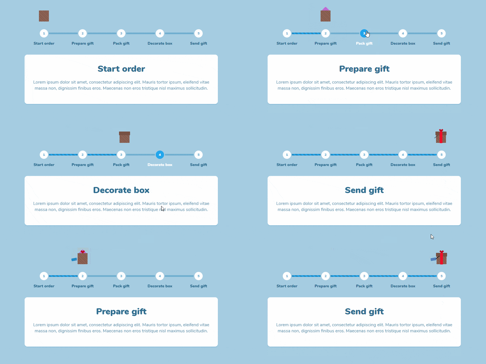
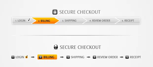
Common Types of progress indicators used by Ecommerce Stores:
- Progress Bar: A progress bar is a horizontal bar that fills up gradually as a task or process is completed. It typically includes a percentage or a label indicating the task’s progress.
Image Source (CodeMyUI)
- Step-by-step progress indicators: These progress indicators divide a task or process into a series of smaller steps and provide feedback on the completion of each step.
Here are some A/B testing ideas you could try with progress indicators:
- Placement: Test the placement of progress indicators on your cart pages. Try placing them in different locations, such as at the top or bottom of the page or on the side.
- Design: Test different design variations for your progress indicators, such as color, shape, size, and animation.
- Labeling: Test different labels for your progress indicators, such as “Steps Completed” or “Percentage Complete.”
- Feedback: Test the level of feedback provided by your progress indicators, such as indicating the number of steps completed and remaining steps or providing feedback on how long it will take to complete.
- Gamification: Test the effectiveness of gamification features, such as using progress bars or badges to motivate users to complete tasks.
-
Time-bound cart reservation
Are you experiencing a high cart abandonment rate on your website? Then time-bound cart reservations can be one of the effective ways to tackle this problem.
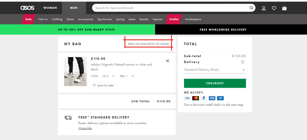
This A/B testing idea involves putting a time limit on items customers have added to their cart. This way, you have a button or a copy reminding customers that their cart expires within a given period.
As you can see in the image above, the item has been reserved for just 60 minutes. If no payment is made after the stipulated time, the cart expires.
-
A/B Testing Ideas On Checkout Pages
It’s like trying out different outfits to see which one looks better on you! By experimenting with the design elements and content, you can figure out what resonates with your customers and tweak your checkout page accordingly.
Let’s explore some testing ideas to try out on checkout pages.
-
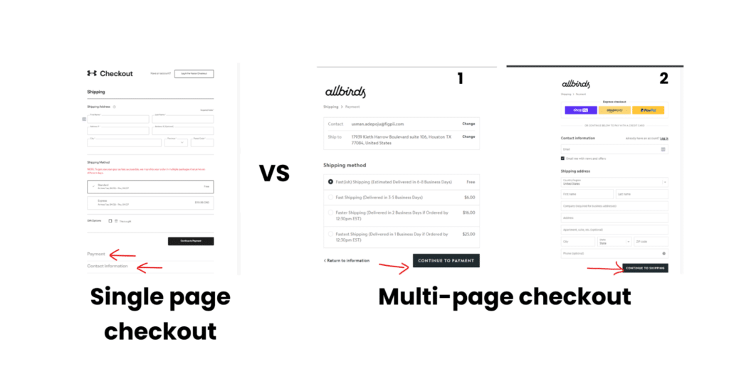
Single vs. multipage
Do you want the whole checkout process completed on single or multiple pages?
It doesn’t matter what you want; what matters is what your customers want, and the only way to find out is to run a split test and see which of the two ideas generates more sales.
-
Guest checkout
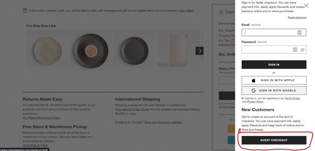
Do customers need to sign up before completing their checkout process? What’s more important to you, another email address to add to your mailing list or extra dollars in your bank account?
Introducing a guest checkout option is a great idea to also A/B test because it can encourage customers in a hurry to make purchases knowing they may not need to sign up.
Guest Checkout on Cratesandbarrel
-
Free Shipping
When A/B testing free shipping, there are different ideas to explore to encourage customers to buy more and reduce cart abandonment.
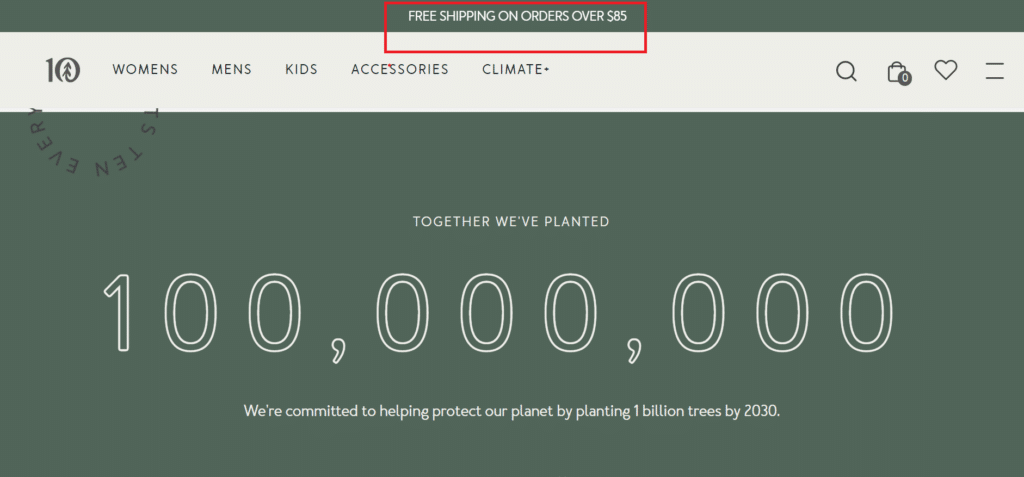
In one variation of your website, you can offer threshold-based free shipping, whereby customers get their items shipped for free after spending a particular amount.
Free shipping can also be given on select products ( especially those rarely purchased). Also, you can offer free shipping for new or returning customers in another variation.
The important lesson you want to learn here is figuring out which free shipping strategy works best at increasing your conversion rates.
Images Source (Tentree)
-
A/B Testing Ideas On Homepage
Split testing on home pages can be a valuable tool to improve the overall performance of a website. Homepages play a critical role in setting the tone for the website, establishing a brand identity, and encouraging visitors to explore further.
-
Navigation Menu
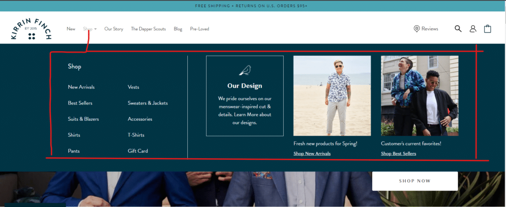
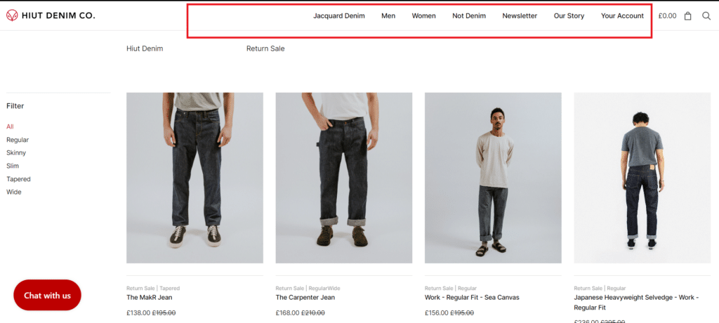
Navigation makes your site easy to explore for your customers. With a good navigation system, customers should be able to go anywhere they want from any page they find themselves.
When running split tests for navigation style, the important thing is to choose a simple navigation style that’s intuitive and easy for customers to use.
Another idea you can explore alongside the navigation menu is a search bar. Users can search your site for the products they want with a search bar instead of going through the navigation menu.
A drop-down menu on the Kirrin Finch website
An example of a sticky navigation menu on the Huit Denim Co. Website
-
Headlines
As mentioned earlier, your homepage matters greatly when piquing your customers’ interest to continue exploring your website.
Headlines are not only specific to homepages, but since your homepage could be the point of entry to your ecommerce business, it’s important to have solid headlines on your home page.
You can A/B test:
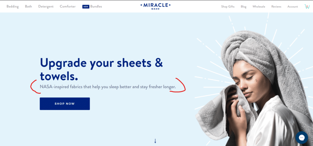
- Benefit-driven headlines – highlight the benefits of your websites, services, or products.
Image Source (Miracle brand)
- Emotion-driven headlines: These headlines tap into the reader’s emotions and aim to elicit a strong emotional response.
- Question-driven headlines: They pose a question to the customers and present your products as answers to this question.
In addition to these headlines, you can change their colors, placements, or fonts during your test to see which is better at driving engagement.
-
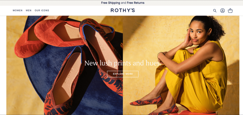
Hero Image vs. Carousels
Due to the constant motions of carousels, they often seem like ads, and in one quick glass, users can dismiss them, even when it contains important information.
If you don’t believe me, believe the Nielsen Norman that conducted a usability study on the effect of carousels.
Better still, if you’re still in doubt, you can run a split test with two versions of your homepage, one containing carousels and the other containing a static hero image.
Hero Image Example on Rothy’s
Benefits of A/B Testing in E-commerce
- Increased conversion rates – Testing different A/B testing ideas explored in this article, especially those directly impacting your conversion rate, can help you determine what works best for your customers and optimize your site for increased sales.
- Improved user and customer experience – Running A/B tests will also help you unlock effective ways to serve your users better while on your site.
- Understanding customer behavior – When you compare the engagement from a home page with carousels with that of a hero image, you can learn one or two things about customer behavior with different site elements.
Also, using different headlines format can help you learn which language and tone appeal to your target audience.
- Customer retention – Optimizing your site for a better user experience can increase customer loyalty and reduce churn. This can lead to long-term growth and sustainability for your business.
- Data-driven decision-making – Using A/B testing to inform your decisions can help you avoid assumptions or relying on gut instincts. Instead, you can use actual data to make informed decisions about your website and marketing strategy.
Although we have established that A/B testing is one of the effective ways to increase your conversion, it’s also important to be careful not to sacrifice user and customer experience on the altar of conversion.
A good example is having a newsletter subscription pop-up on your site without including a way to close the pop-up for uninterested users. While you might notice an increase in newsletter signups, there’s a possibility that your bounce and exit rates will be skyrocketing.
Conclusion
The 15 A/B testing ideas we explored in this article are just the beginning; you can test numerous other areas to improve your website’s performance.
It’s easy to limit yourself to the test ideas considered best practices or standards. The only problem with this is that your website is unique, and some of these so-called A/B testing best practices may not be effective in helping your site reach its potential.
So start experimenting and see what works best for your business! With A/B testing, the possibilities are endless.

