If you run a Shopify store, you know how important it is to convert your visitors into customers. But did you know that the average ecommerce conversion rate is only 2.86%? That means that for every 100 visitors to your store, only about three of them will make a purchase. That’s a lot of missed opportunities and lost revenue.
But don’t let statistics discourage you. There are proven conversion rate optimization (CRO) strategies you can implement to optimize your website and increase your Shopify conversion rate.
CRO is a technique for increasing the percentage of your website traffic that makes a purchase, also known as a conversion. CRO can help you boost your sales and conversion rates without spending more on marketing or acquiring new customers.
In this article, we’ll explore ten conversion optimization tips using real examples from Shopify websites. From creating compelling calls-to-action to optimizing your checkout process, we’ll cover everything you need to know to turn online shoppers into paying customers.
However, if you don’t have the time or expertise to optimize your store yourself, you can always buy Shopify stores. This is a great option if you want to start selling online quickly and easily.
1. Use High-Quality Product Images
The images and visuals on your ecommerce websites are crucial to the Shopify conversion rate optimization process. They are what your customers see, so they need to be high-quality and relevant.
In fact, statistics suggest that 75% of online buyers depend on product images when deciding on a potential purchase.
The right product image can help you increase your average conversion rate, while the wrong one can have the opposite effect.
Start with a good camera if you want to create great-looking product images for your Shopify store. A DSLR or a smartphone camera will do the job perfectly well. You can even use an expensive DSLR if you have one at home; if not, any other camera will do just fine.
The only thing that matters here is that the picture quality should be good enough so your customer can clearly see what they are buying and what they will get in return.
At the same time, your images should be high-resolution to provide crisp details and clear visuals.
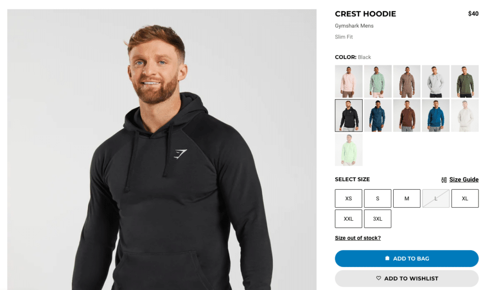
Gymshark is an excellent example of a Shopify store that uses high-quality product images to optimize conversions. Their product images are consistent in style, featuring clean and simple backgrounds that allow the product to stand out.
(Source)
You’ll also notice how their close-up shots perfectly showcase important details like fabric texture and branding.
Here are other tips for creating quality product images for your Shopify website:
- Show multiple angles: Customers want to see every aspect of the product before making a purchase decision. Provide multiple images that showcase different angles, close-ups, and features.
- Use consistent styling: Consistency in lighting, background, and props will help create a brand identity and improve the overall aesthetics of your product pages.
- Include lifestyle images: Customers want to envision how the product will fit into their life. Lifestyle images that show your product in action in a real-life setting will help them relate to it better.
- Use Zoom and 360-degree views: Zoom functionality and 360-degree views can help customers examine the product closely.
- Optimize image file sizes: Large file sizes can slow down your website and hurt your search engine rankings. Optimize your images to ensure they load quickly without compromising quality.
In addition, don’t forget to optimize your images for mobile devices as well.
2. Optimize Your Product Descriptions
A product description is one of the first points of contact between your customers and your products.
It’s the first thing they read before they buy something. It’s their gateway to understanding what you’re selling, what it does, and why they should buy it.
The best way to optimize your product descriptions is by focusing on benefits instead of features.
A benefit is something that helps people solve their problems or achieve their goals – it’s not just an attribute or capacity of something. A feature is what the product does or how it works.
For example, if you were selling running shoes, one benefit might be “helps reduce shin splints,” while another might be “protects against injuries during workouts.”
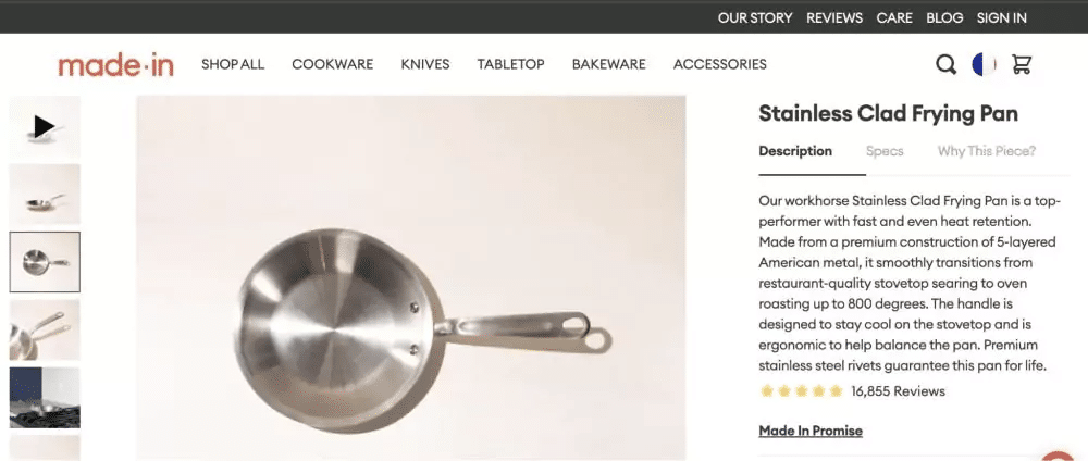
Take this example of the Shopify store Made In Cookware.
The description of their frying pan offers sufficient detail and precise numbers. It focuses on functionality and durability instead of describing how the product will make you feel like a first-class chef.

You’ll also notice how they start with a headline that grabs the reader’s attention and entices them to keep reading.
Similarly, your headline should accurately reflect the product’s key features and benefits.
Here are some more tips to help you optimize your Shopify store’s product description:
- Use persuasive language: Persuasive language will help your customers understand why they need the product. Use words like “must-have,” “essential,” and “life-changing” to make the product sound more appealing.
- Write for your target audience: Your product description should address or cater to your target audience. To do that, use the language and tone that resonates with your audience and speaks directly to their needs and wants.
- Add social proof: Including social proof, such as customer reviews or ratings, can help build trust and credibility with potential buyers. Ensure to feature reviews prominently on the product page (more on this later).
- Keep it scannable: Your product descriptions should be easy to read and scan. Use short paragraphs, bullet points, and headings to break up the text and make it more visually appealing.
- Include a clear call-to-action: Include a clear call-to-action that clearly tells the reader what to do next, such as “Add to Cart” or “Buy Now.”
3. Implement User Reviews
Imagine a customer considering purchasing a product from your Shopify store but is hesitant because they have never heard of the brand before.
However, as they come across several positive customer feedback, they feel more confident in their purchase and decide to make the transaction.
And this is a common scenario. After all, user reviews have a tremendous effect on the decision-making process of potential customers.
And numbers prove this too!
If you look at the statistics, 66% of customers say that having several online reviews makes them trust an online brand. And as many as 72% of shoppers don’t even take any action until they read online reviews about your brand.
This signifies just how important user reviews are for building trust with potential customers.
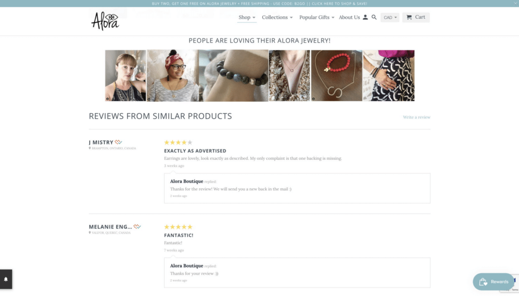
Here’s a good example from Alora Boutique showcasing customer photos along with customer reviews. Look at how they reply to each customer review.
(Source)
Also, notice the “Verified by Fera” icon. The icon helps customers feel more confident in the authenticity of the reviews.
Feedback is another crucial aspect of user reviews. When customers leave reviews, they provide valuable feedback on their purchased products.
You can use this feedback to improve your products, increasing sales and customer satisfaction.
For example, let’s say a customer leaves a review suggesting the product they purchased had a flaw that made it difficult to use. You can use this feedback to improve the product and prevent similar issues from occurring in the future.
4. Simplify Your Checkout Process
If you want to increase your conversion rate for your Shopify website, you need to simplify your checkout process.
Don’t believe us?
Here are some stats:
- As per stats, 18% will abandon their cart if the checkout process is too long or complicated.
- Another Shopify study stated that Shop Pay checkouts see a 1.72 x higher checkout-to-order rate than those undergoing regular checkouts.
To avoid such high cart abandonment rates, you can use an automated checkout process to collect customer details and decrease the number of steps in your checkout process.
You also need to provide clear instructions on completing the form with as few steps as possible.
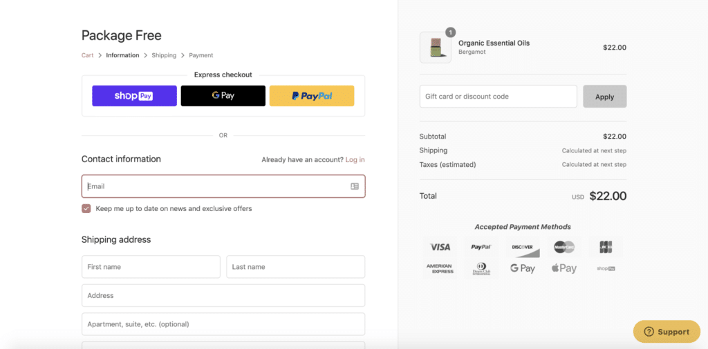
For example, consider this simple checkout process from Package Free Shop, a Shopify store that sells eco-friendly products. They include all major elements that make for a good checkout form, such as white space and a clean design.
(Source)
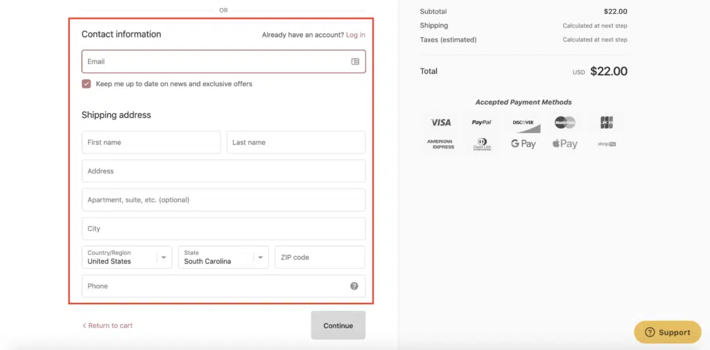
Beyond that, they only ask for vital information, such as their customer’s email and shipping address.
(Source)
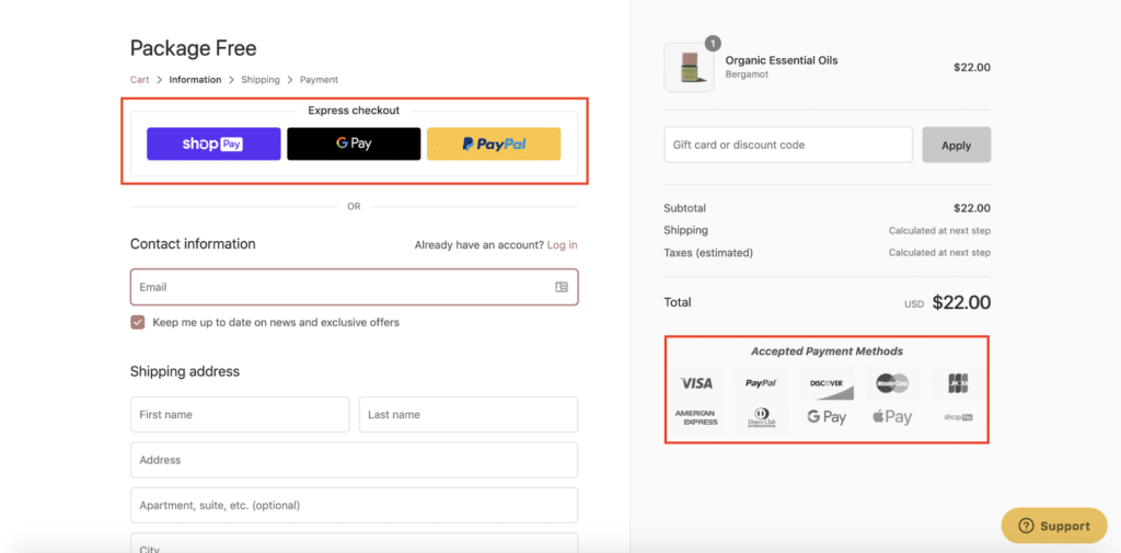
The Package Free Shop also provides its customers with various payment options, including express checkout via Shop Pay, Google Pay, and PayPal, as well as multiple payment gateways.
(Source)
This allows buyers to choose the most convenient payment method, making the shopping experience smoother and more seamless.
In addition, use clear wording at each step of your checkout process so that customers know exactly what they need to do next and why it’s important (for example, allowing them to choose their shipping address).
Here are some more quick tips to simplify your checkout page for better conversions:
- Offer guest checkout: Not all customers want to create an account before making a purchase. Offer a guest checkout option so customers can complete their purchases quickly without creating an account.
- Optimize for mobile: Many customers use their mobile devices to shop online, so ensuring your checkout process is mobile-friendly is important. Test your checkout process on different devices to ensure it’s optimized for mobile.
- Display progress indicators: Progress indicators will help customers understand where they are in the process and how much more information they need to provide.
- Use clear, concise language: Use simple and clear language throughout the checkout process, and avoid using jargon or complex terms that might confuse customers.
5. Use Clear and Compelling Calls-to-Action (CTAs)
Calls to action are essential elements of any online store design. These are words or phrases that encourage a customer to take action and complete a desired goal, such as adding an item to their cart or signing up for a newsletter.
That said, just placing a CTA button isn’t enough. It’s important to place it in a prominent location on your site so that customers can easily spot it and act upon it.
For example, if you want your customers to add items to their cart, put the “Add To Cart” button right where your product description ends, so they can see it without scrolling down too much.
At the same time, use action-oriented verbs like “Shop Now” or “Buy Today” to encourage customers to take action.
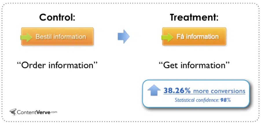
In a case study conducted by a Danish company, they observed that optimizing the Call-to-Action (CTA) button led to a significant increase in conversions by 38.26%. The alteration made was replacing the word ‘order’ with ‘get,’ as ‘get’ sounded more appealing and persuasive to the customers.
(Source)
Here’s a brilliant example of a catchy CTA from Brooklinen, a Shopify store:

Don’t forget to test different CTAs and analyze the data to determine the most effective ones. You can also use A/B testing tools like FigPii to test your CTA buttons without much technical know-how.
6. Offer Free Shipping
There are two ways to offer free shipping. You can either offer it for all orders or just for certain products. You also want to ensure that you offer free shipping on all orders over a certain amount so that customers will buy more when they see that shipping is included.
In a 2021 Consumer Trends Report, a significant majority of consumers – 80%, to be precise, anticipate receiving free shipping on their orders when they reach a certain dollar amount of products.
Furthermore, 66% of consumers expect free shipping for all their online orders.
Offering free shipping can help you increase your conversion rate and average order value (AOV) by reducing cart abandonment and encouraging larger purchases.
7. Implement Exit-Intent Popups
Exit-intent popups can be an effective way to drive more sales and conversions on your Shopify store.
This type of popup displays when your customer is about to leave your website. The idea is to incentivize the customer to keep them on the site and complete their purchase.
In a nutshell, they give you another shot at convincing people to return and finish their purchases!
And there are legitimate case studies that showcase the effectiveness of using exit-intent targeting.
For example, Fastrack was able to recover 53% of their abandoning visitors, resulting in increased sales.
However, exit-intent popups aren’t just about getting more sales – they’re also about increasing customer lifetime value. If you use them as part of an overall strategy, you’ll see better results over time.
You can use them to:
- Get more email subscribers (by adding additional fields),
- Promote products or services on offer (e.g., “Buy now with 20% off!”)
- Offer discounts or deals to encourage people to complete their purchase (e.g., “Our best price ever! Enter code FREESHIP at checkout for free shipping today!”)
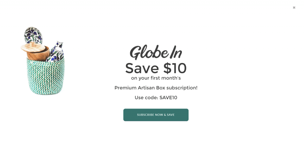
Take a moment to observe how GlobeIn, a Shopify store, utilizes a popup to boost its conversion rate.
(Source)
This exit-intent popup is a straightforward call-to-action that provides GlobeIn users with a $10 discount, helping shoppers complete their purchases quickly and efficiently with an exit-intent popup.
8. Use Video Content
Video content is engaging and helps you stand out from the competition.
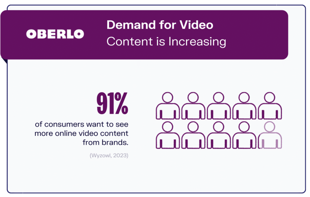
What’s more, 91% of shoppers would like more online video content from brands. That’s a significant number!
(Source)
And who can blame them?
Videos are a great way to show off your products. They also make it easy to explain how to use a product or tell a story about who you are as a business.
Naturally, you can use video content in many different ways on your Shopify store.
Here are some ideas:
- Showcase a product in action.
- Explain how something works.
- Tell a story about your business or product.
- Make an announcement about new products or services.
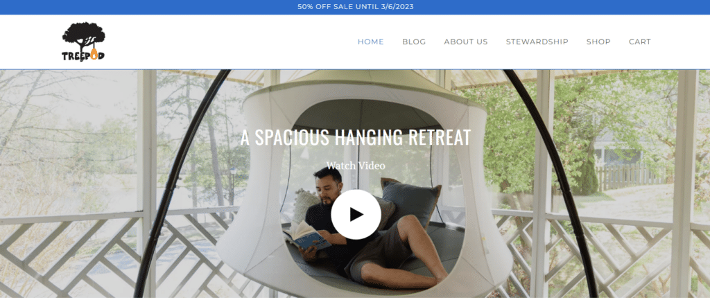
Treepod – a Shopify store that offers spacious hanging retreats – is a perfect example of a Shopify store that uses video content to showcase its product.
(Source)
Through their video content, viewers can see individuals relaxing in their hanging hammocks while surrounded by beautiful natural scenery.
This visual demonstration of the product in use helps potential customers envision themselves enjoying it and can ultimately lead to increased sales.
9. Provide Multiple Payment Options
As per statistics, small businesses that accept multiple payment options can see 7x more yearly revenue than those that offer fewer than four payment gateways.
Clearly, multiple payment options are a great way to increase sales on your Shopify store.
Here’s why:
It increases the likelihood that a customer will purchase from you.
Multiple payment methods will allow shoppers to purchase from you regardless of their preferred payment method. This is especially important for international customers who might not be able to use certain forms of payment in their country.
It eliminates customer hesitation when making purchases.
If a customer is hesitant about purchasing because they don’t see an option that fits their needs, they may leave the website without purchasing anything. You can avoid this by offering multiple payment methods, so customers don’t have to worry about finding the right one for them.
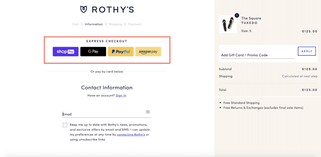
Observe how Rothy, a Shopify store, provides shoppers with the convenience of multiple payment gateways, including Shop Pay, Google Pay, PayPal, and Amazon Pay.
(Source)
This approach allows customers to choose the payment method that best suits their needs and preferences, which can ultimately lead to a more positive shopping experience and increased sales for the store.
10. A/B Test and Optimize Your Website Regularly
A/B testing allows you to test different versions of your website and see which one performs better. It’s an easy way to increase conversions on your Shopify store.
For example, if you have a button that says “Buy Now,” you could A/B test with two different buttons, “Shop Now” and “Buy Now.” You might find that one performs better than the other, so you can use the winning button on your site to increase conversions.
The best way to optimize your site for conversions is to test it regularly. You should also try out different headlines, descriptions, and images to see what works best for your audience.
If you don’t know where to start, use conversion optimization and A/B testing software like FigPii to perform A/B tests on your Shopify store.
The best part? It’s available on the Shopify app store.
Aside from A/B testing, FigPii also has a bunch of other optimization tools that help you gauge how your web pages and webpage elements are performing and then make changes based on those revelations.
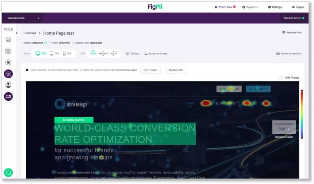
For instance, FigPii provides heatmaps that show you where visitors click, scroll, and spend the most time on your site.
They also provide session replays that give you a firsthand account of how users behave on your site, giving you insight into areas that need improvement.
Seal the Deal with Proven Shopify Conversion Tips!
In conclusion, optimizing your Shopify website – or any ecommerce business for that matter – for conversions is essential to ensure the success of your online business.
By implementing the tips outlined in this article, you can create a better user experience, build trust with your customers, and ultimately drive more sales to your online stores. Remember to keep testing and experimenting to find what works best for your specific ecommerce site and audience. Happy selling!

